News New Jumpers For 2020 - All Changes In OP

Remove this Banner Ad

Status
Not open for further replies.
I thought saints had released their clash for this year already? Perhaps this is their pre-season jumper?

Credit: Mero


Whoever signed off on all the St Kilda jumpers this year seriously needs to be fired.

They've taken good designs and totally ****ed them up by shithouse alignment etc.

Home jumper Deliveroo Logo too ******* big and exacerbated by a white stripe that's too wide. (and thats not even mentioning the problematic colour boxes)

Red Crusader ruined because the designer can only be assumed to be ******* blind.
 

Log in to remove this ad.

I thought saints had released their clash for this year already? Perhaps this is their pre-season jumper?

Credit: Mero


The back looks a bit average, hopefully it looks better with numbers on.
 
I'm pretty sure Canterbury Bulldogs (who are also with Classic) stuff is sold in Brisbane, I would like to see if their stuff has similar "quality" issues to Brisbane's stuff as seen in the OP
That's what baffles me, yes I know we are their first foray into AFL but they have done rugby league for so long including the Kangaroos and Blues they should at least be able to provide gym shorts that have a zip pocket and not be thick like a woolen jumper.
 
There’s not much more the club or designers can do - sponsors pay money for branding, so the club has to give them what they want within the guidelines set by the AFL. It’s a shame the new jumper doesn’t have the same logo placement as the one for Riewoldt’s 300th but the Pepper logo is too wide to fit inside the red space above the cross without encroaching on the Dare logo, it has to go somewhere and that then determines where everything else goes.

Same with the Deliveroo logo on the home, if the max space is 100 sq cm (or whatever it is - I know it is 81 sq in the NEAFL) then the sponsor will want the absolute max size possible in their corporate colours. Sure it would look better with no box but that’s not what they are paying for. Not the clubs fault, not ISC’s fault.

Whoever signed off on all the St Kilda jumpers this year seriously needs to be fired.

They've taken good designs and totally f’ed them up by shithouse alignment etc.

Home jumper Deliveroo Logo too ******* big and exacerbated by a white stripe that's too wide. (and thats not even mentioning the problematic colour boxes)

Red Crusader ruined because the designer can only be assumed to be ******* blind.
 
Same with the Deliveroo logo on the home, if the max space is 100 sq cm (or whatever it is - I know it is 81 sq in the NEAFL) then the sponsor will want the absolute max size possible in their corporate colours. Sure it would look better with no box but that’s not what they are paying for. Not the clubs fault, not ISC’s fault.
Then you make the white stripe narrower so the box doesn't bleed over and you align the crest to center of the sponsor logo.

There are ways to not make it look terrible even with the sponsor being adamant on size/colour.

With the Crusader you just lower the cross there is nothing you can do about the pepper logo encroaching on the center but the crest could be fully within the black and the AFL above if the design was lowered slightly on on the jumper. These are small detail things that don't effect the sponsor at all but do effect the clubs branding.

The jumper is the main piece of club branding more thought and care should be taken with how it is presented!

These jumpers are unacceptable!
 
Team photo day!

729388.jpg


729404.jpg
 

(Log in to remove this ad.)

Popped into the Lions shop today because I needed new Lions gym shorts and I couldn't believe how bad the classic stuff really was. The gym shorts did not even have pockets! I ended up buying the cotton on AFLW one. The guernseys look like a Bali knockoff. I'm disgusted we signed with such an amateurish manafacturer.

View attachment 809393View attachment 809394

Unacceptable.gif
 
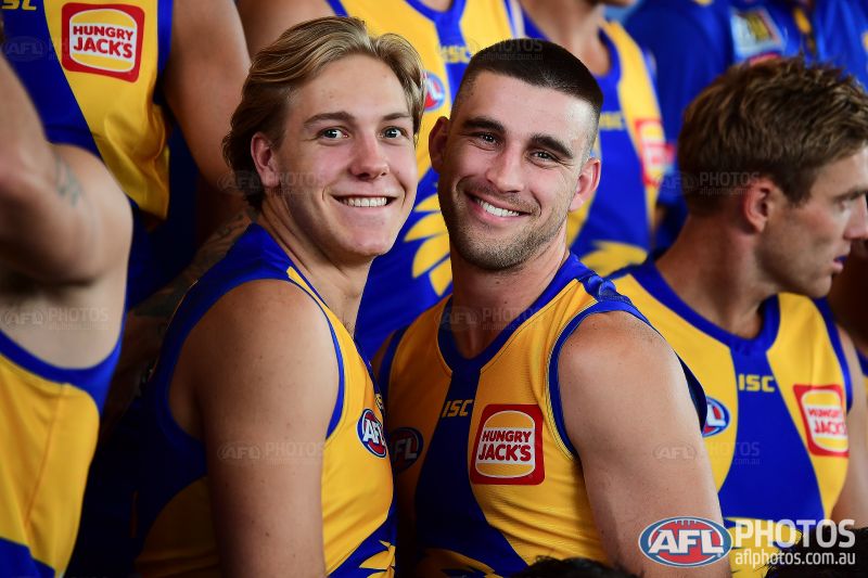
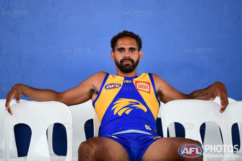
Still a shame the new Eagles logo isn't able to be inversed onto a yellow jumper. Probably the only thing holding it back.

It is able to be, they just won't do it. It would look 1,000,000,000 times better with a blue head on the clash.

The Eagles did use an inversed logo for their ribbon-cutting ceremony - so no reason not to use it on the guernsey.
 
It is able to be, they just won't do it. It would look 1,000,000,000 times better with a blue head on the clash.

The Eagles did use an inversed logo for their ribbon-cutting ceremony - so no reason not to use it on the guernsey.
I mean more like, although it is possible, it doesn't really look as striking as say the original Eagle head when inversed. Which is a shame because it probably should've been one of the main things to consider when putting it on a guernsey.
 
ISC have really buggered the Saints with the way the AFL, club and sponsor logos have been placed. The way they are just slapped on any old place is careless and ugly.
I don't blame ISC (unprofessional sure but they only do as instructed) it's the club that signed off on them that is really to blame, the club would have final say and they've obviously haven't given a s**t that everything was misaligned and signed off on what should have just been an early prototype. The person in charge of signing off on things like this needs to have an acute attention to detail and It would have to be obvious at this point that they don't.

What gets me is that they must have gone through numerous people at ISC and the club and it still made it to the final design.
 
Disagree, makes sense when a major part of the uniform is cut-sewn/applique but to stitch on a logo to a completely sublimated uniform would be super uncomfortable.

Would have to see it in the flesh but a nothanks.jpg from me
 
I don't blame ISC (unprofessional sure but they only do as instructed) it's the club that signed off on them that is really to blame, the club would have final say and they've obviously haven't given a s**t that everything was misaligned and signed off on what should have just been an early prototype. The person in charge of signing off on things like this needs to have an acute attention to detail and It would have to be obvious at this point that they don't.

What gets me is that they must have gone through numerous people at ISC and the club and it still made it to the final design.

From my knowledge and the jumpers that I have seen in the past, St Kilda has had bad sponsorship integration for a while. This one isn’t the best, but imo it isn’t a new think with their kits (maybe it relates to poor finances which allows the sponsors to ring a lot more out of the club). I do want to note that a range of clubs have/ are experiencing poor sponsorship integration.
 
Status
Not open for further replies.

Remove this Banner Ad

Back
Top