Discussion Appreciate and critique the IC 2011 team jumpers

Remove this Banner Ad

Aug 3, 2006
1,983
310
Beside your Mum
AFL Club
Fremantle
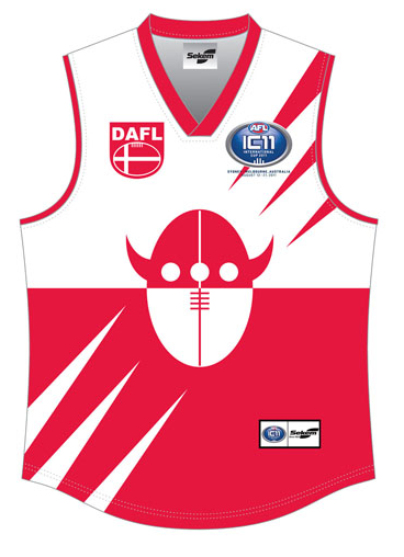
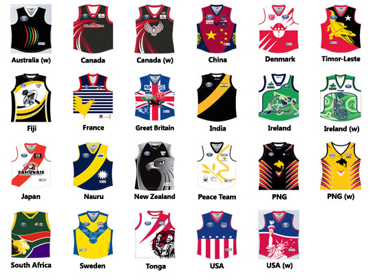
Some fantastic designs here, and maybe an ordinary one or two:

6010371932_031d14d234_z.jpg


Have a closer look here:

Favourite IC11 Guernsey Competition

China's looks good, as does Sweden's :thumbsu:
 

Log in to remove this ad.


Pretty sure that website says 'BigFooty.com', referring to Smeagle and this board. Nice little touch :thumbsu:

Personally I love the China one though:

China.jpg


Get rid of the stars and dragons and its a perfect Melbourne clash, 10x better than their current one :thumbsu:
 

(Log in to remove this ad.)

I don't mind the Denmark one, though it could do with out the spike things in each corner.

denmark.png


Maybe there's a KOTW idea in this ;)
 
Congrats Smeags, you created a better jumper than all of the 'professionals'. :thumbsu:

Not that they're all bad though, some are pretty decent. Timor Leste and and China are impressive.
 
It's a shame that India's just wearing Richmond's jumper this year. Their old jumper was pretty good.
indiaB.jpg

I guess Richmond have become their sister club since then or something.
 
It's a shame that India's just wearing Richmond's jumper this year. Their old jumper was pretty good.
indiaB.jpg

I guess Richmond have become their sister club since then or something.

You'd have to think it's a practical matter, wouldn't you? Cos that photo is exactly the sort of thing I expected to see... and what I actually see doesn't inspire me :(
 
Deesclash2.png


Here we go, a quick edit on the China guernsey to create what I think would be the perfect dees clash. Regardless of what the bloody AFL says, red would work effectively enough to reduce any clash
 
Here we go, a quick edit on the China guernsey to create what I think would be the perfect dees clash. Regardless of what the bloody AFL says, red would work effectively enough to reduce any clash

It would be better if it used a normal red because it still looks like it would clash with Brisbane. Infact the colours look like the old Fitzroy colours.
 
It would be better if it used a normal red because it still looks like it would clash with Brisbane. Infact the colours look like the old Fitzroy colours.

Yeah true, didn't think of that. Because the pic is anti-aliased I couldn't easily do this on paint. Considering this is Melbourne's current shade of red tho I couldn't see them using anything else. You or anyone else can feel free to make this change if you want :thumbsu:

Posted this on the Melbourne board as well and only recieved positive feedback. They even went as far as to tell me I should send it to the club ;)
 
I went for Nauru (simple but still very Nauruan), but East Timor's is a very close second.

China's and BG's are far too busy.

And India... you have shamed me.
 

Remove this Banner Ad

Back
Top