News Carlton Blueout Jumper

Remove this Banner Ad

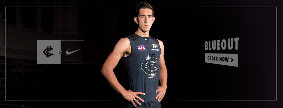
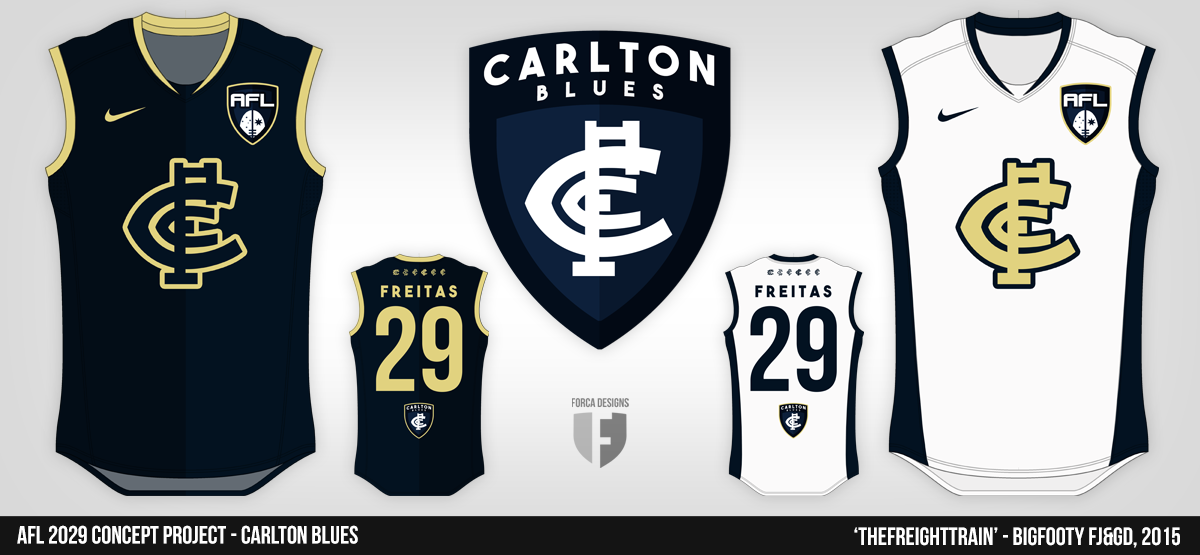
Blueout Guernsey – A tribute to a suburb

Lygon. Rathdowne. Drummond. Elgin. Faraday. Nicholson.

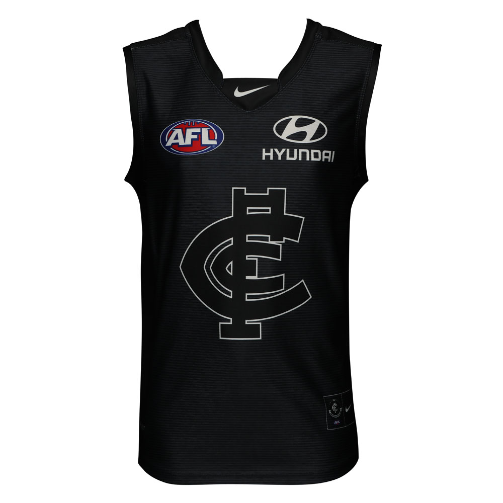
In honour of street names synonymous with the suburb that is the home of the Old Dark Navy Blues, the Carlton Football Club has proudly unveiled its limited edition 2017 ‘Blueout' guernsey.

A tribute to the suburb of Carlton, and in conjunction with long-standing apparel partner Nike, the new-look guernsey takes inspiration from the traditional bluestone appearance commonly discovered in heritage streets throughout the suburb.

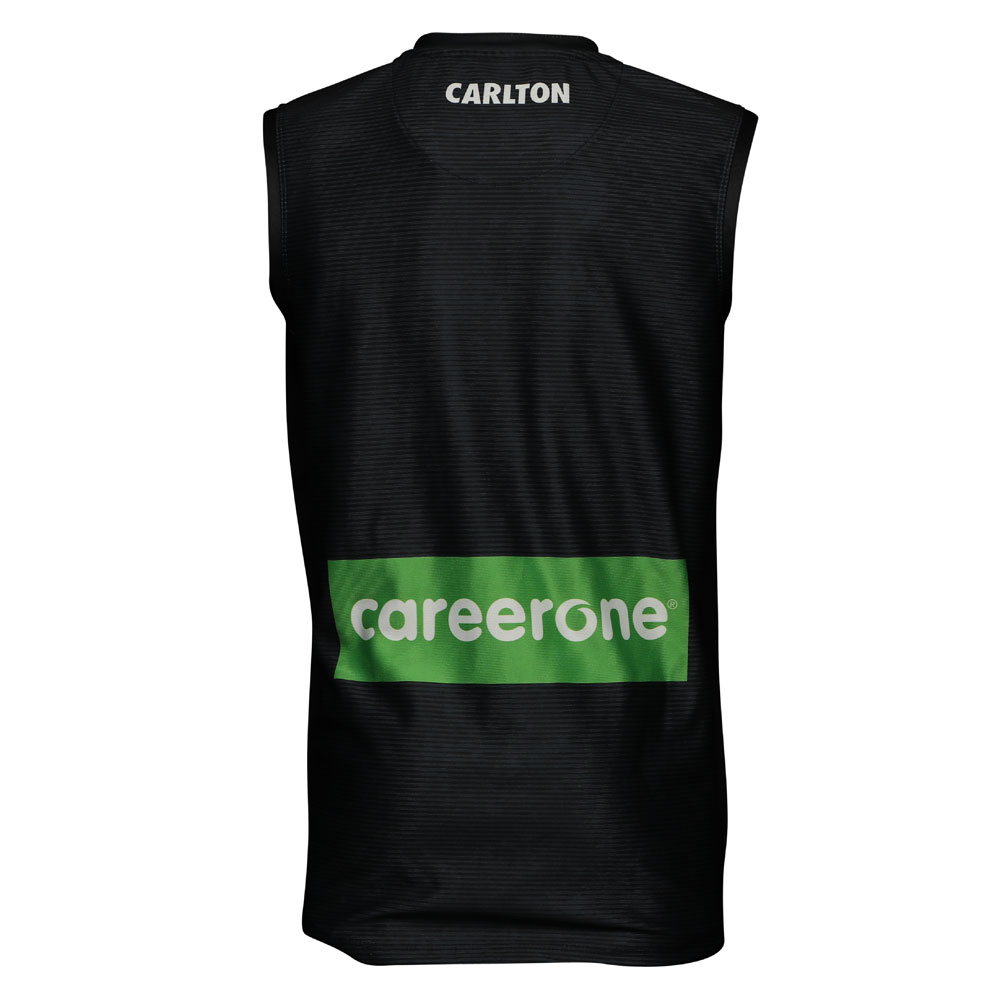
With the bluestone look sublimated in the guernsey, the Blueout will see a navy monogram on the navy guernsey for the first time in the Club’s 153-year history. In a further change, the playing numbers on the back of the guernseys are keylined and the word ‘CARLTON’ is proudly displayed on the back of the jumper, replacing the crest which used to sit above the number.

The Blues will run out in the limited edition guernsey for their Round 3 clash at the MCG against traditional rival Essendon on Sunday 9 April.

80179BC4-EC6D-234A-8E471DFE0DA8268FMerchandise-1000x1000.jpg
8018CACB-B069-E7FF-5E3EE000164F20E7Merchandise-1000x10002.jpg
 

Log in to remove this ad.

I'm over this different template bullshit. We're the only club that has a different template for our replicas which leads me not to buy any guernseys.

Design is great, I love it. Just bring back the replicas which are actually replicas of the PI guernseys.

#GoingFullGroupie
 
Pretty bloody weird to start tying in every second road in Carlton... but oh well. I always thought they could have integrated Lygon Street a lot more into their identity, and I think clubs really need to capitalise on their suburbs: not many professional teams cover a specific suburb and are named entirely after it, but this isn't the way to go about it. But I worked on Lygon Street for 18 months and have lived a walk away from the suburb for five plus years and I really don't think it's any more bluestone than any hundred-150-plus year old suburb in Australia.

I still think this idea is a decent one. Not very innovative and the lag from the US is about ten years but some clubs could look really cool, and some could use it to masquerade and dress up a clash strip (this'd be a better excuse for Essendon than their heritage tripe). I like the execution of the jumper, the tie-in is odd, but overall there are much worse jumpers and waaaay dumber ideas for them. The big let down is the sponsor and AFL logos.
 
If the numbers are keylined the AFL has gone mad. It was hard enough being a league touchie when a team had dark numbers on a black jersey, and we're moving 5x slower than you lot.
 
If the numbers are keylined the AFL has gone mad. It was hard enough being a league touchie when a team had dark numbers on a black jersey, and we're moving 5x slower than you lot.

I read it as meaning white numbers with an offset keyline around them. No way would they allow blue numbers.

And that would actually still be a pretty novel approach for AFL numbers. I can only think of Port who has ever done anything much more exotic with numbers for a while.
 

(Log in to remove this ad.)

I like the concept - and would actually get one if not for that ridiculous career one logo on the back.

If everything was in that outline style - Hyundai on the front and career one on the back, I'd have got one instantly.
 
Looks nice

1maqur.jpg


Yeah my first thought too.

Good idea, poorly executed.

Their home guernsey has that awesome embossed style monogram, why not just make that blue and avoid the stupid pattern etc? And while you're at it, have a chat with your sponsor about maybe dropping the garish green box on the back of the kit for this particular guernsey.
 
I'm over this different template bullshit. We're the only club that has a different template for our replicas which leads me not to buy any guernseys.

Design is great, I love it. Just bring back the replicas which are actually replicas of the PI guernseys.

#GoingFullGroupie
Agreed the current PI template is way better than that retail stuff.
BlueOutShopMainWeiters.jpg
 
They should paste some glow-in-the-dark materials on the outline of the guernsey logo. It'd be like "Where's the logo?" then you bring it to a dark room. "Woahhh". Or those reflector materials they have on workwear.
 

Remove this Banner Ad

Back
Top