News Freo's New Look

Remove this Banner Ad

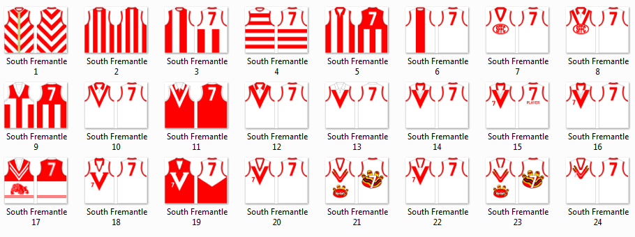
I absolutely love the new guernseys and logo.
Whilst the previous one was great, they've at least matched or outdone it in creating a new look.

Just look at them here. They look serious about being tough. They're not mucking around!

facesb.png


How about the Feng Shui of Guernseys?
The anchor weighing them down compared to the three V's of Vision, Vitality, Victory.
 

Log in to remove this ad.

It looks great. Where as Brisbane's re-design was a second rate, Americanized mess, this is a simple and timeless design, more akin to some of the Victorian clubs like Carlton.

That's a bit unfair to American design, what American sports uniform looks like Brisbane's new one?
 
See, you're an Eagles fan, and this clearly shows you scared!
Told you, they're not mucking around!
Those faces mean business.

Hmm, yes, well I should probably give up now, shouldn't I? I'm just no match for their overwhelming subliminal alliteration and Faces of Meaning Business.

(except for the bloke on the right...that's more a Face of Shouldn't Suck Lemons Before A Photo Shoot)
 
Hmm, yes, well I should probably give up now, shouldn't I? I'm just no match for their overwhelming subliminal alliteration and Faces of Meaning Business.

(except for the bloke on the right...that's more a Face of Shouldn't Suck Lemons Before A Photo Shoot)

They certainly sent a message out to the AFL - just give up now, 2011 is our flag.

The guy on the right's sucking lemons look is like a young Pacino in Scarface.

What the club should do is have all the players come to games dressed in purple pin-stripe gangsta suits with fedoras.
 
Getting of the anchor as a metaphor - and feng shui - goes both ways:

1) it was weighing us down and we're getting rid of it - positive (the most widely accepted metaphor)
2) we dropped the anchor and now are stuck indefinietely untill we bring it back up - negative (a new one i thought about - especially with a lot of the media stating 'freo to drop anchor for 2011')

I'd lean toward the first one (obviously) but technically we didn't get rid of the anchor as it's on the back of the jumper now and is a lot smaller so less chance of weighing us down (if at all) but it's now no longer on the front of our jumper (i.e. where the anchor would usually be on a ship - mariners help me out here i'm just guessing)

The anchor traditionally had us "moored" at port, now we've cut it away, got a smaller one and are free to do as we please

Wow I like the enthusiasm but you're looking way too far into things :p
Freo are a young team on the up and it wouldn't matter if they played in pink and purple stripes they'd still be improving.
 
The anchor traditionally had us "moored" at port, now we've cut it away, got a smaller one and are free to do as we please

Unless things go backwards for the club's fortunes next season... in which case the paradox of all these mystical forces fighting each other will cause a black hole to form! It'll probably consume the Team Store before anything else.
 
It's all BS and superstition anyway. Levi's Dockers with their anchor logo is immensely successful.

However, one thing ive noticed is very true....when teams change their whole look, colors, uniforms, logos, after years of sustained failure, it has a pretty high success rate of turning fortunes around, a championship won soon if not immediately after.
 

(Log in to remove this ad.)

I really like that new Logo...looks more old and traditional...not stupid and modern like the GC one...BAH!!!

Im sort of not decided on the jumper...i have always liked the Purple Haze jumper more than the original one..but once I found out WHY the original jumper was the way it was...it made sense...but I still liked the purple haze one better.

I think they should ahve dropped the Red & Green and just adopted the Purple and Anchor....having said that though..there is nothing wrong with the new jumper, plain old school simplicity.

I think GC should get rid of the Yellow....OR have the exact same jumper as Carlton..wiht a Yellow GCFC on the front..and be called the REDS.

Port Adelaide...need to drop the crap jumpers...go wiht the Basic...Teal and Black with a single White Stripe slightly offset in the middle for alightning strike.

Port-Home-1997.gif

WRONG
user1839_1161653506.jpg

WRONG
Port-5a.gif

WRONG

188870-power-guernsey.jpg

VERY RIGHT!!!!!!!
PortAdelaide0.png

VERY RIGHT!!!!!!!

Ports Jumper should be same as St.Kildas...but with the Lightning Strike SQUARE..not fancy...as the white bit.

Good job Freo though on your new jumper....prob a tad too clsoe to Carlton & Ports New One...but still very good...love the deep Purple....

Looking forward to hearnign a new song too....Maybe "DEEP PURPLES" SMOKE ON THE WATER...OR BLACK NIGHT....is the way to go wiht song...would tie in great wiht the purple thingie.
 
Maybe its just me...but I am really loving the change back to Real Old Looking club logos...this new freo one looks great...I absolutely love the Cats one...looks like its form the 30's or something.

Good job Freo
 
But it also works because you know that there has been tradition tied with it, in terms of East Fremantle and the like.
[/IMG]

Sorry to be picky - but as a South Freo supporter the V is a Souths thing, not an East Freo thing. But the three Vs is supposed to be representative of the original Fremantle Football Club from the end of the 19th century. Those jumpers were white with red Vs all the way down and were adopted by the SFFC when the original FFC (which was renamed the Unions FC) was disbanded. See jumper #1 below:

mhr9l3.png


Definitely wish they'd kept the old anchor. It just looks less like a bent paperclip and more like...well, an anchor!

freooldanchor1.gif
/IMG]

Agree wholeheartedly. This, Mr Eagle, is a WINNER. I would be very very happy of this was the new logo. I don't like the shape of the anchor and I hate the stupid "D". Looks like a piece of gangsta bling. :mad:
 
I'm not a real big fan of the new jumper, especially the logo. I would have rather seen this instead.

fremantlehomev2.png


fremantleclash.png
 

Remove this Banner Ad

Back
Top