Only problem with a Chinese sponsor is once you have one you feel like another 30 mins laterThe Coch chasing the Chinese sponsors.
http://www.goldcoastbulletin.com.au...t/news-story/0889537187b8c77608a035bc206b4256
")
Follow along with the video below to see how to install our site as a web app on your home screen.
Note: This feature may not be available in some browsers.
Only problem with a Chinese sponsor is once you have one you feel like another 30 mins laterThe Coch chasing the Chinese sponsors.
http://www.goldcoastbulletin.com.au...t/news-story/0889537187b8c77608a035bc206b4256
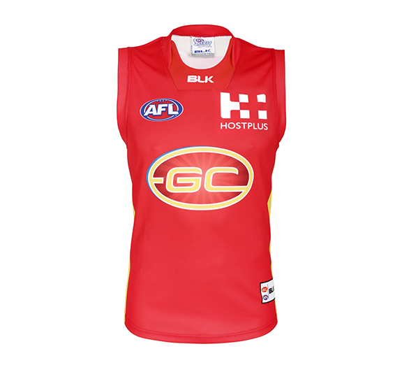
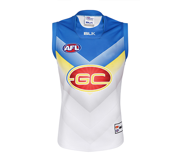
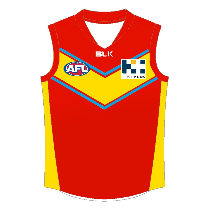
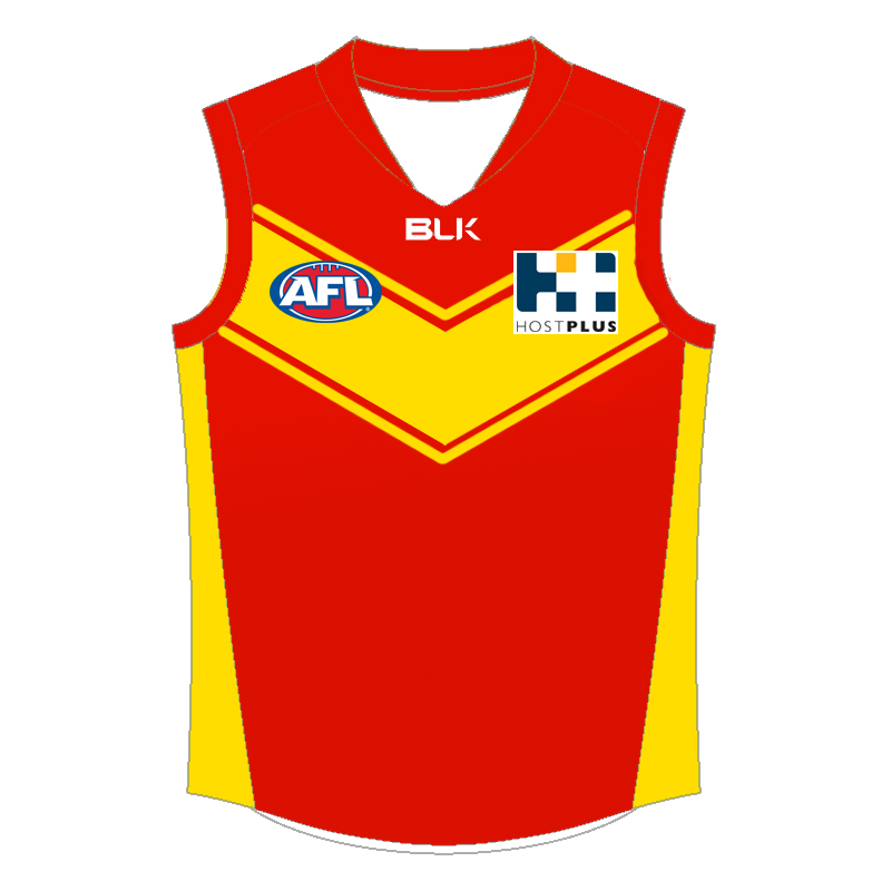
We won't be with blk in 2017these are supposedly the 2017 blk guernseys. still no second major sponsor, as seen on the clash guernsey. that collar is really ugly. no real major design change, probably partly due to the fact blk is going bust and couldn't be bothered since it's likely their last year.
I hope not. It's important to be with a globally recognised brand, particularly going to China in 2017 and merch sales in what could be our best on field season to come.We won't be with blk in 2017
I was wondering what GC fans on this board thought of about the idea of changing the club's logo and guernsey.
The Suns branding has never been popular on the graphic design board but I'm interested to hear the opinions of people who actually support the team.
Ideas have been thrown around this thread lately which lead me to work on this new logo concept.
View attachment 266323
With this logo I'm trying to create a strong, memorable symbol that could be synonymous with the club's image. Similar to what Carlton have with their monogram.
The logo is in the shape of a sun that combines to create a G on the outside, while the C sits inside the centre. The left version features waves of red and yellow in the style of a life guard flag to represent the club's seaside identity. The right version is simplified to match the colour scheme of the home guernsey.
Along with this concept I've created a few redesigns for the club guernseys.
View attachment 266322
The top left and right designs are the same as the old jumpers, just with the new logo.
The top centre design is my own design which is a modern take on the yoke/sash, with sun rays shining from the club logo on the chest.
The bottom 2 show how the blue version of the logo could be adapted as a guernsey design. These might be better suited as clash/alternative guernseys.
Let me know what you think.
okThe jumper reminds me of mcdonalds
Yours reminds me of Port AdelaideThe jumper reminds me of mcdonalds
Hey guys, I was mucking around with the whole Suns rebrand idea and came up with this. My main area of discontent is that it does not really scream 'AFL', but on reflection not that many logos actually do.
View attachment 315653
I was just saying the colours are pretty mcdonalds like thats allYours reminds me of Port Adelaide
And I was just replying that yours is a rip off of the PA Magpies. It's an observation just like yours isI was just saying the colours are pretty mcdonalds like thats all
Perfect opportunity to change our club song as well. Bring in a whole new theme.
really? i had a look and can't see us in their recent follows. might have unfollowed possibly? edit: just saw the post on the fj&gd forum. interesting.Interesting that ISC has started to follow us on Twitter.
I was just saying it reminds me of mcdonaldsAnd I was just replying that yours is a rip off of the PA Magpies. It's an observation just like yours is
have you heard something that it'll be announced this week or just a prediction?Should be this week Announcement on New Apparel Sponsor...got a feeling it's ASICS
Was told it should be this week by someone at the club.have you heard something that it'll be announced this week or just a prediction?
I thought this one looked pretty good.
i think the blue is cuts the yellow and the red too much..
like this
I thought this one looked pretty good.