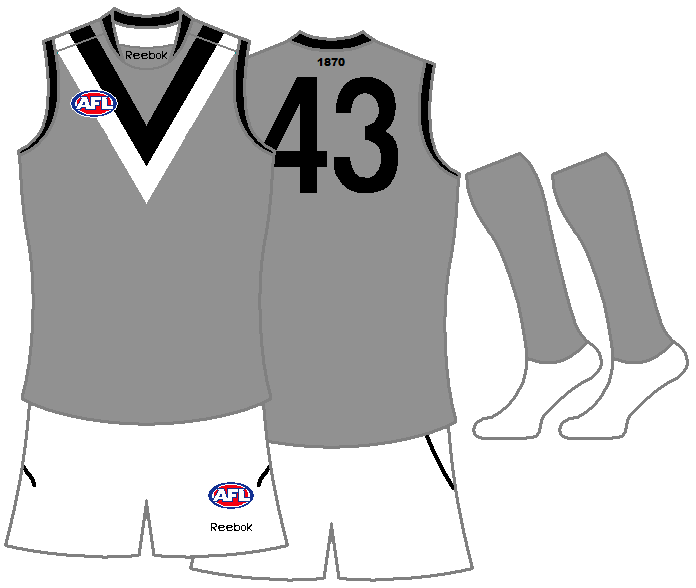
Workshop Improve a Current Guernsey

Remove this Banner Ad

Damo Crows Fan

Club Legend
Oct 28, 2009
1,845
1,211
Radelaide
AFL Club
Adelaide
Ever looked at a playing jumper in use now and thought, "man, if they did X with it, it'd look amazing!" ? Then put your money where your mouth is.

Example, Richmonds NAB cup jumper, i think, would make an awesome Indigenous All Stars Strip, which i'll be using in my own fantasy league thread soon;

indigallstars.jpg
 
Re: Improve a current Guernsey.

Apart from making sponsors' logos less sore-thumb (though those paying for them would say that's the point :rolleyes:)

Adelaide home: Fill in the sides! I thought the guernsey had HOOPS!
Adelaide clash: The current one is a blight on the world. Make the main part yellow, keep the gap in the sides for extra yellow and then make the Blue Red Yellow pattern start at the top stripe. Weart with white shorts and mainly navy socks.
Brisbane: I'm not going to enter into any arguements about the new lion but the overall concept of Brisbane's jumper is good. Maybe placate the Fitzroy fans around the place and return the old Lion to the Fitzroy-coloured guernseys.
Carlton: Not sure if I like the light blue clash top coming out. Though being a Sturt fan in the SANFL I won't be complaining too loudly.
Collingwood: The stripes have been lamented. The clash top works except against North and they've got one for that this year. I'd change the "Clash v North" top to two 'normal' width stripes (eg just remove the middle one) and put the Maggies logo in between them on the front.
Essendon: Nothing wrong with the home, won't debate the curvature of the sash as it's a fairly small point to me. And will reserve judgement on any clash till it comes out, but the old one was terrible. I do like the red shorts though :)
Fremantle: They've brought in two fantastic, simple, strong guernseys this year, the main one especially. Not that I hated the old ones btw, and I really liked their Purple Haze one.
Geelong: I'd like to see an "away" top similar to last year's Ford promo one with the cat's face from the clash, just move it up a row. Might work on that concept and post.
Gold Coast: Odds-on the away top will be their main top before the decade's out. I like the away and the clash. Home is ok.
Hawthorn: I'd like to see a mainly white back on the away top as this would make it a more effective guernsey against other dark-topped teams.
Melbourne: Don't mind the collar actually. Not a huge fan of the stars on the back above the numbers but hey, they're pretty little. With their away top, I did notice sitting at AAMI on Friday night that the navy vee disappears because it's so thin and the shape goes because of the sponsor logo on the left breast. Small point; it works as a clash top coz you can tell the difference between them and the opposition.
North: Never liked the black numbers...though not sure how well royal blue would be seen. GET RID OF THE ARGENTINA STRIPES and return to the all blue with white vee guernsey (with or without logo, I'm not fussed).
Port: Good strong guernsey for a club with a good strong history (like them or not...can you tell I'm a Crows fan?? Lol.) Mayyyybe on the clash go for teal with white side panels. It would mean the vees on the front would be black and white. Some have suggested a white number section on the home to mix in with the SANFL team and I don't mind the idea of that, especially as they're doing the whole One Club thing.
Richmond: Bring back the yellow shorts! Hee hee. And that yellow training guernsey is a must as a clash top, unless they want to go boring and do an inverse with black side panels and black numbers in a yellow box defacing the back sash (I've posted that one somewhere else here but may do so again).
St Kilda: Like their home, like their new clash, liked their old clash too. But don't like the new black collar and cuffs, it's just not St Kilda to me.
Sydney: Always thought they should inverse the front: White yoke with red to go with the red back. Now that red's a dark colour they'll (presumably) need a white away top or something. If they've inversed the front for the home, go with the old front and an all white back for away.
West Coast: I'd like to see the royal blue wings guernsey worn home & away and then the old gold wings guernsey worn as clash (with new eagle head I guess)
Bulldogs: Don't do anything, love it!
 

Log in to remove this ad.

Re: Improve a current Guernsey.


Changed to a Gold back with brown numbers, added HFC to back of jumper, hawks logo returned to the front of jumper, HAWTHORN added on top of the hawks logo
 
Re: Improve a current Guernsey.

This should be collingwoods home for 2012...:Dit goes back to there heritage of white with black stripes but also has some modern stuff:cool:
hfgd.jpg
 
Re: Improve a current Guernsey.

Here's a few of the improvements mentioned in my essay (sorry!) above:
crowsyellow.png

Crows clash

kangaroosclash.png

Kangas clash (added stripes)

portteal.png

Port Clash

richmondclash.png

Tigers clash (kiss principle)

sydneyred.png

Swans home
sydneywhite.png

& away
 
Re: Improve a current Guernsey.


Changed to a Gold back with brown numbers, added HFC to back of jumper, hawks logo returned to the front of jumper, HAWTHORN added on top of the hawks logo

I like the gold back with the stripes, it gets rid of the number box which is good. Not a fan of the HFC and the logo on the front, they're unnecessary to me for teams like Hawthorn who haven't merged or been renamed.

This should be collingwoods home for 2012...:Dit goes back to there heritage of white with black stripes but also has some modern stuff:cool:
hfgd.jpg

I don't think I need to elaborate any further than: for the love of Jeebus, NO!

crowsyellow.png

Crows clash

Not bad, better to incorporate yellow as the main colour than white. But as it is, they're rectangles, not hoops - hoops go all the way around. But that's not your fault, that's Reebok's and Adelaide's!

kangaroosclash.png

Kangas clash (added stripes)
Hmm, not big on the pinstripes. But the vee, absolutely.

portteal.png

Port Clash
Not needed IMO - they've got the black and the white kits, both look great and do the job. I'm not sure why they need teal as a third option or as a replacement to the white.

richmondclash.png

Tigers clash (kiss principle)
Lose the black side panels and I'll be interested! ;)

sydneyred.png

Swans home
sydneywhite.png

& away

Best of the lot, LOVE IT. Simple but makes a whole lot of sense.
 
Re: Improve a current Guernsey.

Not bad, better to incorporate yellow as the main colour than white. But as it is, they're rectangles, not hoops - hoops go all the way around. But that's not your fault, that's Reebok's and Adelaide's!

I wouldn't keep the silly sides on the home top but I think for a clash top it helps to make it more a light colour. Would probably work either way though.

Lose the black side panels and I'll be interested! ;)
I added them because I think (a) Richmond wouldn't want to have so little black and (b) It seemed a bit toooo light/bright with just yellow. With or without is a massive improvement over the current monstrosity still :)
 
Re: Improve a current Guernsey.

I like the gold back with the stripes, it gets rid of the number box which is good. Not a fan of the HFC and the logo on the front, they're unnecessary to me for teams like Hawthorn who haven't merged or been renamed.
I'm not sure about the change on the back tbh. I think you've already got Collingwood and North with the same design on the back, and the number box gives it something individual. I'm in favour of keeping it actually.
PS sorry about two posts in a row, I forgot to say this on the first one :)
 
Re: Improve a current Guernsey.

arsenal-barcelona-16211.jpg


can a teal jumper work for Port like it does for Barca? it also worked for us against Melbourne this time -

shaunk.jpg


all teal (black panels) with black shorts and black socks with teal and white trim. that is however probably an idea for the start of 2013 like Carlton mixing it up with an alternative colored strip. I am otherwise happy with our jumper not including the manufacturer, Reebok is fine but the design will suit another brand better.
 
Re: Improve a current Guernsey.


Changed to a Gold back with brown numbers, added HFC to back of jumper, hawks logo returned to the front of jumper, HAWTHORN added on top of the hawks logo

This. My god why do they have that white number box, it might help with visibility but this way looks much better.
 
Re: Improve a current Guernsey.

20kceqf.jpg


I reckon a silver clash would look great for Port. It is one of our colours (even though it only gets used sparingly) and I think it emphasizes the black and white V's in the jumper.

Juventus use a similar design as a clash strip (below) but with a double sash instead of a double V and I think it works really well.

giovinco+away+juve.jpg
 

(Log in to remove this ad.)

Re: Improve a current Guernsey.

Great minds ;)
(posted over a year ago)

From reading this thread, it seems the current home jumper has fallen out of favour by general consensus to the V-shaped "Back in Black". However, there is also the matter of a clash jumper that needs to be addressed (ie get rid of that HORRID white/teal strip) - regardless of the home jumper, there will always be a need for a second strip due to clash. Why not kill two birds with one stone next year? Since white and teal have been tried and tested (with overwhelming negative feedback), and the Power fans' cry for a more powerful and badass appearance, I thought using your unheralded fourth colour with the same V design might be worth a try.

Would something like this be in order, Port fans?


Note that the changes I have made to the home strip include removing the logo, and also incorporating the traditional and uniquely Port Adelaide white number panel.

I also experimented with a new "V" logo, as it seems the need for the lightning-bolt motif has expired among Port fans.
 
Re: Improve a current Guernsey.

Great minds ;)
(posted over a year ago)

Indeed! :thumbsu:

I don't mind the white number panels either, minus the teal outline. If they ever went with the white number panel it would have to look identical to the port magpies strip from behind (in my view of course!).
 
Re: Improve a current Guernsey.

I still think the silver/black/white Port jumper idea is the best out of all of them.
 
Re: Improve a current Guernsey.

I'm not sure you want to completely alienate non-PAMFC SANFL supporters that go for Power (not really sure how that workd over there anyway, pretty simpl-ish divide here), so went for a nod to the history, like the original jumpers, rather than a full-on replication. But you fellas would know better than I.
 
Re: Improve a current Guernsey.

arsenal-barcelona-16211.jpg

can a teal jumper work for Port like it does for Barca? it also worked for us against Melbourne this time -

It doesn't work for Barca, that looks bloody horrible.

Loving the Port Adelaide triple Smeagle. Number panel on the back is needed for sure.
 
Re: Improve a current Guernsey.

5-colours = donotwant.jpg

Back on topic, the top things on my wishlist for alterations (not makeovers) to current kits are:
- Hawthorn and North adding brown/blue side panels to their jumpers to make them dark. (change the white number panel to brown with white numbers while we're at it)
- Not going to delve into Colingwood's (white) clash for the 12635th time
- White number panel for Port
- So, the Fitzroy lion is a lot cause - can we return the yoke/paddlepop lion size to normal now Brisbane?
- White collars/cuffs for Fremantle home - something to look different from Port, Carlton, Saints...
- Stripes on the Sydney home
- Continue the uppermost white line on the Doggies home around to the back. Outline the numbers in blue or something!
- Back to 2010 versions for St Kilda and Essendon :(

On a similar note, Port and Adelaide's clash kits would look a whole lot better if the socks matched the jumpers.
 
Re: Improve a current Guernsey.

Back on topic, the top things on my wishlist for alterations (not makeovers) to current kits are:
- Hawthorn and North adding brown/blue side panels to their jumpers to make them dark. (change the white number panel to brown with white numbers while we're at it)
Dunno why they need to make their kits dark. Just make the away team wear dark instead and they can deal with not wearing dark shorts at home in these situations.
So if North is hosting the Bulldogs, it would be logical to minimise royal blue on North's uniform and minimise white on the Bulldogs', even though that means that North wears white shorts and the Dogs wear royal blue.
If teams wore shorts in colours other than their main colour we could reduce the number of times they need to wear white shorts...eg let North wear royal blue when hosting the Crows who could wear gold or red shorts on the bottom of their dark home uniform, coz white shorts on the opposition of a team wearing a predominately white guernsey seems counter-intuitive to me.

IMHO :)
 
Re: Improve a current Guernsey.

My two bob - for home jumpers only at this stage

Adelaide - hoops should go all the way round, get rid of side panels
Brisbane - go back to first Brisbane Lions design, or add blue to the Bears chevron design
Carlton - looks fine
Collingwood - white with black stripes.
Essendon - never changed really
Footscray - lose the dog head, go back to the Footscray name
Fremantle - no judgment, they haven't played a season in the new strip yet
Geelong - nothing really, except try to make it look less "fat"
Gold Coast - base it on the concept jumper which was gold on top, red on bottom; or, base on Bears chevron (as a nod to Southport)
Hawthorn - lose white box, add stripes to lower back
Melbourne - nah it's cool
North Melbourne - go to royal blue + white vee as HOME
Port Adelaide - prison bars with teal in the design, but the double V is building its own "legend"
Richmond - doesn't need improving
St Kilda - bring back the funky numbers from the late 70s/early 80s
Sydney - needs a red back.
West Coast - royal blue with gold wings (cos navy blue belongs to too many clubs)

I don't believe in away jumpers - I do however believe in clash jumpers. Clash jumpers should be worn if you are the away team, but only if there is a clash - if Richmond and Sydney play, Sydney's red does not clash with Richmond, despite what the AFL says. Home teams should be the best part of a team's brand and thus exposed as often as possible.

These teams have passable clash jumpers:
Footscray
Fremantle
Melbourne
Port Adelaide

It's possible teams could use a heritage strip as a one or two off clash.
 

Remove this Banner Ad

Back
Top