Workshop Improve a Current Guernsey

Remove this Banner Ad

Thanks Omegaville.........Not sure what jarring means though LMAO!!! If the lion was a bear it would look great on the front is what I meant.....Like this other one I made last night to. Please ignore the Comic Sans font if you don`t like it.....I`ll use a normal font next time.

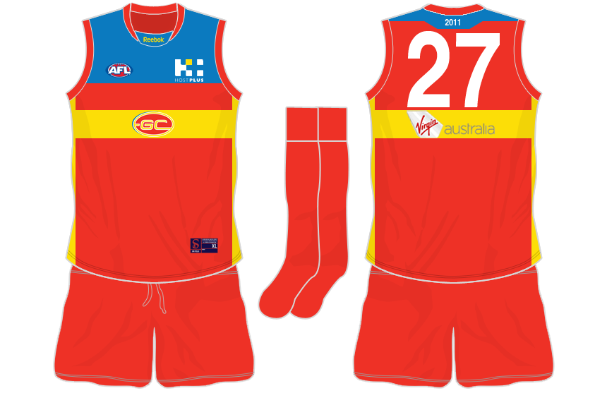
BRISBANE BEARS Proposed CLASH jernsey!!!
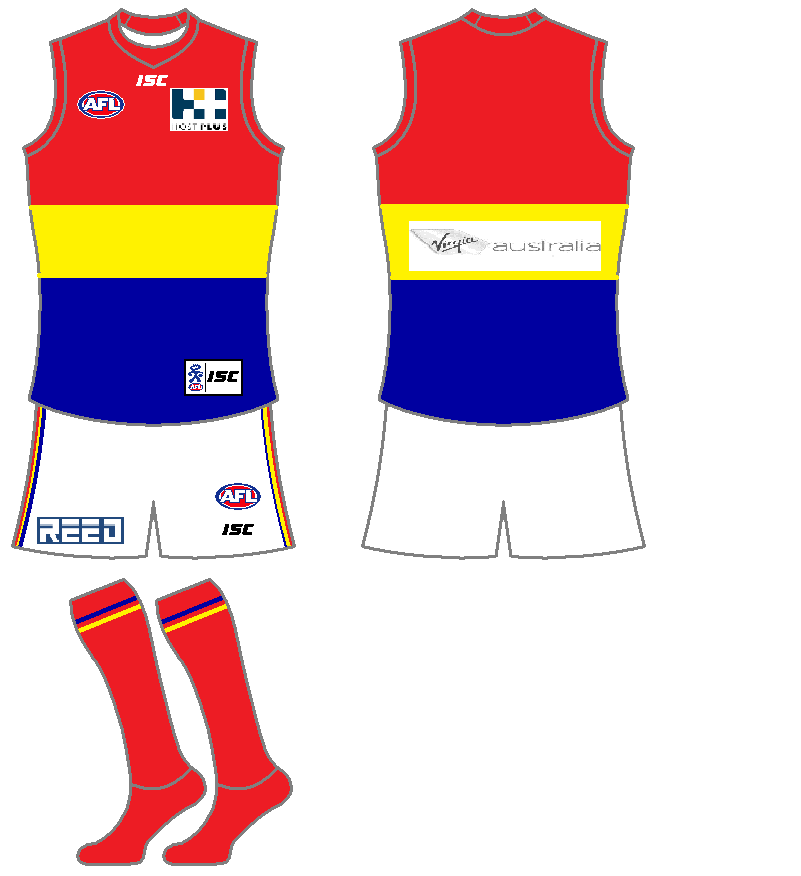
This is a yellow clash gernsey for Brisbane......... pre haps for a heritage game??
bears.jpg

What do you all think?? Any requests????

Thanks I Will try to find that tutorial......Mite even help my designs to be better.

I made 2 others ,so I might upload them later too :cool:

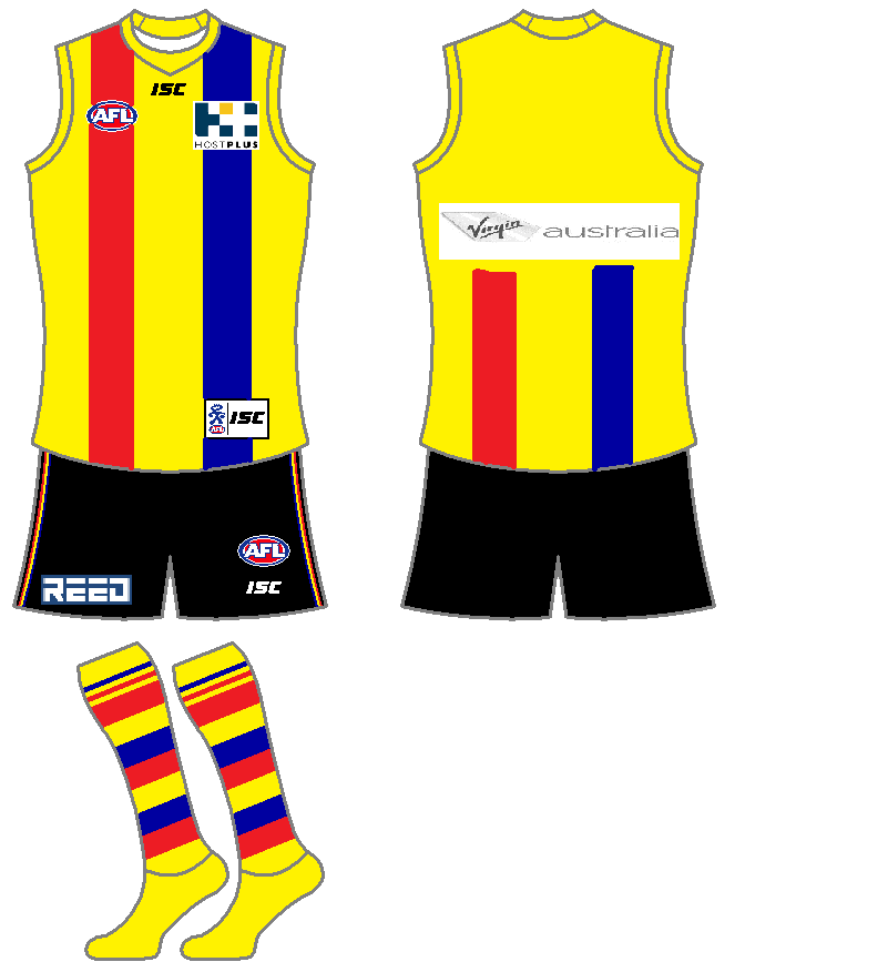
Jimmy Maddon - Yours is brillant!!! Almost looks like a Brissy or Adelaide jumper..... Perhaps a lighter Blue?????

17design - I Like the colors used on yours and the thin black lines
 
Sitting here in the dark, in bed, with my macbook on full brightness... ooph.. Gold Coast colours hurt my eyes...

Ahahaha, sorry mate. What do you think though? I have GWS one o the computer, I just don't wanna fill this thread entirly of me. As an excuse, the insomnia gives me time to make all these :p
 
Just my opinion of some of the guernseys:

Adelaide Crows
Home: Get rid of the side bars.
Clash: Current logo is hideous, bring back the old one, and apply the KISS principle. Something like this:
OldLogosecondfinished.png
 

Log in to remove this ad.

Here are 2 of my other designs.......Would love for a team to pick one of them!!!!!

BLUES AWAY(Preposed)
bluesaway.jpg


"GEELONG CATS" Preposed
And here is my Cats alternotive.........I Like the idea of the cartoon cat,think this could really work. What do you guys think?????????/

cats.jpg
 
Here's a quick idea that popped into my mind for Adelaide. Doesn't deviate from the club colours and has no cartoony logos across the front yet is still light enough to distinguish from opposing guernseys.

2ykgneb.png
 
Hey guys,

My last Gold Coast jumper got a good reveiw, so I've decided to make up a fulll kit. Personally, how they swap the sponsors over for different jumpers is silly in my mind. I don't get why teams bother. So, in these I havn't swapped it over. And I have made a darker blue on the kits.
Just on a side note, I also really like there logo as it is, just the jumpers are not quite so good.
As I read on here, that Reebok are pulling out of jumper manafacturing I have done it on ISC, as they seem to be the next big jumper people.

HOME:
rlyvs4.png

For the numbers, I'd do a white number. I would have done it, but it wouldn't have looked so good.

AWAY:
2a970vc.png

Only change is the white shorts. Again, white numbers.

CLASH:
2lt3w5s.png

Ok, well, I think all clash jumpers are a joke, and not really needed. And I don't think this design clashes, but, for the sake of it, I did one. I think this is different enough, yet keeps the jumper feel. Black shorts just to make it stand out, and black numbers. I don't see the point ina white clash, when, there is no white in the jumper.

Your thoughts guys?
 

(Log in to remove this ad.)

Very similar to one I designed for a fictional team a few months ago - therefore I like it! :D

And on the subject of the Washington Wizards... why have they decided that there needs to be ANOTHER red, white and blue team?
 
And on the subject of the Washington Wizards... why have they decided that there needs to be ANOTHER red, white and blue team?

It is actually a throwback to their original colour scheme, while they were the Washington Bullets (also hinted to in one of their new logos which features a hand reaching up to a ball), so they were one of the original red, white and blue teams.
 
My thoughts:

Adelaide:
  • Home - fine
  • Clash - white is not necessary. They should use one of their other colours:
AdelaideClashYellow.jpg


Brisbane:

  • Their 1997-2009 design was fine. Simply return to this with either the new logo (but smaller) or the old logo
Carlton:

  • Home: fine
  • Clash: 2010 white version was fine
Collingwood:

  • All fine.
Essendon:

  • Home: straight sash needs to finish at the bottom of the jumper, not with some at the side (looks messy)
  • Clash: (based on 2010 template)
essclas.png


Fremantle:

  • All fine
Geelong:

  • Home: fine
  • Clash: something a bit simpler:
GeelongClashDark.jpg

Gold Coast:

  • Remove either home or away jumper. Keep clash jumper for clashes (one of the red jumpers is redundant)
Hawthorn:

  • Home: fine
  • Clash: replace with the heratige "v" jumper (brown with gold v) for a "dark" jumper
Melbourne:

  • Fine
North Melbourne:

  • Home: fine
  • Clash: Replace with heratige "v" jumper (blue with white v) for a "dark" jumper
Port Adelaide:

  • Fine
 
Very similar to one I designed for a fictional team a few months ago - therefore I like it! :D

And on the subject of the Washington Wizards... why have they decided that there needs to be ANOTHER red, white and blue team?

The whole design has history. Would have liked to have seen a return to the Bullets name but with all the American political correctness it never would have happened. I like this, it's sort of a compromise. The old jerseys were getting dated.

For those who haven't seen it:

unveiling_051010_32.jpg
 
That's a very cool looking design. I'm not big on the NBA, but most strips utilise a basic design, right? There isn't much detailing aside from collar/side piping?
 
Here's a quick idea that popped into my mind for Adelaide. Doesn't deviate from the club colours and has no cartoony logos across the front yet is still light enough to distinguish from opposing guernseys.

2ykgneb.png

This looks great, I've always thought Adelaide should use gold for their clash jumpers rather than red or white.
 
That's a very cool looking design. I'm not big on the NBA, but most strips utilise a basic design, right? There isn't much detailing aside from collar/side piping?

Spot on. Lakers the only team not to wear white at home (yellow obviously).

The only real deviation you'd ever see is on alternate strips. The designs are surprisingly a bit more subdued compared to previous years.
 
A combination of Jimmy's idea above and todays announcement of the new Washington Wizards jerseys, I have come up with these designs for the Gold Coast

GoldCoastHome.png

We have a winner. This should be their guernsey

Cut the white clash though, that's too bulldogs. You need to modify that one somehow
 
Here's a quick idea that popped into my mind for Adelaide. Doesn't deviate from the club colours and has no cartoony logos across the front yet is still light enough to distinguish from opposing guernseys.
2ykgneb.png

I had a similar idea, did this a while ago. With mine I kept the order of the "stripes" the same...yellow as the main meant the next colour is blue, then red.
Also a little more navy on the back, and the shorts.
I kept the side panels as it makes it more of a yellow guernsey. On the main guernsey I wouldn't have navy ones; I'd have the hoops go all the way around.
crowsyellow.png
 
Sorry, back on the NBA... I get the history of the references to the old Bullets (as Washington were known when I was into b'ball back in the day), and on the logo and that, it's good. But that colour scheme has been done to death, there's about 8 teams with that combo.
 

Remove this Banner Ad

Back
Top