Michael Scarn
Club Legend
They both look excellent Gava
Follow along with the video below to see how to install our site as a web app on your home screen.
Note: This feature may not be available in some browsers.
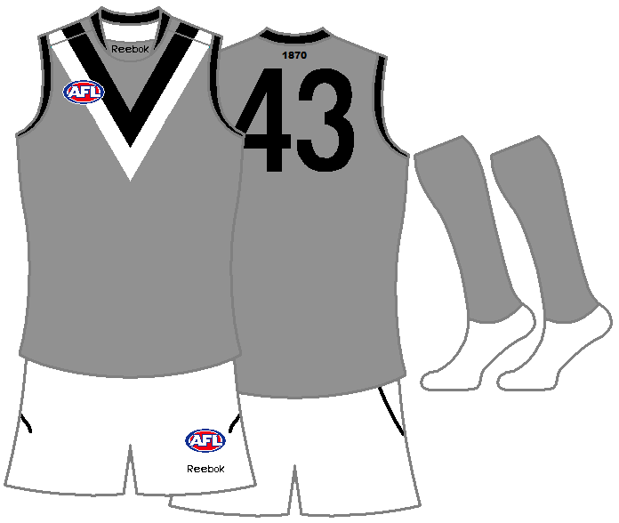
After seeing North Melbourne's blue jumper, thought I'd see how this looks. I like it, looks more intimidating...

LOVE IT! also liked the Kangaroos jumper on the weekend!Would be the perfect clash jumper in my mind. Would not want us to do a Collingwood and adopt it full time, though.After seeing North Melbourne's blue jumper, thought I'd see how this looks. I like it, looks more intimidating...

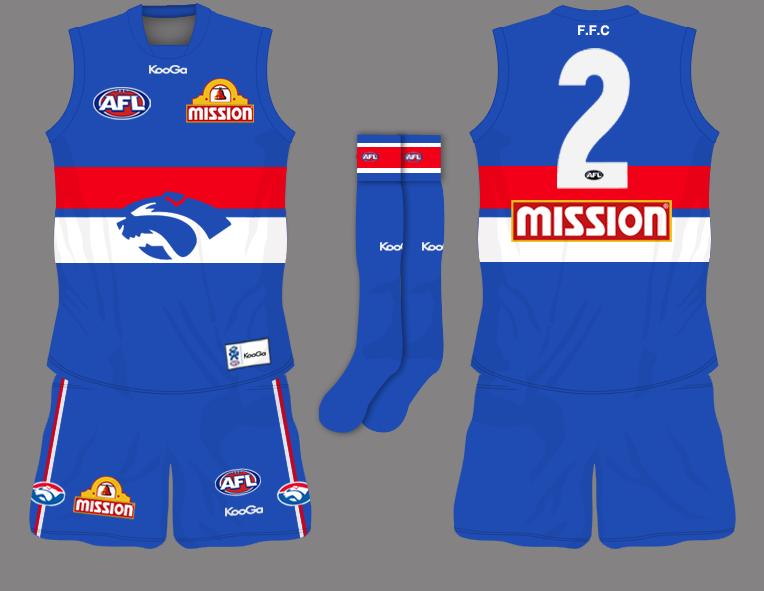
This looked better in my head, but thought I may aswell post it. For the traditional Footscray supporters.
I think it would look better if you lost a couple of logos - the bulldogs on the shorts and the one in the number would clean it up a bit..
This looked better in my head, but thought I may aswell post it. For the traditional Footscray supporters.
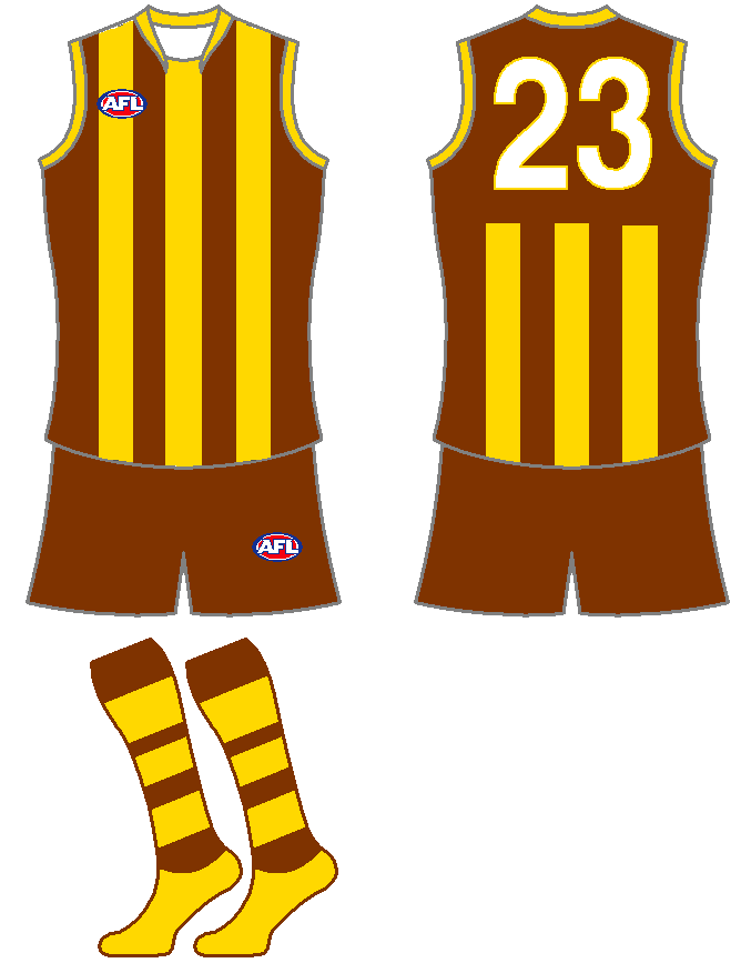


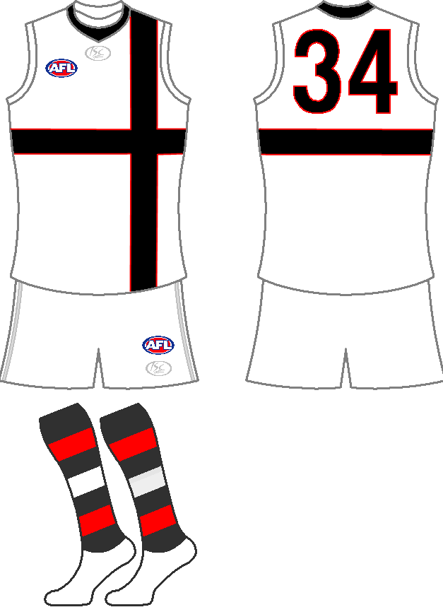
Alternatively - this should be the definitive St. Kilda clash:
Port, Carlton, Richmond, Essendon and (some say) Collingwood are the clubs that clash with St. Kilda. Using the candy-stripe, with white shorts and candy-socks, would be adequate.

how come north dont use this as a clash?
This is my idea for the Port Adelaide Clash, it keeps a little of the originality of the Power (their first jumper).

I reckon a silver clash would look great for Port. It is one of our colours (even though it only gets used sparingly) and I think it emphasizes the black and white V's in the jumper.
Juventus use a similar design as a clash strip (below) but with a double sash instead of a double V and I think it works really well.
how come north dont use this as a clash?
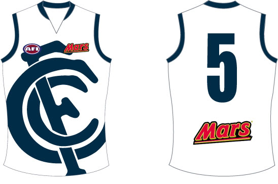
I love that jumper but not for modern times. Does anyone know where I could buy one?