Workshop Improve a Current Guernsey

Remove this Banner Ad

Detroit, New Jersey, Philadelphia, Atlanta, L.A Clippers, and now Washington. 6 teams with red, white and blue, plus the league logo.
 

Log in to remove this ad.

What bugs me more about the American pro sports is how teams up-and-go constantly. Why does a team leave its established home base - in some cases after a very short period of time? Do people over there just have a really short attention span?
 
It's because a lot (or all?) of the teams are privately-owned, so a lot of the moves are purely for financial reasons (or for reasons like disagreements with local cities about venues, stuff like that). The views of the fans pretty much mean squat.
 
A combination of Jimmy's idea above and todays announcement of the new Washington Wizards jerseys, I have come up with these designs for the Gold Coast

GoldCoastHome.png


GoldCoastClash.png

They are top notch Craegus :thumbsu:
 
Been trawling these forums for a couple of years, better late than never to make my first post I guess...

On the whole I prefer simple, traditional style designs (eg. Melbourne, St Kilda home jerseys etc) over "more different" styles (eg. Hawthorn clash jersey).

I put most of these together several months ago when I was on leave and had some time to kill, there are around 70 or so designs - some are only very minor tweaks to current designs, others are influenced by past design and other are just things that looked "interesting" as I was playing around.

Below is a handful of some I liked more than others, the whole bunch can be found here.

Adelaide Crows - Clash
Something a little different, but keeping their crow's head (which I still think looks really unbalanced when place on a jersey

adelaide-3-400x380.png


Fremantle Dockers - "Heritage" Clash
It is only really "heritage" in the sense that it reintroduces red and green.

fremantle-3-400x380.png


Geelong Cats - Clash
Lighter by virtue of there being less horizontal stripes, perhaps something more suited to a training jersey?

geelong-3-400x380.png


Gold Coast Suns - Home
Basically a traditional yoke design (eg. Melbourne Demons) but in the Suns' colours.

gold-coast-1-400x380.png


GWS Giants - Home
A new team, so something 'new' (I'm not really a huge fan of the off-centre G design they picked). A clash version could easily be made by simple swapping the charcoal for white.

gws-1-400x380.png


Melbourne Demons - Clash
I've seen several members on here suggest something similar to this, this is my take on the idea.

melbourne-2-400x380.png


West Coast Eagles - Home
The standard 'wings' design but in the current 'darker' colours. I've also done away with the wing tips on the back in favour of a solid panel... don't hurt me.

west-coast-1-400x380.png


Western Bulldogs - Home
Something more traditional (not sure what year I based this jersey on?) since so many seem to dislike" the bulldog on the front of the current jersey.

western-2-400x380.png


Lots more over here, and I've still got a few more sitting unfinished in a folder somewhere.
 
That's a really good looking portfolio host as well. I agree with many of your concepts. Well done.
 

(Log in to remove this ad.)

This is my idea for the Port Adelaide Clash, it keeps a little of the originality of the Power (their first jumper).

PortAdelaidebetter.png
 
Very good.
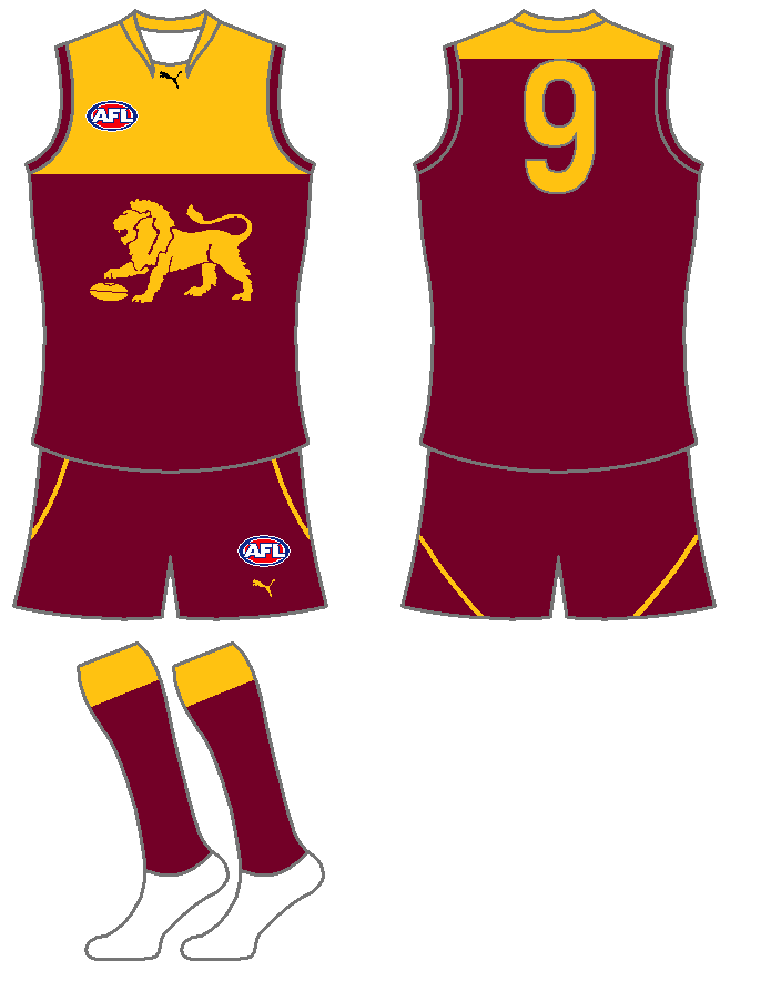
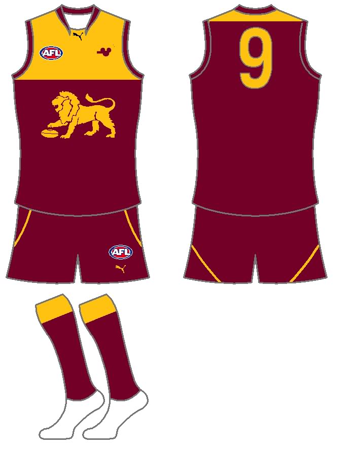
I hope you dont mind but I copied it, added a bear logo and reduced the yellow on the back.
brbffctradhm.jpg


I think its a bit sad that bear logo was dropped totally, they should include reminders in future designs. It is little things like that which make a difference I think.

 
Very good.
I hope you dont mind but I copied it, added a bear logo and reduced the yellow on the back.
brbffctradhm.jpg


I think its a bit sad that bear logo was dropped totally, they should include reminders in future designs. It is little things like that which make a difference I think.

Yeah, it does look better with less yellow on the back. Thanks man
 
I think its a bit sad that bear logo was dropped totally, they should include reminders in future designs. It is little things like that which make a difference I think.

"BBFFC" contains the only reminder... it should have a space in it though, "BB FFC".
The bear logo isn't too bad but when scaled down so much, it looks like Mickey Mouse.

Lions reserves should be called the Brisbane Bears and wear the last Bears kit, when they play in the North Eastern league. No need to keep a Fitzroy presence there as there's already Fitzroy in the VAFA.
 
2qnqnoh.png


Crows clash. Primarily yellow, thus the cut off stripes. I used a KooGa template as they seem to be signing quite a few AFL clubs.

20zad79.png


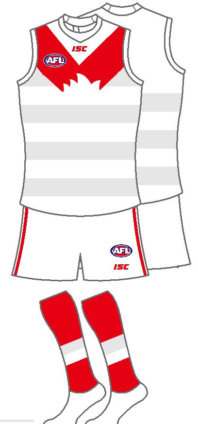
Swans clash.
 
That Crows clash is weirdly cool. It's modern but doesn't deviate too much from the home. Nice :thumbsu:

As for the Swans jumper, in all honesty I don't like it at all. Get rid of all the silver and then it will look a lot better. I did love the hoops guernsey earlier in the year, but if they do appear then they should be in red IMO.
 
After seeing North Melbourne's blue jumper, thought I'd see how this looks. I like it, looks more intimidating...

Hawthorn20111-1.png
 
It would certainly be convenient for us designers to have teams wearing dark jumpers with dark shorts... but I'm not sure on the Hawks. I don't mind it, but I like seeing the masses of gold in the crowd.
 
This looked better in my head, but thought I may aswell post it. For the traditional Footscray supporters.

WesternBulldogs20111-1.png
 

Remove this Banner Ad

Back
Top