Workshop Jumper Ideas for 2018

Remove this Banner Ad

Status
Not open for further replies.
Looks nice but I'm pretty sure there's a thing in the merger agreement that says they have to have a lion on all of their guernseys.

Nice research but I'm pretty sure there's a thing in the jumper design that is a watermark of a lion on the guernsey.
 

Log in to remove this ad.

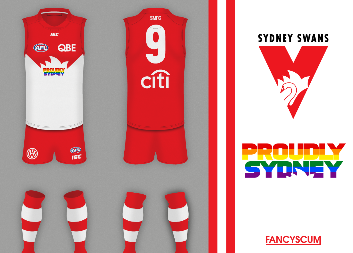
My Sydney Swans pride idea (probably would have the rainbow socks too but I couldn't be arsed making them):
kEFKhh5.png
 
Last edited:

(Log in to remove this ad.)

What's up with all these promotional jumpers being so lacklustre examples being the jumpers Essendon and St Kilda wore last night. They should either include the promotional organisation/event into the teams jumper design rather than make tiny little changes (like the yellow right cuff on Essendon and the rainbow coloured numbers for St Kilda). Basically what I am getting at is go all out on the promotional jumper or don't do it at all because it's a waste of money for the clubs making it and it's a waste of money for the poor suckers who have 'Compulsive Jersey Collection Syndrome' (thankfully I do not suffer this disease).
 
What's up with all these promotional jumpers being so lacklustre examples being the jumpers Essendon and St Kilda wore last night. They should either include the promotional organisation/event into the teams jumper design rather than make tiny little changes (like the yellow right cuff on Essendon and the rainbow coloured numbers for St Kilda). Basically what I am getting at is go all out on the promotional jumper or don't do it at all because it's a waste of money for the clubs making it and it's a waste of money for the poor suckers who have 'Compulsive Jersey Collection Syndrome' (thankfully I do not suffer this disease).
To be fair to Essendon's design it's been like that since the get-go. They've always done the yellow cuff for cancer.

The other side of this is, clubs don't necessarily want a whole new design or a major change to their jumper, as it still needs to be *their* jumper. They're not "the Essendon Daffodils" for the night, for example.

There's enough "major change" jumpers as it is; clubs' jumpers are their main identifier and the front of their brand.
I was thinking that Essendon should keep the yellow cuff but put yellow somewhere else like maybe a thin yellow stripe on the edges of the sash. They don't have to sacrifice their club's identity (like North Melb and the infamous orange jersey) just enough to make the design noticeably different.
 
I was thinking that Essendon should keep the yellow cuff but put yellow somewhere else like maybe a thin yellow stripe on the edges of the sash. They don't have to sacrifice their club's identity (like North Melb and the infamous orange jersey) just enough to make the design noticeably different.
I don't think they would want any yellow on their sash, especially on the outlines. Richmond exists, who have a yellow sash.
 
I was thinking that Essendon should keep the yellow cuff but put yellow somewhere else like maybe a thin yellow stripe on the edges of the sash. They don't have to sacrifice their club's identity (like North Melb and the infamous orange jersey) just enough to make the design noticeably different.
That'd be about as obvious really. Plus the red sash is meant to be on a black background (even if the sash is wheat or poppies) and the yellow outline would get in the way of that.
Plus I think the background of the yellow cuff came about after the AFL refused to allow yellow armbands? So they put a yellow cuff on instead. If someone could confirm. So there's background to why they did it that way in the first place.
 
Plus I think the background of the yellow cuff came about after the AFL refused to allow yellow armbands? So they put a yellow cuff on instead. If someone could confirm. So there's background to why they did it that way in the first place.
That's what Robbo said on 360 when they were showing off the guernsey this week, not sure he's the best source but it seems to confirms your thought.
 
Borne out of a show of support for teammate Adam Ramanauskas, the Essendon Football Club is once again preparing to celebrate its long-standing partnership with Cancer Council Victoria.
Now entering its 10th Year, the ‘Clash for Cancer’ game originated when the club decided to take a stand in support of premiership player Adam Ramanauskas and his battle with cancer.
Despite the AFL denying the Bombers request to pay tribute to 'Rama' with a special yellow armband, the club decided to wear the jumper and the fine in support of a true champion.
It was later agreed by the AFL that the $20,000 would be donated to the Cancer Council of Victoria, Essendon’s preferred charity. The following year, the AFL agreed to incorporate a yellow band into the sleeve of the Essendon guernsey for their annual ‘Clash for Cancer’ game.
http://www.essendonfc.com.au/news/2015-06-24/clash-for-cancer
 
What's up with all these promotional jumpers being so lacklustre examples being the jumpers Essendon and St Kilda wore last night. They should either include the promotional organisation/event into the teams jumper design rather than make tiny little changes (like the yellow right cuff on Essendon and the rainbow coloured numbers for St Kilda). Basically what I am getting at is go all out on the promotional jumper or don't do it at all because it's a waste of money for the clubs making it and it's a waste of money for the poor suckers who have 'Compulsive Jersey Collection Syndrome' (thankfully I do not suffer this disease).
If it's for a good cause - like the cancer council - making people notice it and go 'I wonder what that's for' is better than spelling it out. If it just spells it out that it's for the cancer council people go 'oh yeah, cool', but if it is a little obscure people may look it up an inadvertently learn a lot more about the cause,
 
If it's for a good cause - like the cancer council - making people notice it and go 'I wonder what that's for' is better than spelling it out. If it just spells it out that it's for the cancer council people go 'oh yeah, cool', but if it is a little obscure people may look it up an inadvertently learn a lot more about the cause,
Must admit I did that exact thing watching a Carlton game a couple weeks back and saw they had orange socks, started watching it late so I didn't see what the reason was but it intrigued me enough to look it up.
 
Status
Not open for further replies.

Remove this Banner Ad

Back
Top