Bjo187
Premiership Player
- Apr 30, 2020
- 3,198
- 4,208
- AFL Club
- Essendon
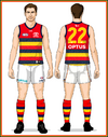
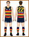
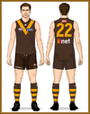
West Coast execs right now:
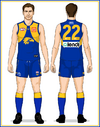
View attachment 1957402
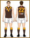
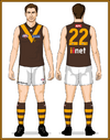
In seriousness though, footy jumpers are becoming less and less of a needle mover, unless it’s retro, retro-adjacent or outlandish.
The European football comparison is a moot point - you’re comparing apples to oranges. Football kits are becoming more and more fashion forward and in general, it’s a lot more socially acceptable to wear a jersey out (a t-shirt) as opposed to a footy jumper (basically a vest/tanktop.)
Adding a white clash to West Coast’s set might sell a few jumpers but there’s better ways to make money in terms of club merchandise than adding another jumper into the set and diluting the brand. I wouldn’t be caught dead wearing a footy jumper to the shops, but I would wear a vintage Mitchell & Ness collab tee, for instance.
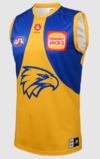
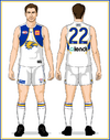
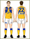
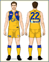
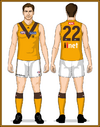
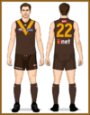
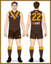
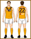
If you wanna see what it’d look like, I made it back when it was being speculated (this was before the rebrand was officially launched) and honestly, I’m glad it never came to fruition.
View attachment 1957409
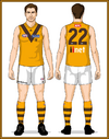
My problem with the yellow one is the eagle is an outline. Would look better colored in. That and with blue shorts would look amazing. Not gonna happen, but just saying.

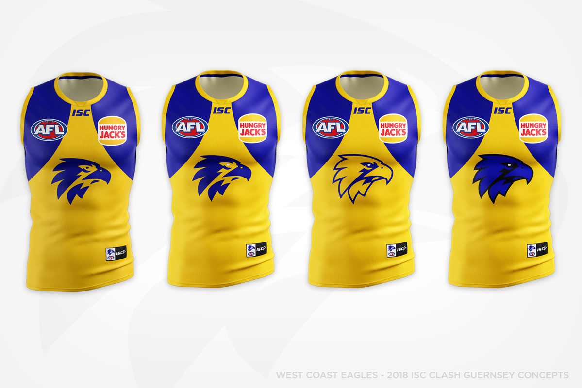
 The logo is meant to be blue and gold, not one colour. And the main keyline should always be the darkest colour and never reverse.
 .jpg")
.jpg")