Ochre
Stop the Steal!
ok here's my idea, i don't know if i'll get time to actually make, and if i do, it will most likely be horrible, so i figured that i'll just post my idea
All the things on the emblem are what make up the Melbourne Football Club, so for my clash jumper, I decided to take that literally
My jumper will have the large MFC monogram on it, the M will actually be made up of heaps of small tridents, the F made up of the eternal flame and C made up of southern crosses.
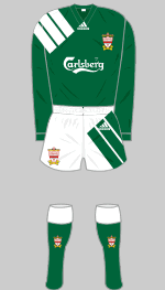
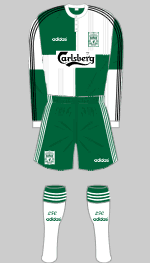
edit: this is separate to the long sleeves one
this is what i want to make, although i wouldnt be able to upload it til friday arvo at the very earliest
if thats too long then maybe someone could make it for me?
")
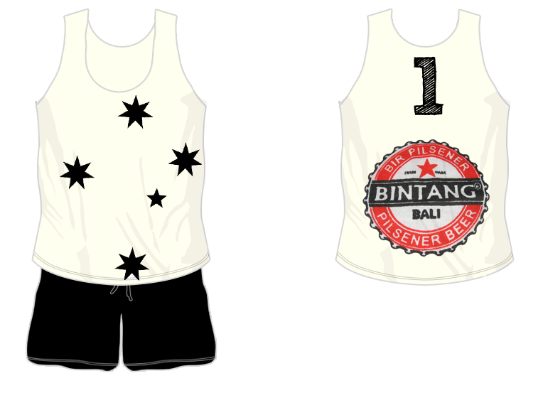
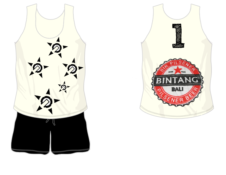
also my second idea, which i'll never have time to make, was going to be a bogan jumper. the southern cross, the traditional bogan tattoo, was going to be on the front, with the long sleeves going to be, literally tattoo sleeves. and the back sponsor was going to be Bingtang Bali