- Joined
- Jun 23, 2021
- Posts
- 2,836
- Reaction score
- 3,167
- AFL Club
- Melbourne
- Other Teams
- LA dodgers LA Kings Melbourne Aces
black knights nice name, like the colors and branding
Follow along with the video below to see how to install our site as a web app on your home screen.
Note: This feature may not be available in some browsers.

Log in to remove this Banner Ad
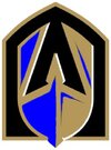
Here ya go... Auckland FC. Not a fan. And that's not because they're now the Nix's rivals.
View attachment 1927356
The contrast really doesn't work at small sizes... Which is a graphic designer's job.
View attachment 1927359
The kit is nice though, but another stripey team with black in it is just... meh.
View attachment 1927362
Nix, Western United, now AFC.
Yes! Totally forgot about them, they need to go back to their Fulham-esque kits for a point of difference here.MacArthur is another black striped team too. It’s all a bit Big Bash generic really.
I'm the opposite. I love black and blue.Black and blue.
What a yucky combo.
The kit works I recon but the logo doesn't foor some reason.Here ya go... Auckland FC. Not a fan. And that's not because they're now the Nix's rivals.
View attachment 1927356
The contrast really doesn't work at small sizes... Which is a graphic designer's job.
View attachment 1927359
The kit is nice though, but another stripey team with black in it is just... meh.
View attachment 1927362
Nix, Western United, now AFC.
The logo leaves a bit to be desired.The kit works I recon but the logo doesn't foor some reason.
Needs a gold outline I think, especially when on that kitThe kit works I recon but the logo doesn't foor some reason.
The kit works I recon but the logo doesn't foor some reason.
MLS vibesHere ya go... Auckland FC. Not a fan. And that's not because they're now the Nix's rivals.
View attachment 1927356
The contrast really doesn't work at small sizes... Which is a graphic designer's job.
View attachment 1927359
The kit is nice though, but another stripey team with black in it is just... meh.
View attachment 1927362
Nix, Western United, now AFC.
Ding ding ding. I’m someone who hates the usual “they just look like this team” cause there’s only so many designs and colourways they could go for, but they literally just look like a blue version of Austin FC, and the name doesn’t help that either. And that would be totally fine if their geographical rival didn’t wear stripes, as well as the two other most recent expansion teams. Black and blue looks cool ordinarily but that shade and design looks so much like a team wear template it’s not funny. I guess we’ll see if they commit to being a stripes team in the future but they’ve come in with it so I assume that’s their plan long term as well.MLS vibes
If FIFA/EAFC had the FanHubHere ya go... Auckland FC. Not a fan. And that's not because they're now the Nix's rivals.
View attachment 1927356
The contrast really doesn't work at small sizes... Which is a graphic designer's job.
View attachment 1927359
The kit is nice though, but another stripey team with black in it is just... meh.
View attachment 1927362
Nix, Western United, now AFC.

They’ve designed it using an unreproducable blue. Looks great on screens but as soon as you have to put it into print or on a guernsey, you lose the contrast.
Happy 19th team reveal day. I look forward to the inevitable whining and irateness when the logo turns out to be a few abstract lines and a dot. Please don't be a piece of crap. Please AFL, i beg you. Get it right.