Discussion Logo Discussion Thread

Remove this Banner Ad

Forever and a day and loved them since I was a kid.
I was the same, I remember getting annoyed at bad logo changes and doodling logos in books.

I feel that while designing will only get better as kids design on Photoshop, the creativity and innocence will get lost by not having logos in pencil.
 
396F3E34-E2E8-4182-BA36-18B0357074CE.jpeg


happening.
 

Log in to remove this ad.

Food company Dole's tweaked their logo.

200


250

Geez the yellow sun(?) in the 'O' sticks out like a sore thumb. Hurts my eyes looking at it, so much going on in concentrated in such a small area. Would've looked better if the made the entire 'O' yellow, and left the 'D', 'L' and 'E' as red
 
Jul 21, 2010
7,687
11,178
Gold Coast
AFL Club
Gold Coast
Other Teams
Philadelphia 76ers
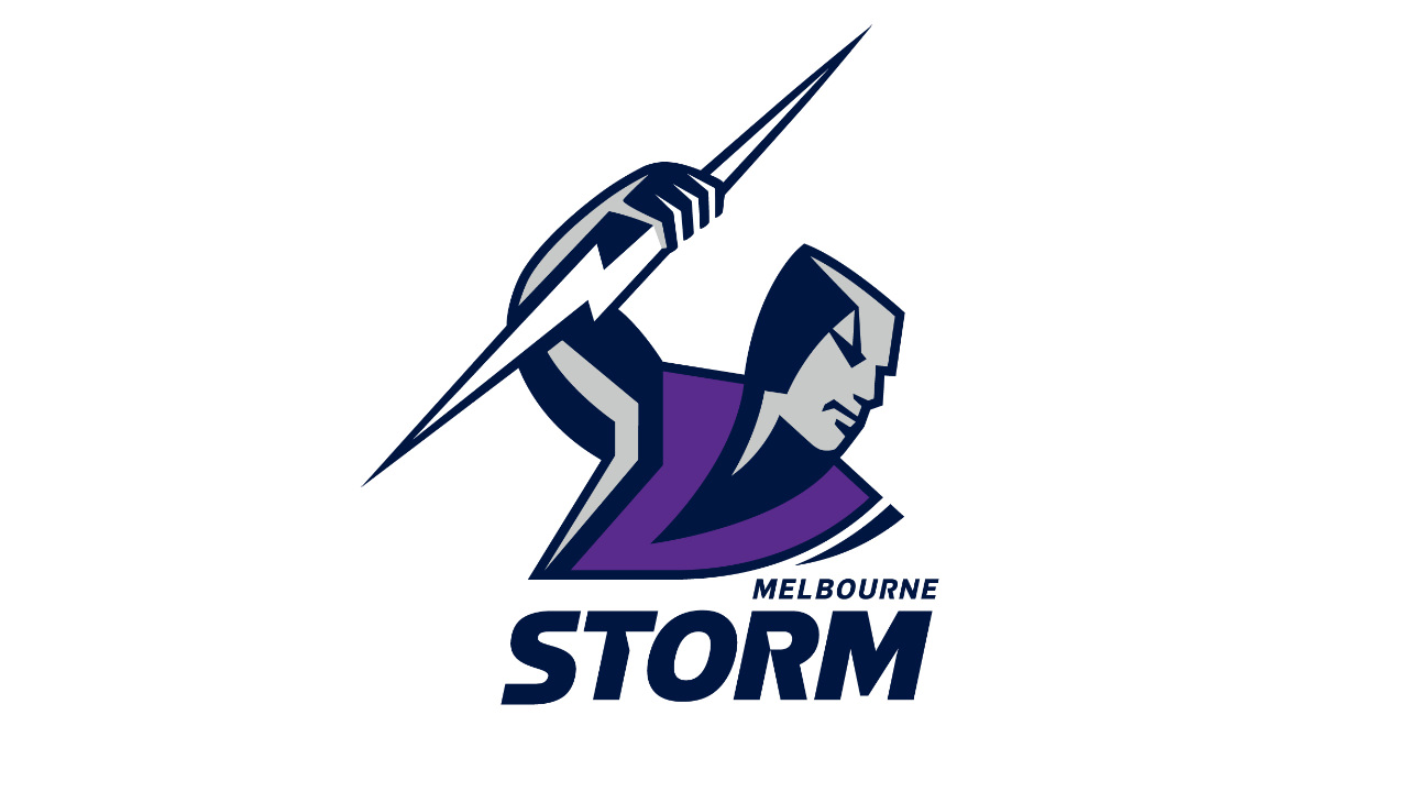
what's the dark "shadow" on the side of his head meant to represent? and the little line that leads from the eyebrow up to the top right of it?
is it literally just some form of shadowing? so many weird angles all round, very odd design.
 
what's the dark "shadow" on the side of his head meant to represent? and the little line that leads from the eyebrow up to the top right of it?
is it literally just some form of shadowing? so many weird angles all round, very odd design.
Imagine 5e light source pointing into the front of his face. That’s why it’s there. Admittedly not the best angle for light.
I can’t say bad about the Storm man since it was made in the mid 90s, but in saying that we should have upgraded it surely.
 
Jun 24, 2011
26,135
16,329
Adelaide
AFL Club
Carlton
Other Teams
ΠΓΣΣ LFC Sturt Steelers Nix
Imagine 5e light source pointing into the front of his face. That’s why it’s there. Admittedly not the best angle for light.
I can’t say bad about the Storm man since it was made in the mid 90s, but in saying that we should have upgraded it surely.
Another example of 90s logo design with odd face shadowing:
images (26).jpeg
 

(Log in to remove this ad.)

Not sure how long this has been in use, but noticed during today's Cox Plate coverage that Seven now have a 'Seven Racing' logo. Looks quite nice, love the gold on blue colour scheme and how the horseshoe ties it all together. The traditional horse symbols (such as the horseshoe and the picture of the racing horse) help it appeal to the general public who don't follow horse racing most of the year

Screen Shot 2018-10-27 at 5.04.31 pm.png
 

Remove this Banner Ad

Back