Remove this Banner Ad

Discussion Logo Discussion Thread

🥰 Love BigFooty? Join now for free.

Australian Cricket isn't quite an interchangeable term with Cricket Australia. It refers to all of CA and the state/territory associations. At a guess, this template might be intended for things like the Australian Cricket Hall of Fame, Australian Cricket Pathway, Australian Cricket Family etc. Feel like I've seen it already used in documents, can't remember exactly where though.
 
Under Consideration's Brand New section has become a subscription only operation which means I can't access their future posts and also means I have one less avenue to finding logos.
 
Under Consideration's Brand New section has become a subscription only operation which means I can't access their future posts and also means I have one less avenue to finding logos.

I applaud them for taking the step. It couldn't have been an easy decision, but reading through the rationale a few days ago, it was either subscriptions or the site essentially shuts down. I've been reading it for ten or eleven years, $2 a month is a super deal.

Plus, not that they're trying to publicise it, but if there's still a financial barrier preventing you from continuing to access the website, they're happy to waive the fee, no questions asked. I couldn't have thought of a better way for a popular blog to transition to a paywall model, in truth.

They've handled it very well, as they've done with most things over the course.

Which reminds me... I need to subscribe!
 

Log in to remove this Banner Ad

American fast food chain Bojangles has a new logo which looks like an old Ruffles logo.


Old.

1598585146707.png

New.

1598585154975.png


The old Ruffles logo for comparison.

1598585205191.png


Even reminds me of an old book title by The Berenstain Bears.
 
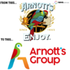
Arnott's has a new corporate logo.

View attachment 947357
"Hey can we have a minimalist bird with slight gradients?" "sure" "oh can you make sure you destroy a traditional logo while you're at it?" "no problem. do you mind if we make it look like a hotel do-not-disturb sign?" "perfect"

1598589993128.png
 
Old
Apple_first_logo.png

New
applelogo.png

What the **** were these stupid mother****ers thinking?

They took a ****ing shit on their history. What is that all about.

They ****ing pissed away something rich with detail. That fully sucks.

Good jobs not going overboard with too many ****ing colours. Give me a break.

And it looks like ****ing Pac-Man. Real mature, guys. Get it together, you're blowing it!
Hate to be one of those guys, but the attempt at making the parrot form an A seems pointless.
Well, the bird is on a perch, like the original version. And 'A' is the first letter of the company's name. So that would be two points, rather than none, according to my extensive calculations.
 

Remove this Banner Ad

Old
View attachment 947616

New
View attachment 947617

What the fu** were these stupid motherf***ers thinking?

They took a ******* sh*t on their history. What is that all about.

They ******* pissed away something rich with detail. That fully sucks.

Good jobs not going overboard with too many ******* colours. Give me a break.

And it looks like ******* Pac-Man. Real mature, guys. Get it together, you're blowing it!

Well, the bird is on a perch, like the original version. And 'A' is the first letter of the company's name. So that would be two points, rather than none, according to my extensive calculations.


Looks like we found the designer.
 
Arnott's has a new corporate logo.

View attachment 947357
Rebranded after the sale from Campbell's. This was the previous corporate logo used on linkedin. Still a shit update.

0
 
Big uproar about this on social media. Lot of people forgetting that this would probably never see the light of day in a supermarket.

Wouldn't have anything to do with News Corp running an article comparing it to the consumer logo and essentially portraying it as a replacement?
 

🥰 Love BigFooty? Join now for free.

The old one was perfect, what on earth made them think it needed an update?
It was for use globally at trade shows etc. it was reported on as if we as consumers would see it and people lost their minds.
 
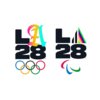
2028 Olympics emblems revealed

D260DD78-6AB2-48E2-917C-80361C542FC2.jpeg
DC683377-2A4C-48CF-AEE9-3EDD1B1FC414.jpeg

Unique to the olympics, there is a core logo of the L, 28 however the A is going to be different for every use apparently reflecting the evolution of the digital age.

Personally, I'm not a fan
 
Last edited:
Essendon are using this for the loading screen on the club app. I wouldn't mind if we changed to this version. Maybe with an inverse to be used on black backgrounds.View attachment 910791

Interesting to see the invert of this on the clubs facemasks.
ESS1__58864.1595491035.jpg
 

Remove this Banner Ad

Discussion Logo Discussion Thread

🥰 Love BigFooty? Join now for free.

Back
Top