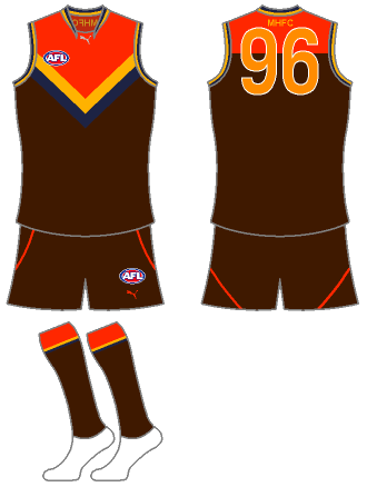
Competition Merger Of The Week 1: Melbourne Hawks

Remove this Banner Ad

52228086qml.jpg


Close: 22 Feb (Normally wont run this long, but I want this to run at diferent times to KOTW)

Maximum 2 Entries

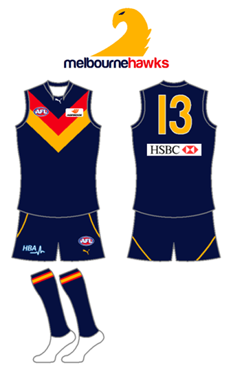
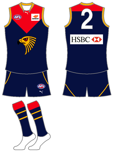
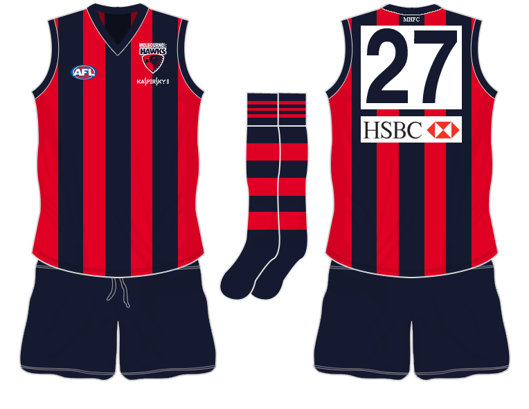
EDIT: I 've decided to allow a clash/away jumper for each entry, however, it cant use the traditional design of either club (ie yoke or stripes)
 

Log in to remove this ad.

my first entry, taken longer than it should have since i have been distracted watching the winter olympics :)


tried to combine the yoke ans stripes into a melbourne "M"
as usual, let me kow what you think
 
In respons to Craegus's guernseys, while the first one looks really good I'd probably move away from having an away guernsey with completely different colours to the home. It makes the red and blue Melbourne Hawks logo on the away look a bit out of place.
 
It can be Hawthorn Demons.

The reasoning for me and others saying Melbourne Hawks is because Melbourne is the capital city, a stronger name to have.
Plus with that, the way I thought about the merger would be Melbourne name and guernsey design belonging to the Dees, and the colors and hawk logo belonging to Hawthorn when they try to come up with the best identity compromize.

But I also like JamesMcB's idea of merging all colors/design into the one guernsey. If one can find a good way to blend all those colors/shapes in as they're so polar opposite to each other to make work well imo.
 
In respons to Craegus's guernseys, while the first one looks really good I'd probably move away from having an away guernsey with completely different colours to the home. It makes the red and blue Melbourne Hawks logo on the away look a bit out of place.

That is why the away is not currently an official entry it is just a quick mock up in response to munts comments.
 

(Log in to remove this ad.)

Here's my first effort:

2uqd9tt.png


I don't normally ask for feedback but I feel I've done a really good job especially with the logo so some comments would be nice, thanks.
 
Yes Willo, is inspired from that guernsey. Joined the two parts together to create the hawk. Didnt want to use the current one as it seems everyone is, but the previous logo I never really was a fan.

I'm happy with how it is but thanks for the feedback GG.

And in reply to Coxy's change I'll add the clash jumper I had in mind.
 
Hey onyacoxy you have said in the original post that you cant use either traditional design (vee or stripes) on the away/clash. Melbourne doesnt use a vee it uses a yoke. My thoughts of a vee are what Port is wearing now or what Man U is wearing ATM. Also because Hawthorn use vertical stripes can we use horizintal stripes or stripes that dont go vertical.
 
Hey onyacoxy you have said in the original post that you cant use either traditional design (vee or stripes) on the away/clash. Melbourne doesnt use a vee it uses a yoke. My thoughts of a vee are what Port is wearing now or what Man U is wearing ATM. Also because Hawthorn use vertical stripes can we use horizintal stripes or stripes that dont go vertical.

yoke vee same thing :p

horizontal stripes are fine, its just to stop someone using the exact design of one of the teams as there home and away
 

Remove this Banner Ad

Back
Top