Competition Merger Of The Week 1: Melbourne Hawks

Remove this Banner Ad

Log in to remove this ad.

Home
melbhawkshome1.png

This is sort of a crack at a prison bar design using Hawthorn's stripes and a wide vee inspired by Melbourne's yoke. Looked better in my head but I think it's got something to do with the lack of colour combos you can use because i refuse to use the red, blue and gold because Adelaide use them.

Clash
melbhawksclash1.png

A cross between Hawthorn's 1996 pre-season jumper and the wide vee used in the home design. I actually quite like this and might change the home design a bit so I dont waste this away design.

BTW the red is exactly the same shade in both jumpers. Its just looks a bit pinker in the clash because it is surrounded by a lighter colour.
 

I also tried to avoid the red-yellow-blue colour combination, and came up with this. Navy with a brown and red vee for the home jumper; and silver (from Melbourne's 2008 away jumper) with a red vee yoke and a brown hawk (from Hawthorn's 1983-96 logo) for the away jumper.
 

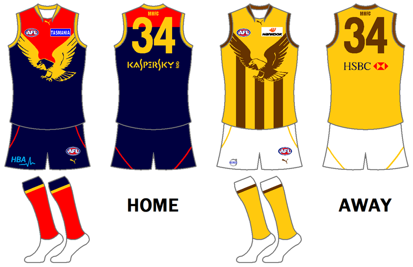
Combining fire (from the fiery demons of Melbourne) with the Hawks: The Hawthorn Firebirds. The home jumper maintains the yellow vertical stripes of Hawthorn, and introduces red from Melbourne. The away jumper features the Firebirds mascot (based on the Hawthorn logo from 1997-2007), similar to the majority of the Melbourne's clash/away jumper, which feature the mascot.
 
Hey this is pretty much my first proper go at this sort of thing, spent most of today reading the tutorial and practising so any input would be hugely appreciated.

HOME

rtqkqq.png


AWAY

2zr2jpk.png

 
The logo is really good. I like how you haveput the hawk and the M together and it doesnt look like you have just slapped to differnent logos together

The fiery M-Hawk is brilliant.

thanks guys

am gunna redo it tonight coz looking at it with that terrible quality is giving me the shits
 

(Log in to remove this ad.)

My first enrty for the Melbourne Hawks. I have tried to retain the existing Melbourne and Hawthorn jumpers as much as possible, but with the added Hawks logo.

24ymhic.png
 
Tried something a little bit different. I'll do a clash guernsey later on if I get to it. I'd do a logo but I can't top onyacoxy's M-hawk.

melbournehawkshome.png
 
Yeah Paulie pretty much nailed it IMO. The Hawk creating the border for the yoke is both simple and brilliant. Strikes a perfect balance.

The only issue is that it ends up using Crows colours. Discarding the Brown is the most obvious choice, but it leaves you with the exact colours that an existing team uses. IMO it's probably the biggest decision you have to make when designing this guernsey.
 
My first enrty for the Melbourne Hawks. I have tried to retain the existing Melbourne and Hawthorn jumpers as much as possible, but with the added Hawks logo.

24ymhic.png

Bloody brilliant. I had a similar idea, but I feel there's enough differences between to enter it.
 
Yeah Paulie pretty much nailed it IMO. The Hawk creating the border for the yoke is both simple and brilliant. Strikes a perfect balance.

The only issue is that it ends up using Crows colours. Discarding the Brown is the most obvious choice, but it leaves you with the exact colours that an existing team uses. IMO it's probably the biggest decision you have to make when designing this guernsey.

Yeah I found the Navy, Gold & Brown to be the best three colours to use but I'm a newbie to all this so I could've gotten mine totally wrong since it's my first guernsey I've ever posted for other people to view.

I love Paulie's idea though, brilliant.
 
Round1Logo.png


HOME
Round11.png


CLASH
Round12.png


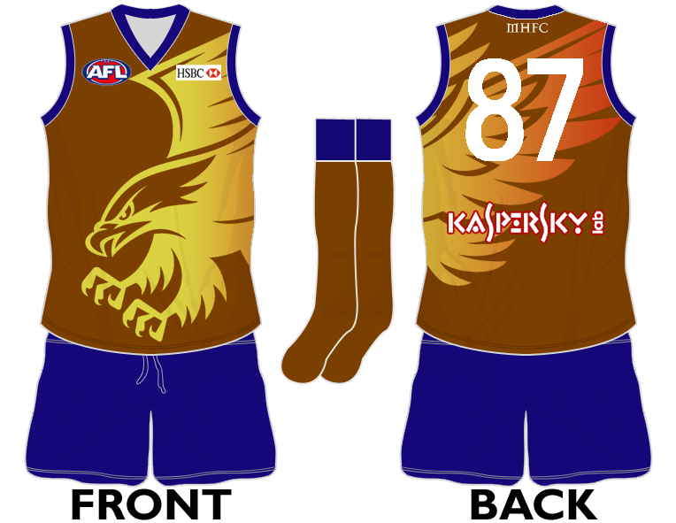
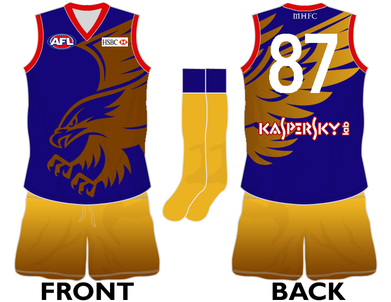
I decided to steer clear of the Adelaide colour scheme. Instead I went for blue and gold, the home jumper retaining the yoke with one made up of blue gradients. The clash jumper retains the stripes with a gold gradient. The socks on the home jumper are inspired by Hawthorn's, whilst the ones on the clash jumper are inspired by Melbourne's. Could have made the gradients a wee bit more subtle but overall I'm pleased with the end result.​
 
Yeah but Harrington stole the logo from Hampshire. And I do all the designing from Harrington, so :p.

Oh, the blocky gradients are there because that's the way I do them. I don't make the guernseys the way Smeagle does, because I realise if you use word some of the quality goes when uploaded.
 
Hey this is pretty much my first proper go at this sort of thing, spent most of today reading the tutorial and practising so any input would be hugely appreciated.

HOME

rtqkqq.png


AWAY

2zr2jpk.png


I like them but the graidient shorts on the away are a bit over the top,so maybe just stick with white :)

Oh and its good to see a nice result from my Photoshop tut :)
 
My First entry:
I know very un-imaginative logo, but couldn't think of anything better

melbhawkslogo.jpg


HOME:
melbhawkshome.png


AWAY:
hawksmelb.png


Any Feedback?
 
My First entry:
I know very un-imaginative logo, but couldn't think of anything better

melbhawkslogo.jpg


HOME:
melbhawkshome.png


AWAY:
hawksmelb.png


Any Feedback?

For me it just seems too Adelaide. Not saying I don't like it, if they didn't use those colours it would be awsome but yeah just too similar to them for me.
 

Remove this Banner Ad

Back
Top