Navigation
Install the app
How to install the app on iOS
Follow along with the video below to see how to install our site as a web app on your home screen.
Note: This feature may not be available in some browsers.
More options
-
 BigFooty Tipping Notice Img
Weekly Prize - Join Any Time - Tip Round 9
The Golden Ticket - MCG and Marvel Medallion Club tickets and Corporate Box tickets at the Gabba, MCG and Marvel.
Round 8 Winner: bearweger
You are using an out of date browser. It may not display this or other websites correctly.
You should upgrade or use an alternative browser.
You should upgrade or use an alternative browser.
News New Jumpers for 2017 - All changes in OP
- Thread starter Red Crow
- Start date
- Tagged users None
- Status
- Not open for further replies.
Looks like that god awful collar is here to stay in 2017.
It looks great, loved ISC's template this year and their nice think collar. Hopefully we see Essendon's artwork soon too.
MKMatty
Busy Vibin’
I'm personally a fan of the thick collar. Definitely grown on me through the year.
- Jun 12, 2012
- 20,582
- 65,421
- AFL Club
- Port Adelaide
Looks like that god awful collar is here to stay in 2017.
Yeah f@#k that collar.
I have this faint hope that the PI Fire Sale we just had was a precursor to a glorious Nike return.
I'm personally a fan of the thick collar. Definitely grown on me through the year.
The bottom half is fine but it just gets so manky around the neck. Either do a proper old school folded collar or don't bother.
Nike would be sweet for their off field but * that noise jumper wise. I think they charge a fortune for them. And our off field stuff is terrific. Old template was fab on the SBS design though.Yeah f@#k that collar.
I had this faint hope that the PI Fire Sale we just had was a precursor to a glorious Nike return.
ISC's collar would be the best if the idea wasn't so horribly executed. The front part is a bit too thick and the stitching across it is.. I dunno, aesthetically displeasing? I have been on this forum too long to let it slide, at any rate. The back is a bit of a clusterfook too.
TheLoungeLizard
The world's most handsome man
It's just the the strange bits on the side that irritate me.I'm personally a fan of the thick collar. Definitely grown on me through the year.
Nike with the current template wouldn't suit the V.Yeah f@#k that collar.
I have this faint hope that the PI Fire Sale we just had was a precursor to a glorious Nike return.
The bottom half is fine but it just gets so manky around the neck. Either do a proper old school folded collar or don't bother.
And ISC did a old school rounded collar without the extra side bits for strength in 2010:

- Jun 12, 2012
- 20,582
- 65,421
- AFL Club
- Port Adelaide
Nike would be sweet for their off field but **** that noise jumper wise. I think they charge a fortune for them. And our off field stuff is terrific. Old template was fab on the SBS design though.
ISC's collar would be the best if the idea wasn't so horribly executed. The front part is a bit too thick and the stitching across it is.. I dunno, aesthetically displeasing? I have been on this forum too long to let it slide, at any rate. The back is a bit of a clusterfook too.
Yeah it's the back and sides that bother me.
Re: Nike though I actually really like their current collar/template and reckon it would look fab in Port colours. I'd be happy to pay an extra $10 per piece for merch too, but I think that might be the nostalgia talking.
I shouldn't rag on ISC too hard though, apart from the current template they've done a pretty good job with Port since they started so credit where it's due.
- Jun 9, 2015
- 12,096
- 9,312
- AFL Club
- St Kilda
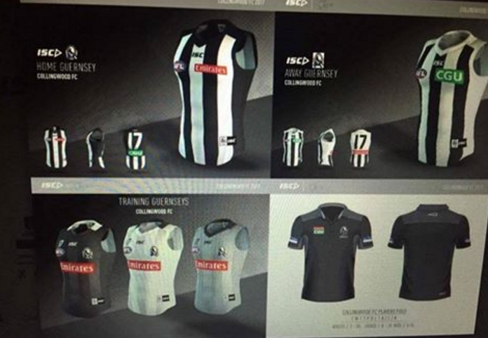
Interesting to see how collingwood has an "away jumper" on that isc preview
TheLoungeLizard
The world's most handsome man
That old school 2006 style Puma collar would look wicked good on Port
Away and clash are generally interchangable termsInteresting to see how collingwood has an "away jumper" on that isc preview
Fizzler
BBTB
- Dec 26, 2013
- 12,800
- 16,435
- AFL Club
- Port Adelaide
- Other Teams
- OKC, Coburg, Werribee, Storm, QPR
You joking? I love that collar so much. way more comfortable an normal than last years. Plus the material on the jumper is heaps better, colours seem much more vibrant.Looks like that god awful collar is here to stay in 2017.
TheLoungeLizard
The world's most handsome man
But it's not as pleasing to look at.You joking? I love that collar so much. way more comfortable an normal than last years. Plus the material on the jumper is heaps better, colours seem much more vibrant.
Fizzler
BBTB
- Dec 26, 2013
- 12,800
- 16,435
- AFL Club
- Port Adelaide
- Other Teams
- OKC, Coburg, Werribee, Storm, QPR
Apart from the oveload of stitching outside it, which isn't even that noticeable for Port, it's great. And the lines on the collar actually loom pretty cool, especially on the blue training jumper.But it's not as pleasing to look at.
TheLoungeLizard
The world's most handsome man
I always thought the old collar was the best of any in a long time and the whole ripping thing people could have lived with.Apart from the oveload of stitching outside it, which isn't even that noticeable for Port, it's great. And the lines on the collar actually loom pretty cool, especially on the blue training jumper.
Fizzler
BBTB
- Dec 26, 2013
- 12,800
- 16,435
- AFL Club
- Port Adelaide
- Other Teams
- OKC, Coburg, Werribee, Storm, QPR
Nah the neck looked awkward IMO. The way it goes straight down kind of annoyed me.I always thought the old collar was the best of any in a long time and the whole ripping thing people could have lived with.

- Oct 1, 2012
- 3,245
- 3,035
- AFL Club
- West Coast
- Other Teams
- Los Angeles Lakers, Perth Wildcats
I think the colour issues are 100% justified, you only have to look back a page or so to see what could have been for West Coast had BLK been in charge. I think the Tigers supporters have every right to be disgruntled in the same way we were re: wings and Brisbane supporters were re: paddle pop. In this day and age a company the ilk of BLK have the means to be able to amend their material and or printing process, the fact they dont is a a slap in the face for clubs who demand a better end product (as Richmond have allegedly asked for). The collar and material haven't changed at Kooga/BLK for a long period, Puma have changed both in the medium amount of time i have been collecting PI's/Matchworns. It isn't hard to get PMS/RGB colours correct to reflect the colour they are meant to reflect, apart from RBK and BLK i haven't come across a company in a state in league, including local leagues including the club I have played for, for ~8 years where our home jumper is black (and has always looked black, even in the sun) BLK are useless in terms of their ability to accurately portray colours and Richmond amongst other clubs have the right to demand better.I really hope the tigers jump ship ASAP because I'm sorta sick of hearing about the colour issues tbh. Was it as prevelant a discussion when Reebok was in the league and had Port running around in a shade of Brown?
TheLoungeLizard
The world's most handsome man
I agree wholeheartedly about the colour issue and apparently inability to solve it, but not on the collar thing.I think the colour issues are 100% justified, you only have to look back a page or so to see what could have been for West Coast had BLK been in charge. I think the Tigers supporters have every right to be disgruntled in the same way we were re: wings and Brisbane supporters were re: paddle pop. In this day and age a company the ilk of BLK have the means to be able to amend their material and or printing process, the fact they dont is a a slap in the face for clubs who demand a better end product (as Richmond have allegedly asked for). The collar and material haven't changed at Kooga/BLK for a long period, Puma have changed both in the medium amount of time i have been collecting PI's/Matchworns. It isn't hard to get PMS/RGB colours correct to reflect the colour they are meant to reflect, apart from RBK and BLK i haven't come across a company in a state in league, including local leagues including the club I have played for, for ~8 years where our home jumper is black (and has always looked black, even in the sun) BLK are useless in terms of their ability to accurately portray colours and Richmond amongst other clubs have the right to demand better.
If you have a good intrusive collar I don't think it has to be changed all the time just to sell new jumpers.
I doubt many people really upgrade for a new collar (sponsors sure) and we often see perfect collars changed to worse ones for the sake of it (Adidas)
And weirdly Richmond's black was fine with Reebok, from memory only Port had the brown issue.
dylancox08
Senior List
- May 10, 2015
- 174
- 138
- AFL Club
- Collingwood

Suprising that the ISC 2017 Collingwood templates don't feature the 125 year anniversary logo anywhere.
TheLoungeLizard
The world's most handsome man
Looks to be on the back, above the numbersSuprising that the ISC 2017 Collingwood templates don't feature the 125 year anniversary logo anywhere.
- Oct 1, 2012
- 3,245
- 3,035
- AFL Club
- West Coast
- Other Teams
- Los Angeles Lakers, Perth Wildcats
Yeh the collar part of my reasoning wasn't really based on anything they have done wrong, more so the fact an update can "refresh" a jumper look without a design change. Of course you dont want it to impede aesthetically or practically, I have a BLK PI GWS jumper and it is very comfortable to wear. Puma ~2011 PI's are slightly less so. IMO the collar is a very minimal issue, just nice to see a subtle change now and then.I agree wholeheartedly about the colour issue and apparently inability to solve it, but not on the collar thing.
If you have a good intrusive collar I don't think it has to be changed all the time just to sell new jumpers.
I doubt many people really upgrade for a new collar (sponsors sure) and we often see perfect collars changed to worse ones for the sake of it (Adidas)
And weirdly Richmond's black was fine with Reebok, from memory only Port had the brown issue.
Jack Stevens
#2 Ticket Holder
The new collar is fine, it's the shoulders are s**t.
They were never going to change after one year, anyway.
They were never going to change after one year, anyway.
MKMatty
Busy Vibin’
Not saying it isn't justified, but its gotten to the point where people are dropping the topic into threads it doesn't belong like a punchline to a joke. It's gotten to a point where there's really no discussion to be had until we see next year's jumpers. Why can't we have a break?I think the colour issues are 100% justified, you only have to look back a page or so to see what could have been for West Coast had BLK been in charge. I think the Tigers supporters have every right to be disgruntled in the same way we were re: wings and Brisbane supporters were re: paddle pop. In this day and age a company the ilk of BLK have the means to be able to amend their material and or printing process, the fact they dont is a a slap in the face for clubs who demand a better end product (as Richmond have allegedly asked for). The collar and material haven't changed at Kooga/BLK for a long period, Puma have changed both in the medium amount of time i have been collecting PI's/Matchworns. It isn't hard to get PMS/RGB colours correct to reflect the colour they are meant to reflect, apart from RBK and BLK i haven't come across a company in a state in league, including local leagues including the club I have played for, for ~8 years where our home jumper is black (and has always looked black, even in the sun) BLK are useless in terms of their ability to accurately portray colours and Richmond amongst other clubs have the right to demand better.
Block Groupie if you want because it's always them.Not saying it isn't justified, but its gotten to the point where people are dropping the topic into threads it doesn't belong like a punchline to a joke. It's gotten to a point where there's really no discussion to be had until we see next year's jumpers. Why can't we have a break?
Hank93
Brownlow Medallist
The stripes look thicker again. Nice.
- Status
- Not open for further replies.
Similar threads
- Replies
- 3
- Views
- 624
- Replies
- 8
- Views
- 606
- Replies
- 175
- Views
- 14K


