News New Jumpers For 2018 - All Changes In OP

Remove this Banner Ad

Status
Not open for further replies.
It's really not that hard. Some white jumpers work because, you know, those clubs have white in their proper jumpers and they're just inverses.

It looks weird for say Essendon or Adelaide because they don't use white anywhere at all.

The good white jumpers don't use stupid splashes or cartoons, they're just inverses that so happen to be white.

Adelaides works perfectly. All white with the navy, yellow and red single band. That's exactly the kind of "non white team" example I'm talking about
 

Log in to remove this ad.

If I had even a modicum of design flare id do a mock up of each teams white alternative, in my head all of them pay homage to their current home strip just in white so its easy to avoid a clash. In the instance of a clash jumper creating a clash (Melbourne v Sydney) both teams wear a home jumper.

I think you will find most options already mocked up (this has been discussed once or twice here).

Go to google images, and search for "xxxxx clash jumper" (or similar) and you will get links to a.tonne of options (inc those by people here)
 
Adelaides works perfectly. All white with the navy, yellow and red single band. That's exactly the kind of "non white team" example I'm talking about
But yellow and red alternatives work fine and also look far more interesting. I also think there's a lot to be said for neutrals or younger people watching the game and immediately knowing the yellow with red and navy team are the Crows. It's good branding to keep your main brand going... which is, in most cases, your colours.
 
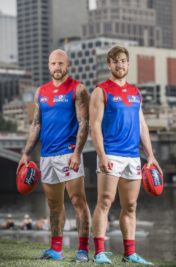
Royal blue Dees guernsey described by the AFL as one of two clash jumpers. We know they're never perfect with the terminology. But does this mean a white variant remains? Or are they referring to the redback?

 
Demons' new strip. (Presumably away or clash.)

I like it.

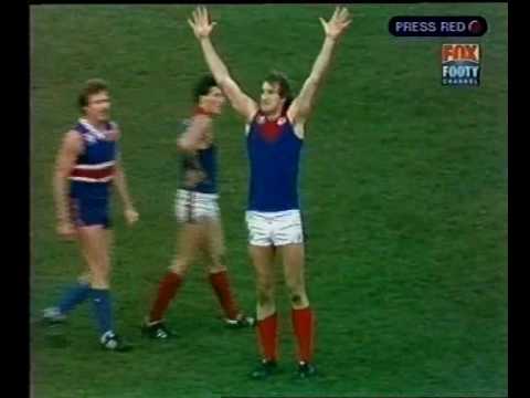
Plus, old Dees fans may think Todd's come out of retirement.

26991683_10155072444476440_576009197386324139_n.jpg
I thought I was looking at a couple of the Bulldogs players for a moment! Not a good idea - why have Melbourne gone for royal blue - never thought that was one of their original colours?
 
Really hope Melbourne remove the blue background from the Zurich logo on their guernseys so it will look like the old AHG one.

screenshot-thedemonshop.shopdesq.com-2018-01-23-14-19-05-999.png

screenshot-www.google.com.au-2018-01-23-09-21-56-024.png

Hopefully they're only using a heat-pressed logo sticker as a short-term fix whilst the new guernseys are in production.
 
Royal blue Dees guernsey described by the AFL as one of two clash jumpers. We know they're never perfect with the terminology. But does this mean a white variant remains? Or are they referring to the redback?


Red back


Sent from my iPhone using Tapatalk
 

(Log in to remove this ad.)

Was worn from 1975-86


IIRC that lighter shade came about due to the introduction of colour TV.

The brighter colours for the newly minted colour TV helped each team stand out.

Yellow shorts for Richmond.
Red shorts for Essendon too.
 
I thought I was looking at a couple of the Bulldogs players for a moment! Not a good idea - why have Melbourne gone for royal blue - never thought that was one of their original colours?
That's like saying Geelong look like Carlton. The big red yoke should help you :p
 
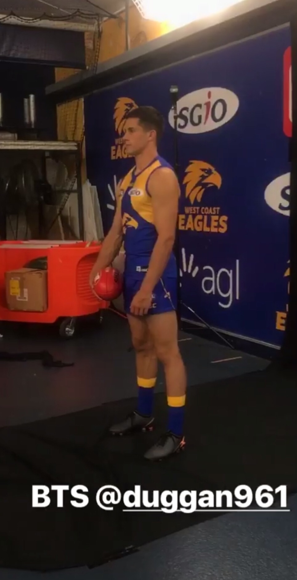
the eagle head in the middle of the stripe ruins the look of the shorts.
Other than that the kit looks mint
Yeh looks a bit weird. Could well be a fold in his shorts making appear like that. Will reserve judgement until a proper view can be seen.
 
Status
Not open for further replies.

Remove this Banner Ad

Back
Top