


I have absolutely no problem with that.Starting to think there might be one-colour restrictions on collar logos?
Navigation
Install the app
How to install the app on iOS
Follow along with the video below to see how to install our site as a web app on your home screen.
Note: This feature may not be available in some browsers.
More options
You are using an out of date browser. It may not display this or other websites correctly.
You should upgrade or use an alternative browser.
You should upgrade or use an alternative browser.
News New Jumpers for 2023
- Thread starter TheLoungeLizard
- Start date
- Tagged users None

Jack Stevens
#2 Ticket Holder
We are going to be mercilessly bullied by the 28 year old male.Mosh is StKildas collar sponsor
View attachment 1597335
- Mar 30, 2014
- 2,606
- 4,273
- AFL Club
- Brisbane Lions
- Other Teams
- Dolphins, Seattle Kraken
Ooof, that's woeful - feel like i'm looking at a local club and not an AFL team. Bring back Dare!Mosh is StKildas collar sponsor
View attachment 1597335
Bjo187
Premiership Player
- Apr 30, 2020
- 3,189
- 4,202
- AFL Club
- Essendon
Looks like a woman's sports bra from the back.
- Sep 30, 2015
- 3,225
- 4,984
- AFL Club
- West Coast
Reminds me of Melbourne's away guernsey.Second training jumper for the Lions. Very nice!
View attachment 1594723
- May 3, 2004
- 643
- 1,210
- AFL Club
- Geelong
The placement of the crest on St Kilda's jumper is horrible on that jumper
The black box could be moved a tiny bit to the right so the black panel's edge is clean. Instead, a little part of the crest has crept into the white space, and it just looks sloppy
I also don't like the back of Geelong's jumper. I just want milk that tastes like real milk
The black box could be moved a tiny bit to the right so the black panel's edge is clean. Instead, a little part of the crest has crept into the white space, and it just looks sloppy
I also don't like the back of Geelong's jumper. I just want milk that tastes like real milk
Could be given at least in the Suns case. The logos of @Realty was all white not with the black box and blue '@' like the coaches shirt and no blue box on the plungie logo.Starting to think there might be one-colour restrictions on collar logos?
- Mar 30, 2014
- 2,606
- 4,273
- AFL Club
- Brisbane Lions
- Other Teams
- Dolphins, Seattle Kraken
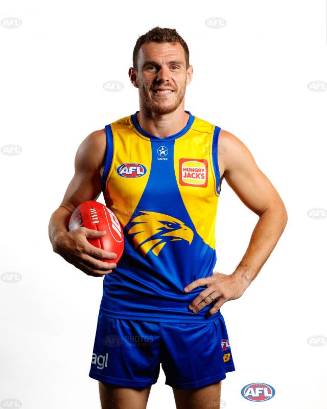
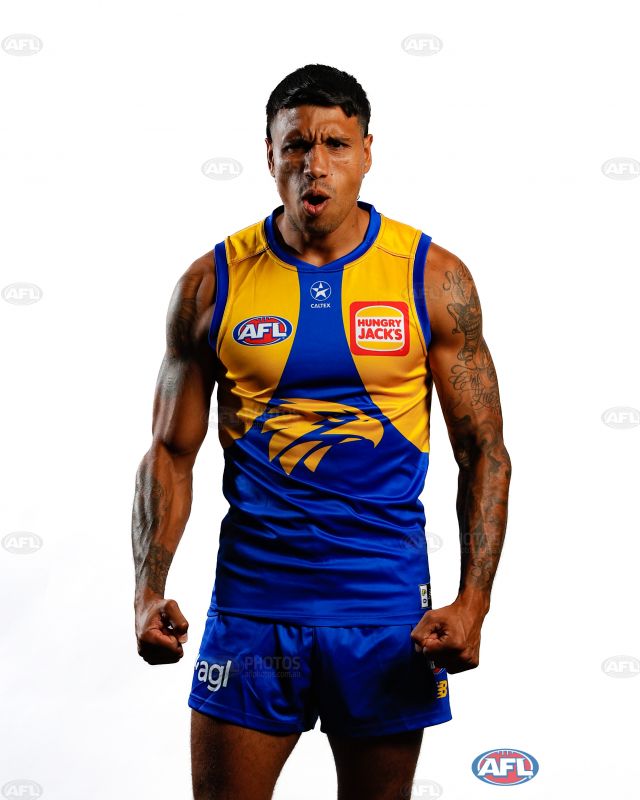
Caltex is multi-coloured though for the WeaglesCould be given at least in the Suns case. The logos of @Realty was all white not with the black box and blue '@' like the coaches shirt and no blue box on the plungie logo.
- Aug 25, 2014
- 7,718
- 11,772
- AFL Club
- Richmond
Better look at the home.
- Mar 30, 2014
- 2,606
- 4,273
- AFL Club
- Brisbane Lions
- Other Teams
- Dolphins, Seattle Kraken
Is that an early version or only a player issue?
Better look at the home.
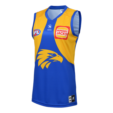
West Coast Eagles New Balance Men's Home Guernsey (2024)
The West Coast Eagles SuperStore is the only place to shop to ensure that 100% of the profits from merchandise sales remain with the club
 wcesuperstore.com.au

You can tell this version with the coloured caltex has been photoshopped. The white version is a the actual version.Is that an early version or only a player issue?
View attachment 1597730West Coast Eagles New Balance Men's Home Guernsey (2024)
The West Coast Eagles SuperStore is the only place to shop to ensure that 100% of the profits from merchandise sales remain with the club
RedmanWasHere
Rarely in kitchens at parties.
- Aug 23, 2010
- 26,877
- 29,610
- AFL Club
- Essendon
- Other Teams
- Exers, Gryffindor, Rich+Ess AFLW, Tassie
Better look at the home.
This has to be photoshopped.
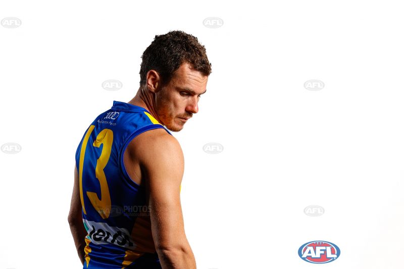
Shuey has shorter hair now.

- Mar 30, 2014
- 2,606
- 4,273
- AFL Club
- Brisbane Lions
- Other Teams
- Dolphins, Seattle Kraken
Except it's also this way on the training kits and the away kitYou can tell this version with the coloured caltex has been photoshopped. The white version is a the actual version.

Yeah I’ve got one those blue training guernseys, Caltex logo is coloured
saints confirm what we saw yesterday
This has to be photoshopped.
Shuey has shorter hair now.
There’s a video on the Eagles Instagram page that shows multiple players, all have the Caltex logo in white. I saw retail versions at the team store with the coloured logo though, so must’ve been a last minute change?
blackbelair
Senior List
- Jun 29, 2021
- 299
- 248
- AFL Club
- Sydney
saints confirm what we saw yesterday
Yuck - confirmed worst jumper for 2023?
Rubber Arm
AFL Sucks
- Oct 10, 2018
- 1,643
- 3,575
- AFL Club
- North Melbourne
- Other Teams
- ^ I don't actually go for North.
I just noticed that the AFL logo on the saints jumpers don't sit nicely in the red panel 

But that's the thing.
Saints fans want a bigger white panel. They get it.
Then they want a bigger Saints logo. They get it.
Now people are not happy that both encroach into the white panel.
What do people want/expect with this design?
Saints fans want a bigger white panel. They get it.
Then they want a bigger Saints logo. They get it.
Now people are not happy that both encroach into the white panel.
What do people want/expect with this design?
- May 28, 2010
- 1,712
- 2,136
- AFL Club
- West Coast
Player issues appear to have all-white Caltex logo now, retails would have been printed before. Will be interesting to see if theey update the retails once first wave of stock sells out (if it even does).Is that an early version or only a player issue?
View attachment 1597730West Coast Eagles New Balance Men's Home Guernsey (2024)
The West Coast Eagles SuperStore is the only place to shop to ensure that 100% of the profits from merchandise sales remain with the club
Big question is was the change from Caltex or the AFL?
But that's the thing.
Saints fans want a bigger white panel. They get it.
Then they want a bigger Saints logo. They get it.
Now people are not happy that both encroach into the white panel.
What do people want/expect with this design?
I thought the point of all 3 (+ the pin stripping on the cuffs and collar) are nods to saints jumpers of the past as its their 150 year
- Mar 30, 2014
- 2,606
- 4,273
- AFL Club
- Brisbane Lions
- Other Teams
- Dolphins, Seattle Kraken
saints confirm what we saw yesterday
It reminds me of the demons with their encroached v/yoke
Similar threads
- Replies
- 175
- Views
- 14K
- Replies
- 2
- Views
- 690
