News New Jumpers for 2024

Remove this Banner Ad

I use to see that uniform on a lot of "worst guernseys ever" lists, so I'm not sure why people think it was a shoe in to win. It'd be like expecting the Power Rangers Hawthorn guernsey to win a popular vote against other uniforms.
BF is a hive of contrarianism when it comes to the ochre. I don't think the wider fanbase cares for it even a fraction of what you see here.
 

Log in to remove this ad.

our red is getting more pink also
I'm glad I'm not the only Melbourne supporter who thinks this. Our colours when studied properly are horrific and they have been this way for years. The last time our colours were right in my opinion was the 150th guernsey in 2008 and maybe 2009. They haven't been right since we were with Reebok. I despise New Balance and wish we would ditch them. I love Mero's work more than anyone but I know for a fact the colours he has on the footyjumpers site for us aren't right. They've had this faded pink look for years now.
 

sdnr-web.png


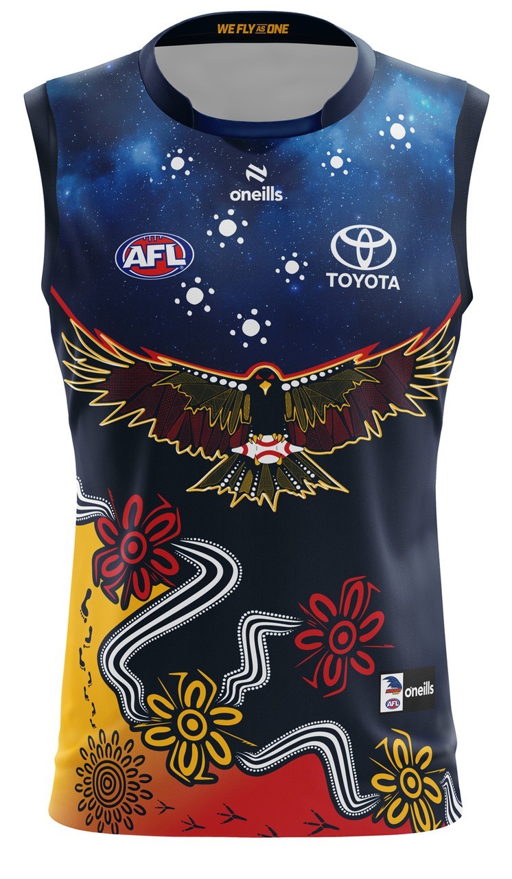
Crows_guernsey_front__74443.1710466163.jpg

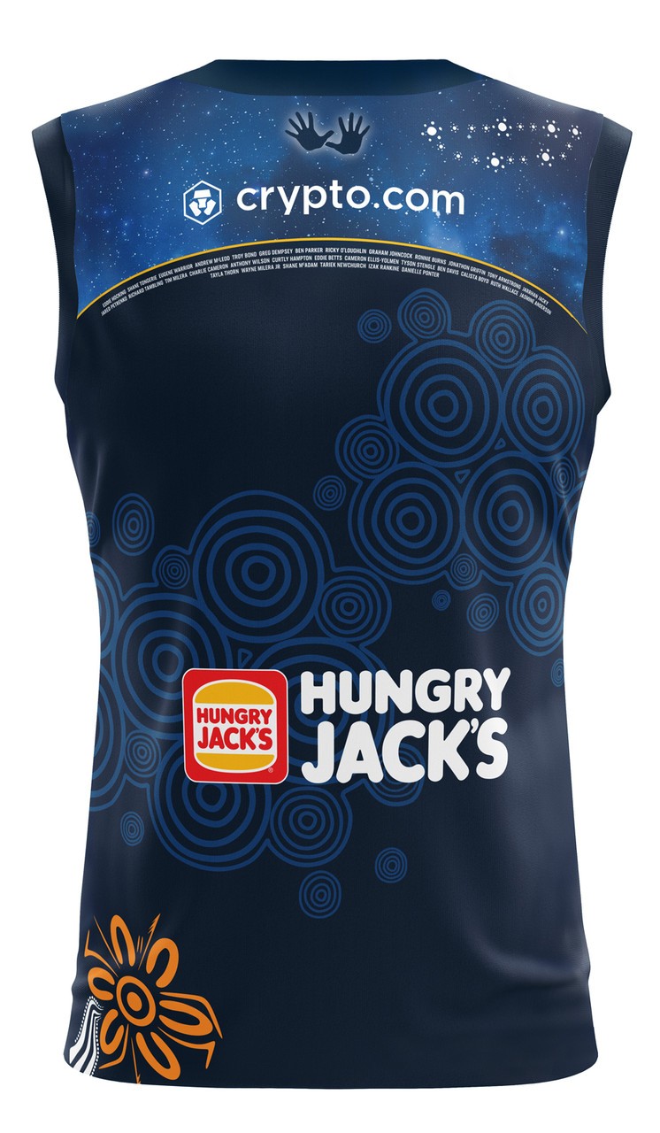
Crows_guernsey_back__90790.1710466163.jpg
 

sdnr-web.png


Crows_guernsey_front__74443.1710466163.jpg

Crows_guernsey_back__90790.1710466163.jpg
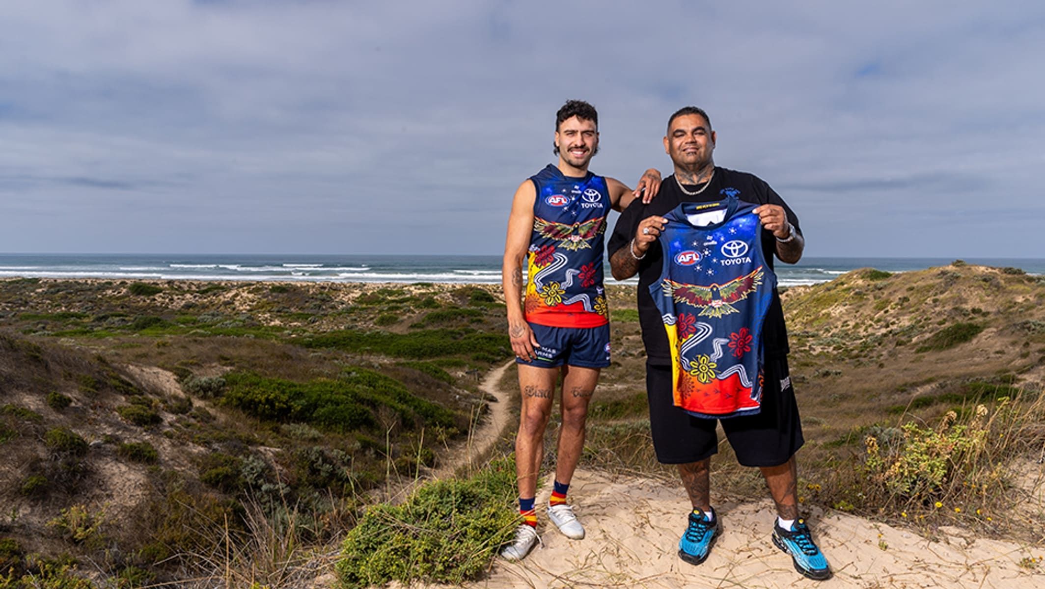
Ordinarily I probably wouldn’t be huge on this in the same way I didn’t really like Hawthorn and West Coast’s last year despite them being some of the most popular. That being said, the Crows have nailed this just like they usually do and it’ll probably end up being one of the best in the league. Love the starry night sky and how it fills the space but also looks very eye catching in a good way in the actual photos. Hope it looks that good on field as well. Also looks like it’s been announced early because the Crows will need to wear it against North Adelaide who also wear a red jumper.

The Crows play Collingwood away who I think we saw a white based jumper for, and then West Coast at home who will definitely rock their light jumper. Whether they end up wearing that at home as well is another question.
 

(Log in to remove this ad.)

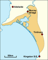
That is a stretch and a half. The only thing similar to the coastline is the design going diagonally down to the bottom right corner 😛
Actually I don't think it's too much of stretch given the artwork is symbolic of Rankine coming back home to SA.
(From the article unveiling the jumper)
1710485494601.png
If I had to guess, the four meeting places on the jumper (the symbols that are similar in shape to a flower) might be Adelaide in the top left, Gold Coast to the right (obviously brought a lot closer because it can't exactly be to scale) and then the other two could be something to do with the location of the Ngarrindjeri people.
1710485826602.png
 
View attachment 1933646

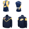
West Coast will wear a 1995 navy wings throwback in Gather Round vs Sydney.

Will be interesting to see if the gameday jumpers feature the retro AFL logo
s**t I can’t believe I’m saying this but I’m glad it won. With the old AFL logo and the HJs sponsor that looks absolutely elite. Hard to see how that gets topped this year tbh. Shockingly and pleasantly surprised
 

Remove this Banner Ad

Back
Top