- Jul 8, 2017
- 21,803
- 64,231
- AFL Club
- Richmond
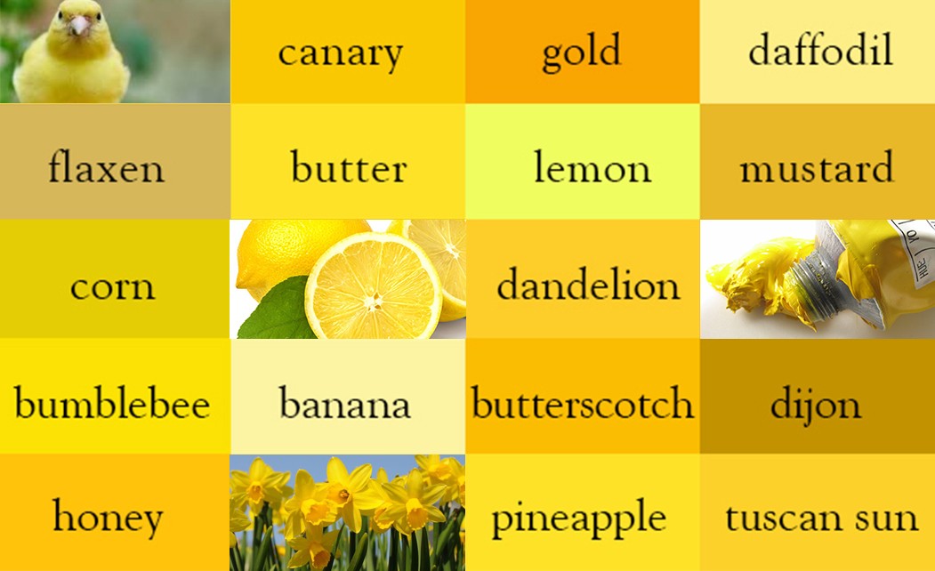
Butter or bumbleee
Follow along with the video below to see how to install our site as a web app on your home screen.
Note: This feature may not be available in some browsers.
Butter or bumbleee
Yeh looks good when I go see em play. Lolthese campaigners have the perfect yellow
not too dark , not too bright and no nasty fluro tinge
View attachment 1790822
didya find a Werribee scarf and keep it?these campaigners have the perfect yellow
not too dark , not too bright and no nasty fluro tinge
View attachment 1790822
latest membership email
I have never seen them photoshop that hard back into traditional yellow. maybe its coming back for 2024
View attachment 1824372

You’re fought the good fight for long enough. It’s time the club rewards your perseverance with a traditional yellow with zero sponsorship on it.latest membership email
I have never seen them photoshop that hard back into traditional yellow. maybe its coming back for 2024
View attachment 1824372
#weareeveryonesgrandfinalgeelongmafialooks like cotton on got confused by the green nib and fluro and made a mistake. even the tiger logo is fully green
some players are wearing standard yellow


this is from the rioli 150 video on social media. the club photoshops the rancid fluro "yellow" back into the traditional Richmond yellow on every promo pic/vid on social media. they do it all the time
this would indicate the club prefers the traditonial yellow over the rancid fluro "yellow"
time to bring the traditional yellow back permanently and then rfc won't have to photoshop the fluro out of our sacred yellow sash
photoshopped richer yellow (this yellow is farrken perfect, it's not too dark and it's not too light. theres no fluro tinge... this yellow is perfect !! :
View attachment 1706871
but it's photoshopped by the club !! unfortunately it doesn't look like this in real life, it looks like hi vis fluro workwear..
View attachment 1706879
gif is from this vid:
Current jumper ‘ yellow ‘ was decided by Louie .more photoshopping back into the traditional yellow
hurry up and just change it back
if the rancid fluro yellow was that good you wouldnt photoshop back to what we obviously prefer
View attachment 1830926


nah nib is horrendous on our sashSponsors love it, they love how their logo is completely eclectic to the jumper, it stands out.
But we also despise it cause of how ugly it looks.
Jeep was the best sponsor purely for how legit that logo blended in with the jumper. Couple of other good ones like Motorola spring to mind, but the Latitude is horrific.
I feel the NIB one has made some improvements