Tutorial The Microsoft Paint/Word Tutorial

Remove this Banner Ad

Apr 28, 2007
1,932
327
Melbourne
AFL Club
West Coast
Other Teams
Subiaco — West Ham
How to make a professional-looking Footy Jumper using only Microsoft Paint and Word

Now I must warn you, it is quite a read. I have taken the Gibbsyspin approach, and spelt it all out as though I am teaching aliens :eek:. But it is designed to help you guys out in the best possible way.

Thank you for your patience, and enjoy! :footy:


--------------------------------------------------------
1. Planning and Preparing

1.1 What you need
As the title suggests, all that is needed to make professional-looking jumper designs is good old Microsoft Paint and Microsoft Word. MS Paint is probably something you’ve played around with before as it comes as standard with most versions of Windows; but you may have found it clunky, scrappy and amateurish. Technically speaking it is a simple bitmap-editing graphics software, dealing only with aliased images (more about this later); however by nature it is extremely controllable and, with experience, relatively easy to work with. Word is obviously part of the Microsoft Office collection, and most PCs would have it installed. Although its primary function is processing documents, there are certain tools that are useful when it comes to designing. I realise other components of the Office suite (Publisher, PowerPoint etc) can do the same/similar things required of this tutorial – that's cool; but for the sake of familiarity (most use this application frequently) and size of the clipboard available, I will use Word here.

Now, I have Windows Vista installed on my PC, therefore I use the Vista version of Paint. It has several advantages over the Paint we see in XP – a much nicer default colour palette, an increased number of undo levels (10 times instead of 3), a zoom slider (which can zoom OUT – extremely handy), and a crop function. I don’t know if it’s available on teh int3rw3bz for download, but I highly recommend this program over the XP one! For those of you lucky enough to have Windows 7 – I hear the Paint on that is in another league entirely, so this might be a bit of a backwards step! When (if) I get W7, I’ll let youse know and post another tutorial. Naturally, I am also using Word 2007, which is part of the Vista package. The interface might appear strange and foreign to XP users – it is – but the basic functions are all the same. Those of you with Office/Word 2003 may have to look around a bit to find the various tools you need.

1.2 Developing your idea
Before you start your design, you should have a good idea in your head as to what you are going to make. I always make a small, basic drawing on paper of my ideas, particularly for the Away Guernsey and Kit of the Week competitions.

For competitions like these, you may need some inspiration. Mero’s famed footyjumpers.com is a brilliant resource, where you can find every single jumper worn by every VFL/AFL team. It also contains all the official logos, which can be very handy when designing jumpers.

AFL Clubs’ Wikipedia pages are other useful links, with high-resolution logos and historical information that you can use for inspiration. The former, along with stuff from footyjumpers.com, are important in your design process colour-wise... more about that later.


2. Templates

2.1 Teams and their manufacturers
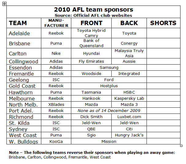
Here is an updated list of the 16 AFL teams and their respective clothing sponsors. Use this guide when selecting what template (below) to use:
• Adelaide – Reebok no. 2
• Brisbane – Puma
• Carlton – Nike
• Collingwood – adidas no. 2
• Essendon – adidas no. 1
• Fremantle – Reebok no. 1
• Geelong – ISC no. 1
• Gold Coast – Reebok no. 2
• Hawthorn – Puma
• Melbourne – Reebok no. 1
• North Melbourne – X-Blades
• Richmond – Reebok no. 1
• Port Adelaide – Reebok no. 2
• St Kilda – ISC no. 1
• Sydney – ISC no. 2
• West Coast Eagles – Puma
• Western Bulldogs – KooGa

2.2 Template files
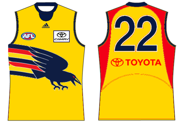
Here they are – the 2010 AFL jumper templates for Paint. Now, you may think “Hey, that isn’t what they look like when he posts them on BigFooty”, and you may be wondering what all those complicated different shades of grey are for – don’t be startled! By following this tutorial, I will show you how to turn these templates into works of art ;).

You can see that they are all based on the same jumper shape but with slight differences according to the manufacturers. I have tried my very hardest to get all the collars, cuffs, panels and short-stripes as correct as possible. Please tell me if there are any inaccuracies that you can see, and I will gladly update them.

It is important to note to people that may have used my templates previously (cory, aidan :p) that these are all slightly different, with updated collars/cuffs, shifted-up AFL logos and no numbers (to be explained later on).

For everyone to note, the AFL logo that features on the jumper and shorts of every template contains white (including the outline) that is slightly off-white. This is to help you in processes detailed later on.

• adidas (no. 1)


  • adidas (no.2)

• ISC (no.1)


• ISC (no.2)


• KooGa


• Nike
footyjumpertemplatenike.png
[/URL]

• Puma


• Reebok (no.1)


• Reebok (no.2)


• X-Blades


(NOTE: the difference between Reebok and ISC’s 1 & 2 is the side panels – some teams choose to have them, some don’t)

2.3 Saving and opening the templates
With the files above, I would recommend saving the ones you need on their own for future access by right clicking and selecting “Save Image”. I have them in their own separate folder named “Footy Jumper Templates” – it’s up to you. Make sure they are saved to your computer as bitmap (.bmp) images, so you can readily open and edit them in paint.

If you have saved them correctly, it is now just a matter of starting up Paint and opening the particular file. When starting a new design, I ALWAYS keep a blank copy of the template I am using in the top left corner – you will need it, trust me.

The features of these templates will be outlined in the following chapters.
 
Apr 28, 2007
1,932
327
Melbourne
AFL Club
West Coast
Other Teams
Subiaco — West Ham
3. The Jumper
For this tutorial, I am using my entry to the Away Guernsey of the Week Round 12 competition as an example.

3.1 Base colours
Along with a copy of the template, I have some squares with the colour palette I am dealing with present at all times on the clipboard. I make sure I have the CORRECT colours to use – there is little more off-putting than a poorly-coloured jumper when selecting my vote for the AGOTW and KOTW comps. For this reason I urge you to NOT use the default colours on the bottom of your screen. Yes, if you double click any of these colours you can change them manually, but this custom colour palette won’t be there when you re-open the file.

So, please, use the resources mentioned in 1.2 to get a good image of the official logo/jumper so you can select these proper colours using the “dropper” tool. You can see here how I’ve started my design.


3.2 Shapes & Designs
So, you’ve got an idea in your head (and maybe on paper), you’ve started on the template and selected your base colours. Now for the fun part – designing! I have attached below some basic designs that you can place on top of the template to incorporate in your design. Make sure you have your background colour as white (right click white on the colour palette), and make it transparent by clicking on the second option down that appears on your left-hand toolbar.


• Sash


• Wide “V” (this can also be use as a yoke for Melbourne and Sydney jumpers)


• Narrow “V”


• Hoops


• Stripes


• Pinstripes


These graphics fit all the templates, but overlap in some parts due to the differences in collars/cuffs/panels. Simply copy the original template you should have left in the top left-hand corner and paste it, with a transparent white background, over your design again by carefully lining it up with the pixels in the background. Colour out the excess bits, and there you have your template with basic design. You can see here how I’ve added some pinstripes to my yellow jumper, “replaced” my template and got rid of the lines I didn’t want.


Obviously, you can also apply these shapes to the back of the guernsey as well (use Image --> Flip/Rotate --> Flip Horizontal to flip the sash for the back).

Use these shapes as a guide – but feel free to create your own design using the various tools like lines, curves, circles – whatever!

After this step, you may want to colour in these new features – I haven’t because there is more to add to my design.

3.3 Handy Designing Tips
I thought I might share some little tricks here that I have found with my experience with Paint...

When drawing lines using the Straight Line tool, hold down the Shift button on your keyboard to draw perfectly straight vertical, horizontal and diagonal (45 degrees) lines.

Do the same thing when drawing ellipses and rectangles to draw perfect circles and squares every time.

If you have selected an object, you can “stamp” it onto the clipboard by pressing the Control button on your keyboard.

When you want to change large fiddly amount of one colour into another, save time by have the original colour as you background colour, drawing a large rectangle of the colour you want to replace it with next to it, and drag your drawing over the top of this new colour. This is explained in detail in 3.9.

3.4 Adding Team Logos
Now that you have your basic design, you can add more complex graphics as you desire. The way you do this, where you place it, and the intricacy of the emblem can range from the simple to the extremely challenging – I have chosen a fairly simple application for the purposes of this tutorial.

I have chosen to use a monogram I found on footyjumpers.com, and I wish to place it in the middle of my guernsey.


I now copy this image onto Microsoft Word, where I have a blank document ready to go.

Now, here is the tool that will become your best friend. In the case of Word 2007 users, double-click the image and select Recolour in the Picture Tools ribbon. A drop down menu will appear, where you now choose “Black and White” under the Colour Modes. Why, you may ask? Well, this tool not only changes the colours of the image – it makes the image become aliased, or “blocky/pixelated”. This allows us to easily edit the size and colours in Paint, being a bitmap image editor. Trust me; this is an extremely useful tool, and one that I use in almost every single jumper that I make.


Now, I want to slightly increase the size of my monogram – no problem. Just increase the size of the image as required in Word, cut and paste the larger image onto you Paint clipboard, then copy the image from there back onto the Word clipboard where you recolour it again to black and white to have it aliased. Copy this back onto Paint and you’re ready to go.


Now that I have my logo aliased and resized, I will use the Invert Colours tool under the Image tab to make the logo black (don’t worry, I’ll change it to brown in due course). Now, with white as the background transparent colour, I position it on the jumper.


3.5 Numbers
I believe that with all the activity this board has had since its movement/renaming/independence, designers should start placing their own “trademark” on their designs.

I tried to find that same font that his website chronicles as the authentic font across most teams. The best I could come up with is Helvetica Narrow Bold, which I had to painstakingly trace over its character map (you actually need to buy it to use it).


Obviously, open up a new paint file and copy/paste the above image onto there. Select the number/s you want to put on there – your favourite player, lucky number, 69, whatever – and paste them individually on the templates. You can see how I’ve left a grey “guide-box” on the back of the jumper templates, the numbers should fit perfectly between those lines. Use your own judgement to make sure they are relatively centred! In my case I’ve chosen 16 – just a number that has always been “lucky” for me.


Once you’ve done that, you can get rid of the guide-box and colour the numbers and their outlines. I have left a 2-pixel thick outline on each of the jumpers – use them as you wish. With this jumper, I don’t need them, so I filled them in brown also.


(NOTE: I must admit I did try placing little AFL logos at the base of each number as they are in real life. However, this proved a real hassle, and I couldn’t make the logo small enough without making it unrecognisable. Trust me, it looked like a spotty blob!)
 
Apr 28, 2007
1,932
327
Melbourne
AFL Club
West Coast
Other Teams
Subiaco — West Ham
3.6 Neck Characters
As you may be aware, some merged/renamed/relocated clubs like to place certain initials on the back of the neck of their playing strips. I have recognized this trend by allowing for you to place characters here, as you can see from the little white panel above the number panel.

Use the font Impact set at size 11 and it should fit right in the box (you must be in the original zoom setting in order to type text). You can’t change the colour once you have “set it” (text is automatically anti-aliased), so make sure you select the right colour of the background and text the first time by using the dropper tool.

For your information, here is the list of current neck characters on AFL teams:
• Brisbane - BBFFC
• Port Adelaide – 1870
• Sydney – SMFC
• Western Bulldogs – FFC

For those designers who are more adventurous, you can even place images in the box, like Adelaide's crow a few years back and Fremantle's anchor this year.

Here, I decided to add “HFC” to the neck on my jumper, here’s how it turned out:


3.7 Gradients
I’ve decided to have a gradient in my design – where it fades from one colour to another. This is another skill that requires the assistance of our good friend Word.

Now, you may have noticed on the colour palette I put onto my clipboard, there were two different shades of yellow. For the record, one was the goldy-yellow from the current Hawthorn jumper, whilst the other was the brighter shade we saw in the jumper from 1998-2005 (thanks to footyjumpers.com).

I have these colours on Paint – but how do I get them onto Word so it can make a gradient out of them? Here is another little handy trick: use the “dropper” tool in Paint to select one of the colour you want to use; click on the “Colours” tab up the top, then “Edit Colours”; in the window that opens up, click on “Define Custom Colours>>”. This will take you to the full colour spectrum where you can see the properties of your selected hue.


Take note of the figures given for “Red”, “Green” and “Blue” (in this instance 255, 214 & 0). Back in Word, create a rectangle under the “Insert” ribbon. When choosing the shape fill, make sure you select “More Fill Colours”. This will bring up a new window; go to the “Custom” tab, where you will see the same spectrum as in paint. Simply type in the Red, Green and Blue values from before you should come up with the exact same colour you desired. This colour will now be saved to your “Recent Colours” under Shape Fill.


Repeat this process for your second colour. Now you have both colours in the temporary palette, you can begin the gradient. In Paint, select a sample of the portion you wish to gradient and copy this to Word for reference. Now, make your rectangle in Word approximately the same height, in my case (width doesn’t affect a horizontal gradient), as the area you wish to colour.


Next, select Shape Fill --> Gradient --> More Gradients. This will open up a window in which you select the Two Colour option and choose the custom colours you have “created”. Select what type of gradient you want, horizontal in my case.


You should now select No Outline around the rectangle. Because I want my gradient to be on the back and the front, I extend my rectangle’s width to accommodate the back as well. Copy and paste your rectangle onto the Paint clipboard close to your designed jumper.


Now you need to fill the bits where you want the gradient to appear in a completely new colour. It doesn’t matter what it is – it will only be there for a minute! For instance, I don’t want the collar, cuffs and shorts with this gradient, so I don’t fill them in.


Make the same colour your background colour as well. Then, select the entire design and move it over the top of the gradient rectangle with your background transparent. Your gradient should now be showing through where the random colour was. Change your background colour to white again, get rid of the coloured rectangle the jumper “left behind”, and hey presto, you have a nice clean gradient on your design!


3.8 Collars and Cuffs
Now it’s time to colour your collar and cuffs. This relies on person discretion, depending on the design. I find that with my design, particularly because I plan to use gold socks and shorts, brown is needed on the collar and cuffs to complement and “frame” the central monogram. Filling them in is self-explanatory – the only thing I have to comment on is to pay particular attention to the manufacturer’s logos in/around the collar. In most cases, they should be black or white, depending on the background. Just make sure that all pixels of the lettering and symbols are coloured.


3.9 Finishing/Tidying Up
Ok, now to add the finishing touches on your design. Firstly, any colours you haven’t put in need to be filled. I outlined a tip in my Handy Tips which helps with colouring large fiddly sections quickly and easily, a process similar to the one we followed in the Gradient section.

Draw a large rectangle of the colour you want, brown here, and make the unwanted colour, black, the background (right click).

Select the whole design and drag it over the rectangle and there you have it.


You many notice that my pinstripes have are discontinuous on the back due to the replacing of the template. I used the Shift button with the line tool to fix this quickly.


If you go over/outside the lines (no star sticker for you today ;)), make sure you use your original template to fix it up.

Other than that, your jumper part of the design is complete. Well done!

4. The Shorts
Now for the easy bit – the stubbies.

4.1 Base colour
Shorts are obviously one main colour – unless your Carlton of 2007 – and are generally a solid hue (though we have seen gradients with Melbourne in 2008). Their colour should compliment the jumper in colour, as mine do with my Hawthorn design.


4.2 Manufacturer Lines
A prominent feature these days with the shorts is the stripe designs manufacturers place on the sides. I have tried to get these as accurate as possible – again, any inaccuracies, let me know! Fill them in with the secondary colour, ie the one not used as the base colourm, on front and back where applicable. Note that with ISC’s, there is an option to have 3 different lines; St Kilda have red, black and white on their black home shorts and red, white and black on their white away shorts.

With the golden shorts, I decided to obviously have brown Puma lines. Don’t forget to colour in the manufacturer’s logo, too.
 

Log in to remove this ad.

Apr 28, 2007
1,932
327
Melbourne
AFL Club
West Coast
Other Teams
Subiaco — West Ham
5. The Socks
You will have noticed by now the extensive grey detailing in the socks. These aren’t there to scare you – they are there to help you! By following these instructions, you can make almost any sock you can dream of, without having to touch the line tool yourself.

5.1 Monocolour
We’ll start with the simplest. Using the fill tool, colour every “panel” in the colour you choose.


5.2 Tops Only
West Coast have made this type of sock famous – simply colour in the fold a different colour to the rest of it.


5.3 Seven-stripe
One of the most common designs, this sock features 3 coloured sections on another 4 of a different colour (Geelong, Essendon, Richmond). Alternatively, you can alternate 3 or more colours in this pattern, ala St Kilda or Adelaide.

This pattern is easy to identify on the template – the darker and lighter shades classify these stripes. Here is an example.


5.4 Nine-stripe
Similar to the seven-stripe, this one contains hoops of alternating colours, as used by Sydney, Fremantle (away), Hawthorn and North Melbourne (clash).

This one is a little trickier to see – starting from the top, the “fold” remains all one colour. Ignoring the seven-stripe guides, look down from the fold and the first break in, shade in your first stripe. Use this width as a reference to find the rest of the stripes. As a guide, you can see that a subtle change in darkness indicates a new hoop.

Since Hawthorn use this design in their home socks, I chose to use this pattern with my entry – this time using a technique made famous by top poster InCase (thanks mate!), that is alternating light/dark shades of the same colour (I used the same colours that we see in the jumper gradient). Here is how I did it.


5.5 Middle-stripe
This is a modern trend with away/clash kits. The light hoop that you can see in the middle of the template (as used in the 7-stripe) also has 3 lines either side of it in the darker sections for you to add some extra colour to it, ala Adelaide/Port Adelaide/Carlton.


5.6 Tops Revisited
On the fold you can see 8 smaller lines in alternating shades. These can help you if you wish to create socks akin to Brisbane, Western Bulldogs and Gold Coast.


5.7 Miscellaneous
As I stated in the intro, you can make almost any sock you wish. This includes Fremantle’s strange looking home sock, Collingwood’s clash one and even those soccer-inspired ones that sometimes make an appearance from yours truly in the KOTW/AGOTW competitions.

Be creative with your designs! Nothing is stopping you from experimenting with vertical lines, images, gradients...

5.8 Bottoms
The bottoms of the socks, ie. where it is inside the boot, can be designed two ways. Some people choose to leave them white, some choose to colour them. It’s really up to you – now that I have thought about it, most if not all manufacturers colour their bottoms these days with the new materials. I just like the looks of white - I've always done it like that.


6. Adding Logos
This step is entirely optional. Sometimes adding logos makes them look more professional and complete; sometimes its clutters the space and distracts from the actual design.

6.1 Sponsors Gallery
*THIS IS CURRENTLY UNDER DEVELOPMENT. I WOULD APPRECIATE ANY INFORMATION REGARDING YOUR TEAM’S (AND OTHER’S) SHIRT/SHORT SPONSORS FOR 2010 TO SPEED UP THIS PROCESS!*

6.2 Locations
Once you have the logos selected, copy them to your Paint clipboard. I have neglected to use guides on the templates this time around, as I believe with the above gallery specifying the right sizes, most of the hard work has been done. All you need to do now is move these onto the jumper and shorts. Use common sense and good judgement to position them correctly – the front shirt sponsor in line with the AFL logo, just to the left of the edge of the right cuff. The biggest logo is clearly for the back of the jumper – place it just underneath your number/s; make sure it is centred! Finally, the short sponsor logo should be on the left leg, on the left edge just above the bottom. Take note of any manufacturer’s lines – they should not be touched by the sponsors logo.


7. Resizing
You’re on the home stretch. Now for the step that makes it look like you haven’t touch Paint at all. Get ready to anti-alias...

7.1 In Word
This is the process that I use. On a new Word document (or a blank page on the same one you used earlier), extend the margins out a bit. This is so the entire jumper will fit initially.

Then, simply select your finished jumper design, leaving a reasonable white border around it, and copy/paste it into Word. After making sure that this image hasn’t been restricted in size by the margins, take the bottom corner and decrease the size into approximately a quarter of the original (use the markers place half way for reference).

This should give you a clear, anti-aliased image that looks like it has come out of Photoshop. Copy/paste it into a NEW Paint file, making sure the clipboard is resized around it appropriately.


7.2 In Paint
Alternatively, you can use the slidebar zoom-out tool in Vista’s Paint to do effectively the same thing. Zoom out one factor from the middle, press the Print Screen button on your keyboard (PRTSC), and paste this into a new Paint file.

In this new clipboard, select the jumper design, copy it, select “File --> New” (don’t save changes) and paste it.

You can see that this creates a final image of a little less quality, particularly around the edges. But some would argue that it is quicker.


8. Saving and Uploading
You’re almost done now! You have your design, you’ve resized it and placed in a new Paint file...

8.1 Saving It
Although this sounds pretty self-explanatory, it needs to be done right to make sure:
a) The picture can upload in the first place
b) No image quality is lost
For these reasons, I always make sure the file is saved as PNG image. This involves clicking on the drag-down tab in the Save As window, and selecting “Save As Type: PNG (*.png)”. Make sure this is done for both Paint files you have made.

As for the file name – I like to call the original clipboard “____ Development”, as the design is in its developmental stage. Thus, to distinguish the finished product from this, the final copy I call “____ Finished”. Again, this is all up to you!

24-bit bitmaps are the default saving type in Windows XP; JPEGs are Vista’s Default.
Often – for some unknown reason – bitmap (BMP) images do not upload with some Image Hosters.
Once an image is saved as a JPEG, it immediately loses quite a bit of its quality – and furthermore, you cannot edit it again in Paint properly.

8.2 Uploading It
There are many different Image Hosting websites around – including Photobucket, FreeImageHosting and ImageShack. I like to use ImageShack, I find it quicker and of a better quality.

Go to imageshack.us, select the image you want to upload through "Browse", check "remove size/resolution bar from thumbnail?", then click upload. Once it’s uploaded, copy the address they give you in the box next to "Hotlink for forums (1)". Make sure you uncheck "Include details".

Paste that address in your post and you're done!


--------------------------------------------------------------------------


Well, there you have it. I hope this will be of some use to the people of BigFooty – I know there are many budding designers out there.

Any questions - feel free to post them in this thread and I, or other Paint Pro’s here, will try to help you out!

Happy Designing :footy:
 

LeeARM

Premiership Player
May 11, 2008
4,667
2,396
AFL Club
Essendon
Excellent job, Smeagle. Not that I've read it yet, but the amount of effort and thought you've put into it (like everything) is amazing.

Personally, I like to get things done as quickly as possible once the idea's in my head but you like to make sure that every little detail is perfect. Although I probably won't use your method, I'm sure you'll give me ideas to use.
 

LeeARM

Premiership Player
May 11, 2008
4,667
2,396
AFL Club
Essendon
Okay, I finished reading it now. I think you've done a great job and haven't skipped on any details. Hopefully paint users read this and we can see an improvement in designs. It should be nice to see.
Someone might be able to Photoshop-ise these templates too (I might even be able to if I try) and we can add shading and layers to them.

Also, I think I'm gonna start using "33" on my jumpers. It was the number I wore in my junior footy years and I think it's pretty neat (as far as numbers go).
So no one take that one!

(Does anyone know if there's a way to smooth out pixelated images? I'm attempting my photoshop-ising idea already)
 

aidancdaman

Club Legend
Aug 7, 2009
1,362
12
Auckland
AFL Club
Essendon
Well done Smeagle. Interesting to see I used to downsize differently, but also through word, then I changed to my secret way;)
 

Gibbsy

Cakewalk
Oct 12, 2009
23,614
27,536
Geetroit
AFL Club
Collingwood
Great effort Smeagle, really enjoyed reading the tutorial.

As for sponsors help, here is my knowledge so far...

25ezgjk.png


The majority of the shorts haven't been released yet, but when news comes to hand I'll update.
 

Tomfoolery

Debutant
May 11, 2009
99
0
Geelong
AFL Club
Geelong
Wow, now that is the best thing this boards had so far, hopefully can improve my jumper making by an amazing amount.

Thanks Smeagle.

On a side note, shotgun 6 as my trademark.
 

(Log in to remove this ad.)

Gibbsy

Cakewalk
Oct 12, 2009
23,614
27,536
Geetroit
AFL Club
Collingwood
I just did a remake of one of my older guernseys using your templates and insightful tutorial.

You helped me turn this shoddy paint job:
2emnbsi.png


Into a really nice looking kit:
znkfx3.png
 

LeeARM

Premiership Player
May 11, 2008
4,667
2,396
AFL Club
Essendon
lol, I found it on the first page of Google when I searched the name of the font. I don't think you were looking hard enough.
 

Gibbsy

Cakewalk
Oct 12, 2009
23,614
27,536
Geetroit
AFL Club
Collingwood
Okay. As Smeagle mentioned in the Numbers section on his tutorial, we will all assign ourselves unique numbers to place on the back of our guernseys when desiging, so we can easily tell whose is who.

What I have already done, and what I suggest you to do, is paste your number in the area on each guernsey and save it as another copy, so you don't have to copy on the number each time.

The following numbers have been decided - post in this thread to confirm yours, and I'll edit this post:

1 - GANTY
6 - Tomfoolery
7 - Furla81
9 - HodgeSlamminSamBox
13 - Gibbsyspin
16 - Smeagle
17 - cory676
18 - gloryandfame
19 - EBUS
24 - Crow_Throw
30 - Aidancdaman
32 - TheCuzEffect
33 - LeeARM
36 - Molons
41 - Headless
50 - StatsFanatic

It's up to you, but I suggest maybe putting your number in your avatar or signature, even your "Other teams" section under your name, just to let people know who you are ;)
 

Remove this Banner Ad

Back