Remove this Banner Ad

Mega Thread The Port Store Mega Thread Part 2

🥰 Love BigFooty? Join now for free.

Hybrid designs are bad on every level.
Simple is best.

BiB is a solid design and has quickly cemented itself as a Port Adelaide guernsey.
PBs are timeless and shouldn't be ****** with. Closest I'd go to adapting them would be the black and silver version posted by Not Again but not sure what the point of them would be.

Interestingly, the black and teal version of the PBs that someone posted here didn't look as bad as I thought but didn't feel like a Port guernsey, where as the black and silver ones do. Maybe it's due to my age and seeing teal as the least Port part of our branding.

There's only one 'Port Adelaide guernsey' to me. BiB is a step up on SBS but it's still a major compromise.
 
There's only one 'Port Adelaide guernsey' to me. BiB is a step up on SBS but it's still a major compromise.

I disagree on this but don't have the time right now to articulate why.
I'll see how I go tonight.
 
I disagree on this but don't have the time right now to articulate why.
I'll see how I go tonight.
This sums it up
a525a4f226f15440ac8aaa52f47d288b.jpg


Sent from my SM-G930F using Tapatalk
 

Log in to remove this Banner Ad

Two important little guernsey tidbits with Ports relevance.

Firstly the new Eagles reveal shows a new AFL number font.

uxJuS8m.png


Secondly we have a confirmed new ISC collar. Should be much better for our rumoured new showdown guernsey.

tXrJpX7.png

I’m really diggin the new collar, it looks very similar to the 2013-15 one. Keen to see the best uniform in Australian football (Cometti 2014) on this template.
 
Two important little guernsey tidbits with Ports relevance.

Firstly the new Eagles reveal shows a new AFL number font.

uxJuS8m.png


Secondly we have a confirmed new ISC collar. Should be much better for our rumoured new showdown guernsey.

tXrJpX7.png

That HJs logo is hideous
 
I have so many issues with that piece.

Interesting. What kind of issues do you see with it? Here's a bunch more of random thoughts about it rather than 'issues'.

- Historical accuracy or inaccurac(ies), including the implication of a single "arrow of time"?

For example, suggesting that we stopped using the "PB" when we started using the "SBS" is both wrong in fact and an incredibly dumb thing to concede to certain hostile entities for nothing offered in return.

- Intentionally or not, making "all guernseys look equal" across time?

There are three natural eras IMO and maybe the simplest modification would show that.

"The Victorians". Legacy, if you like. Yes an overloaded word. But we need something different to "Heritage" to call our "dead" guernseys as opposed to the living ones. Also labeling our oldest groups of guernsey designs as "Victorian" is going to cause so much confusion to 5DoubleCrow type illiterates that it's almost worth it for that alone ;)

"The PBs", the biggie. We should always present these as a group - think ownership, continuity, 'brand' association and recognition vs copyrighting any one design. If Maccas golden arches were built or drawn in different curves over time, human brains would still see the continuity. Now here's a thing. "Heritage" IMO is the right word, poorly used. Correct me if I'm wrong, apart from Collingwood I think we're the only AFL club that still uses what the rest of the competition calls "heritage" guernseys in a living competition week in week out, not just in the occasional "AFL Heritage round". "Heritage" buildings are used and respected. They are not archeological sites as with say the "legacy" group.

The "AFL": adding silver and teal to the existing black and white. It's an addition, not a replacement ;)

- ignoring the "non mainstream" guernseys.

Not so enamored of all our attempts at a "clash".

Then there are the "special editions". I know the "lightning bolt" holds a special place in many folks hearts. And not.

Love to see a line up of all the indigenous geurnseys on there much more interested in that than the "clash" or the "special editions".

Purely as a graphic, I like the thing as it is. That's leaving aside all of my points above. I'm sure it was a labor of love for the folks who did it. The poster could and should be re-imagined and re-issued for 150. It deserves more thought added to "the love".

Your thoughts?
 

Remove this Banner Ad

This sums it up
a525a4f226f15440ac8aaa52f47d288b.jpg


Sent from my SM-G930F using Tapatalk
Well...

Firstly the player on the far left is not a Port Adelaide player but a South Adelaide player. Subsequently there is a follow on error due to this.

Additionally the four different guernseys in the middle were worn over a four year period after WWII.

Why should a guernsey worn for a single year be proportionally worth a space equivalent to 8 years? That four guernsey line after WWII is worth 32 years despite being combined worn for 4.
 

🥰 Love BigFooty? Join now for free.

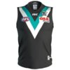
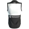
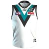
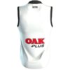
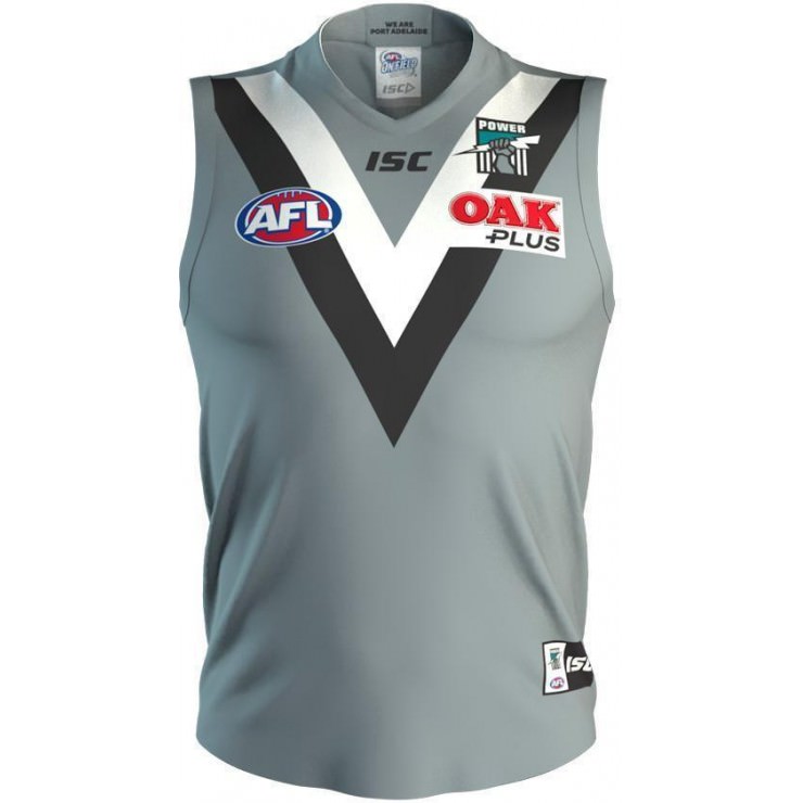
Looks like the 2018 guernseys will land with Oak front and back until the new sponsor is finalised (assuming the Renault logo on the back of the home is an error).

I reckon the away looks awesome with the new black collar and no side panels.
It does look good, but the side panels meant we were wearing black and white stripes.
 

Remove this Banner Ad

Mega Thread The Port Store Mega Thread Part 2

🥰 Love BigFooty? Join now for free.

Back
Top