Thoughts on AFL website? How do you rate afl.com in 2020 ?

Remove this Banner Ad

A couple of random minor things...

Improvement in 2020:

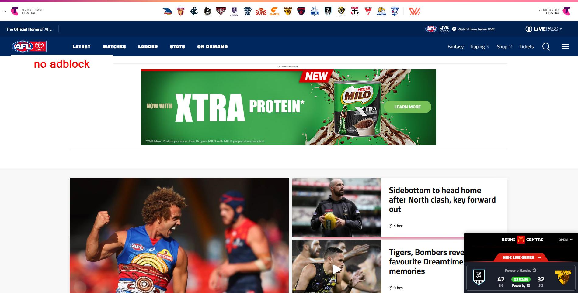
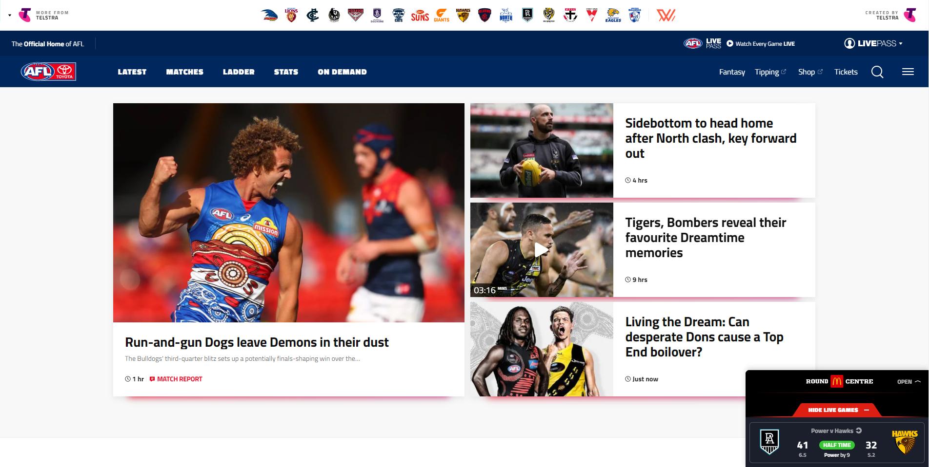
I like the way they've sorted & stored the videos from past rounds. Like a mini-match centre, you can click on the round & game you want and then scroll down to see all the relevant clips for that particular game: the coaches' press conferences, extended highlights of the game, 30 second clips of individual highlights, the "last 2 minutes", etc...

It's not exactly an essential feature. I doubt there's a million people wanting to dig through these clips from previous rounds. But for those who do, it's a hell of a lot easier now than in previous years when you had to click your way back through every goddamn video from every round. Trying to find a video from more than a week ago used to be a pain in the arse. So I'll give them a tick for improving this aspect.


Stats Pro:

I like some of the stats in this section which aren't freely available elsewhere. e.g. pressure acts, contested one on one's, hitouts to advantage.
They allow you to filter any team(s) you like for the previous round and for the current season. But you used to be able to click on a tab for any previous season and view your customised stats table with all players ranked on any column you wanted.. All the way back to 2005, if I recall correctly... I found this to be a useful resource. Why on earth would they take it away? Some of us like charting players' progress from year to year, or discussing a past player's season versus a current day great and comparing their stats. (e.g. Danger 2016 vs Dusty 2017)

Please bring it back, if you're reading this, AFL Webmaster.
 
Last edited:

Log in to remove this ad.

Absolute trash, don't even use it anymore despite consistently referring to it for twenty years. Completely focused now on promoting their own shite content and brokering clicks to useful info. The aesthetic is more phone-based and dumbed down. Just shameless, desperate, sad, anything-but-the-footy aggravating experience. Nothing remotely witty, analytic, convenient or useful.

The 2020 Matchday experience on there for radio n stats followers is just plain awful.
 
Last edited:
It boggles my mind how a corporation with nearly $1B in revenue could have had a better website back in the early 2000's than it does now.
This is what happens is companies get sucked in by bogan web designers. These are people with no qualifications and no idea, but seem to think they're geniuses (maybe because they've done some online IQ test)
I've had to deal with them in the past. They say stuff like "All you've got to do is click here, then go to that drop box, click there then find the menu click there, then click that box then go to there click that twice, it'll take you to this page and all you have do is click there, and there, twice there, there again, and you're almost there....."

You tell them "that's bullshit. come back with something more user friendly and much easier to navigate"
They say "We hear you" but then they come back with something even worse.
You ask "Can we get some advice from someone with an actual qualification who might have some ******* idea"
They say "It's all theory with them, not life experience"

This is what happens when you let ******* bogans design s**t. Dunning Kruger on ice.
 
First things first, it's horrible unless viewed with an https://www.bigfooty.com/forum/account/upgrades ;).
tRqrciC.jpg


with adblock
8EjBBJE.jpg


Putting that to one side, it feels like the Match Centre in the bottom right corner is your key navigation point for up to date info like Scores, Ladder, Injuries etc.

afl match centre.gif

And I'm not really a fan of that. It's setup like a chatbot which I hate. Previously scores have been on the screen and unless you're going for the 'avoid spoiler' crowd, I don't see why fixtures need to be behind a menu. Surely it's the most important part of the a home screen for a sports organisation.

The main waste that I see is the huge tiles for multiple news items. The AFL appears at odds with big sporting codes in that they take up a huge amount of the screen with, in the above example, 4 news items. Most have one featured article with a link to another 5 to 10 news items. Personally the NBA do this really well and it's nothing special, just a preference. I certainly prefer the score ribbon at the top with recent results and upcoming games, you can see them without clicking.

NBA front page
2AS8aYL.png
 
The app is just as bad as their website. Whoever coded the website and app should be ashamed of themselves whilst laughing all the way to the bank. You could probably find a designer on a random freelancer site to design and code something much, much better.
 
-17/10

Just, actively terrible at every opportunity.

If it's at all possible to get information - stats, fixture, ladder, whatever - elsewhere I will use that.

The match centre, for example, being divided up by days is just... why is that helpful? The Javascript crud on the team lineups means it takes a weirdly long time to load, and breaks if you use the back button.

Requiring sixteen clicks to get anything seems to be the fundamental driving principle of absolutely everything whoever's Telstra's outsourced webdev to, whether it's afl.com.au or fantasy or whatever. Sack everyone responsble, burn their houses, and salt the earth on which those houses had been built.

afl.com.au delenda est
 
Terrible.

Surely if you're a professional web developer you can freeze a title bar on a stats page. It's very difficult to see the titles for stats when going down the page. I can't believe how stupid they are.

Very poor navigation, having to scroll days to get to other matches. The Match centre should view ALL matches for the round on one page.
 
For those rating it terrible, pretty much everyone, what's an example of a league website that you really like?
This same site 3-4 years ago was pretty good. Simple. Easy. Why they complicated it like they have is madness. When your lead reporter is the slimy Bitch Teary, Game over man. He's basically a sniveling Damo jnr in the making. A weasel. He would be far better suited working on a gay pr0n site. (Not that I know anything about them :p)

Even the Richmond (possibly other teams also??) home site is a s**t show now. Same s**t format as AFL.utensil. And barely any player content anymore which often made it a laugh. All monotonous crap from the same one author, with the same boring weekly crap from matty Bitcho. A disgrace TBH
 

(Log in to remove this ad.)

It's genuinely terrible. I liked the old one (last year or the year before?). The new one is really hard to navigate to get scores/game stats/fixtures, especially on a phone. The old one was really easy to see everything you wanted to know on game day, ladders, fixtures etc.
 
I never read news on it. Would go elsewhere for opinion and analysis.

It's pretty good game day, reasonable stats and the live commentary options are good.
 
This same site 3-4 years ago was pretty good. Simple. Easy. Why they complicated it like they have is madness. When your lead reporter is the slimy b*tch Teary, Game over man. He's basically a sniveling Damo jnr in the making. A weasel. He would be far better suited working on a gay pr0n site. (Not that I know anything about them :p)

Even the Richmond (possibly other teams also??) home site is a sh*t show now. Same sh*t format as AFL.utensil. And barely any player content anymore which often made it a laugh. All monotonous crap from the same one author, with the same boring weekly crap from matty Bitcho. A disgrace TBH
2016/2017 were essentially identical. Can't say I was a big fan. In all years they had that rubbish Telstra header. Looks completely unprofessional, as though this is the corporate games page relating to Telstra sports.

I'll give it this though, the news headlines with the rotating stories and ribbon is far better. The match centre is far better placed, in line with what I posted on the current NBA.com page.

It's just that the ads, ads, ads. Telstra business, Sky News, Foxtel, Foxtel/Telstra movies. Then the 'Mars Matchups', 'Woolworths Mark of the Year', bloody embarrassing.

July 2016
oYYJBGw.jpg


In 2018, Match Centre moved around but was still prominent

2018
Sorry wayback couldn't load the pics. Checkout the high scores in this round!
pVhJ2oC.png


All in all, I think they've:
- Attempted to tidy things up, which they have at the expense of being able to find what you need
- Stuffed up with the Match Centre, if someone is going to the website, chances are they want to know (1) recent scores or (2) upcoming matches or (3) both
- Looking for team lineups, tribunal results, players, stats, is unnecessarily difficult.

Checkout the following 'big' sports headers, pick the odd one out

t0Olmz3.png


ZZsAmAt.png


zqg8Hce.png


ViqKJte.png


dkAdPmf.png


YCKNtFM.png


and the AFL sticks out for what it hides in menus:

ZiQqtD9.png

The 2018 version of the website is certainly my favourite and should the website revert back to a previous version (which I think we'd all gladly accept), that would be the one. The Telstra header was cleaned up, it had a slightly more modern edge to the 2017 version but kept all of it's benefits, and most importantly, it worked

In the large white space in the screenshot of the 2018 version was the large image banner from the 2017 version, which I always liked. The images were attractive and the top 4-8 stories were always highlighted, with everything else clearly accessible below
 

Remove this Banner Ad

Back
Top