FootyGuy13
That Guy in the Back Corner
- Feb 21, 2018
- 5,210
- 16,012
- AFL Club
- Melbourne
Follow along with the video below to see how to install our site as a web app on your home screen.
Note: This feature may not be available in some browsers.
Melbourne's flag isn't too horrific. I'd say the way the St. George's Cross is done well for something which was ripped off England (who ripped it from Genoa). The emblems probably need a makeover, not the best job done there. Maybe use as little of the colour palette as possible, as stated in the video, the less colours the better. Other than that, for a flag you'd hardly ever see let alone wave, it's alright.
View attachment 609146
Melbourne City makes the Melbourne flag look tolerable, which is a shame since it is Melbourne City
Brisbane on the other hand is just...View attachment 609269
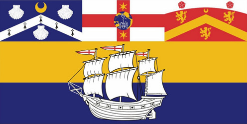
On one hand, at least I now know why Brisbane Bullets have their colour scheme, but on the other ha- wait... are those pretzels on a flag?Melbourne City makes the Melbourne flag look tolerable, which is a shame since it is Melbourne City
Brisbane on the other hand is just...View attachment 609269
City of Greek pretzel doctorsMelbourne City makes the Melbourne flag look tolerable, which is a shame since it is Melbourne City
Brisbane on the other hand is just...View attachment 609269
Reminds me of thisHere's a proposed flag for the European Union. The only way to describe it is disgustingly majestic. In case it isn't clear, it's the flags of all EU nations stretched side-by-side.
My current flag collection (those that are up at the moment)
From left to right: Prussia, Alemannia, Red Ensign, Swabia, Eureka Stockade.


Good shout.One of my favourites is Tokyo’s flag. Simple and beautiful, in my opinion.
View attachment 610049
Interesting. I was curious if any national flags broke that rule and there's a few, including Brunei, Comoros, Philippines and Vatican CityNever liked that one because of the use of white and yellow next to each other. Metals (white and yellow) should never be placed next to or on top of other metals.
One of my favourites is Tokyo’s flag. Simple and beautiful, in my opinion.
View attachment 610049

Wouldn't be too bad of a portfolio idea - minimalistic AFL/NBA/NFL/etc logosWhere’s the minimalist logo thread when you need it?
https://www.bigfooty.com/forum/threads/minimalist-afl-logos.994371/Wouldn't be too bad of a portfolio idea - minimalistic AFL/NBA/NFL/etc logos
