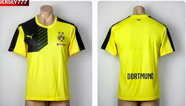
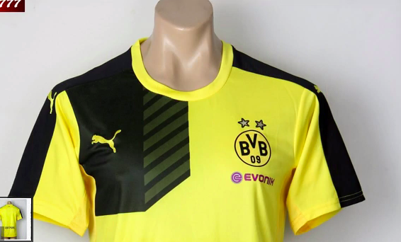
new one aint much better mateYeah i'm not a fan of Puma either, i still wake up in middle of the night having nightmares of how bad Dortmund's kit was this year. Perhaps it affected the players too.......
Follow along with the video below to see how to install our site as a web app on your home screen.
Note: This feature may not be available in some browsers.
new one aint much better mateYeah i'm not a fan of Puma either, i still wake up in middle of the night having nightmares of how bad Dortmund's kit was this year. Perhaps it affected the players too.......


View attachment 136251 I think this is the rumoured home kit, both look good either way.
Surely that's a warm up or training top right?new one aint much better mate


MY EYES!!!!!!!new one aint much better mate


Geez... that has to be the worst home kit I've seen...new one aint much better mate


new one aint much better mate


Surely that's a warm up or training top right?
Oooh, possible Italy Euro 2016 jerseyWe've signed a 3 year extension with Puma. Our 15/16 kit will be on show in our final home game and available to purchase from Sunday.
good of newcastle to have the wrong wonga logo on their kit. very apropos
Indeed, though I think the King Power logo was changed around the same time as when our kit was about to come out (last, as usual). It's likely we'll be using that next season.
It's too bad that Newcastle have put everything into their new shirts, the new logo is not as interferring as before, and it does have some Northern Rock potential. Could be a shiny logo.



New Charlton Athletic home kit.
I like the design, but it is ruined somewhat by the sponsors logos.

New Charlton Athletic home kit.
Don't mind it personally, sometimes less is more. The reason I posted it was they'll be sharing the same kit with a 2nd Division team in Madrid. Which is odd.uninspiring
True home kit?
There's absolutely no doubt that i just don't understand Newcastle supporters haha.
The one I have seen them with the sash is the best, is that an away too or do I have the wrong team?Here's the home kit for Middlesbrough who are a game away from being promoted.
