


Should be used against the Suns, GWS and Crows.
Navigation
Install the app
How to install the app on iOS
Follow along with the video below to see how to install our site as a web app on your home screen.
Note: This feature may not be available in some browsers.
More options
You are using an out of date browser. It may not display this or other websites correctly.
You should upgrade or use an alternative browser.
You should upgrade or use an alternative browser.
Changing the Original Lions Guernsey/Clash Jumper Discussion
- Thread starter Hysteria25
- Start date
- Tagged users None
WhiteLionFeva
Brownlow Medallist
- Oct 19, 2011
- 13,071
- 16,573
- AFL Club
- Brisbane Lions
- Other Teams
- Mt Gravatt, MHSOB, FFC, CGS
I find the material doesn't stretch like it used toWhat's interesting is that over the years, the lions on my guernseys get bigger and bigger. It seems there is a direct correlation between the size of the lion on my guernsey and the number of holes on my belt.
Yeah, definately has a breaking point. Just buy a new one mate.I find the material doesn't stretch like it used to
WhiteLionFeva
Brownlow Medallist
- Oct 19, 2011
- 13,071
- 16,573
- AFL Club
- Brisbane Lions
- Other Teams
- Mt Gravatt, MHSOB, FFC, CGS
Well I'm definitely getting one of these - biggish one tho.Yeah, definately has a breaking point. Just buy a new one mate.
BRAB
Biggest Victim on this Site
- Oct 20, 2014
- 32,988
- 63,490
- AFL Club
- Brisbane Lions
Amazing clash
Might even buy it it's that good
Might even buy it it's that good
Yep, ordered mine. Won't say what size, but my wife actually ordered with memberships and I'm sure she added an extra "X" to the size she bought me a few years ago (yes, she got me a paddlepop).Well I'm definitely getting one of these - biggish one tho.
Or did you mean the clash? Haven't ordered one of those. Will wait to see if it grows on me.
Or did you mean the clash? Haven't ordered one of those. Will wait to see if it grows on me.
Weren't you just lamenting the fact that the jumpers don't do exactly this?
New space age fabrics, James.Weren't you just lamenting the fact that the jumpers don't do exactly this?
WhiteLionFeva
Brownlow Medallist
- Oct 19, 2011
- 13,071
- 16,573
- AFL Club
- Brisbane Lions
- Other Teams
- Mt Gravatt, MHSOB, FFC, CGS
Yeah, no I meant the clash - have enough of the others.Yep, ordered mine. Won't say what size, but my wife actually ordered with memberships and I'm sure she added an extra "X" to the size she bought me a few years ago (yes, she got me a paddlepop).
Or did you mean the clash? Haven't ordered one of those. Will wait to see if it grows on me.
Hollow Knight
Imperfect vessel
- May 3, 2005
- 96,485
- 106,664
- AFL Club
- Brisbane Lions
- Other Teams
- Scuderia Ferrari, Dallas Cowboys
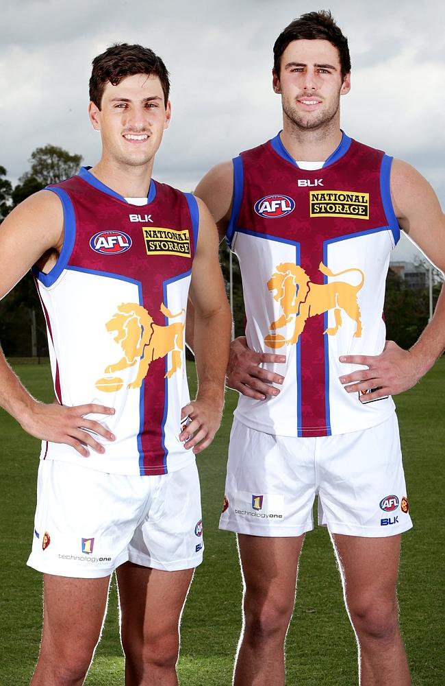
The outlined version looks best, imo. I think it may have even been better without the lion (it looks a little bit slapped on) but it's still better than any other clash jumper the Lions have had.
Unfortunately there are some pointless maroon lines down the side that some people may not have noticed.
You're pointless!
chopperduck
Brownlow Medallist
Without the bit on the side it would be entirely white from side on. Considering white shorts, i like the bit on the side.
chopperduck
Brownlow Medallist
I wouldnt mind a simple thin black outline around the lion just to define the edges a bit. Very thin fine outline though.
- Moderator
- #588
____
.
- Sep 1, 2009
- 7,496
- 8,950
- AFL Club
- Brisbane Lions
- Other Teams
- Everton, Brisbane Bullets, Thai Port FC
Clash jumper is okay, wouldn't be too upset to see it in the Grand Final if we clashed with our opponents (e.g. Crows or Suns) and finished below them, but even with the "must be white" ruling, it still could've been better, think the Lion with the outline would've been much better.
Had a crack at some tweaks

Had a crack at some tweaks


Mavlions1961
Club Legend
- Jan 31, 2010
- 1,396
- 1,300
- AFL Club
- Brisbane Lions
- Other Teams
- Seattle Mariners, Seattle Seahawks
Some people will never be happy.
This jumper is by far the best clash jumper we have had since the clash jumper inception. Previous versions I just couldn't stand the white and how they had it, with this version it is broken up, has the traditional lion and has Fitzroy's earliest heritage.
So I am on board with this one, I love it.
The lion on the clash jumper looks smaller for some reason
Definitely the best clash jumper we have had in a while, and besides arguing about why a club with 3 colours has to add another one to avoid clashes being beyond me, I like what they have tried to do.
Bringing in the old Fitzroy connection is great, I think the success of the Fitzroy historic gurnesey from a few years ago has really paved the way for this.
To be nit picky, when (I think) GingerGreatness posted pretty much this identical mock up a couple of weeks ago I though the yellow lion on the white background didn't quite pop enough and I still feel the same. Maybe a thin outline, or even a blue lion could have worked but not sure.
Overall though you have to be pretty happy. A move in (what I think) is the right direction, so hopefully in future years with a little refinement here and there is can be perfect.
I really like it. It is always tricky to make a quality clash jumper that the fans will like but the club has done a great job with this design. Compared to the 2014 clash jumper this looks like the best jumper in the league imo.
This jumper reminds me of the Hall off Fame jumper from 2012 - we had three options to choose from and I voted for the jumper that was the same as the one that won, but without the funnel. TBH I didn't like how the FFC monogram overlapped on the funnel, much like the Lion on this jumper. However I've grown to love that strip and I'll probably come around to love this one also.
It's alright but would have preferred a Bears 'V' instead of the funnel with a Lion just under it. Above the V Maroon, and below it white with the Lion.
Last edited:
Simba Moyo
Hakuna Matata
I can understand how the gold on white can be seen as a little awkward, but I'm really quite happy with it. The Lion HAS to be a part of the jumper, and especially with the whole #PrideInTheJumper it was going to be prominent too.
Vast improvement over our previous clash. Will look good when we crush the Suns in rd 5
Vast improvement over our previous clash. Will look good when we crush the Suns in rd 5
- Moderator
- #597
This jumper reminds me of the Hall off Fame jumper from 2012 - we had three options to choose from and I voted for the jumper that was the same as the one that won, but without the funnel. TBH I didn't like how the FFC monogram overlapped on the funnel, much like the Lion on this jumper. However I've grown to love that strip and I'll probably come around to love this one also.
The overlap looked fine on the FFC hall of fame jumper because it was light on dark
The lion here is light on light
It looks pretty good to me (prefer no outline).
But seriously, never mind the jumper. How about getting those pasty looking lads out for some sunshine, maybe followed up with a big fat steak?
But seriously, never mind the jumper. How about getting those pasty looking lads out for some sunshine, maybe followed up with a big fat steak?
Tainey
Debutant
I know which one I'd prefer...

I still remember being at the Chalk after a game in 2010, waiting at the bar in my 2009 guernsey. A bloke comes up next to me in his freshly purchased 2010 clash guernsey, and proceeds to question whether I'm a real fan since I hadn't updated to the new lion. Turns out he was a new fan and this poor bastard had been duped into buying one of the ugliest guernseys in our teams history. I felt so sorry for him I had to buy him a beer.

I still remember being at the Chalk after a game in 2010, waiting at the bar in my 2009 guernsey. A bloke comes up next to me in his freshly purchased 2010 clash guernsey, and proceeds to question whether I'm a real fan since I hadn't updated to the new lion. Turns out he was a new fan and this poor bastard had been duped into buying one of the ugliest guernseys in our teams history. I felt so sorry for him I had to buy him a beer.
TheFVK
Norm Smith Medallist
- Mar 21, 2008
- 7,504
- 27,014
- AFL Club
- Port Adelaide
That is a cracker of a clash guernsey- love the Y.
Similar threads
- Replies
- 33
- Views
- 646
- Replies
- 272
- Views
- 9K
- Locked
- Replies
- 358
- Views
- 11K
- Locked
- Replies
- 421
- Views
- 17K
