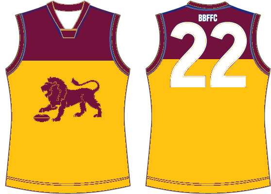
Is it part of the deal that the Lion needs to be yellow? I've always wondered why Brisbane don't use something like so (excuse the quick MSPaint bodge, and ignore the traces of blue) as a clash jumper:

Homage to the Bears while keeping the Lion, and with no need for a bland white effort.
Homage to the Bears while keeping the Lion, and with no need for a bland white effort.