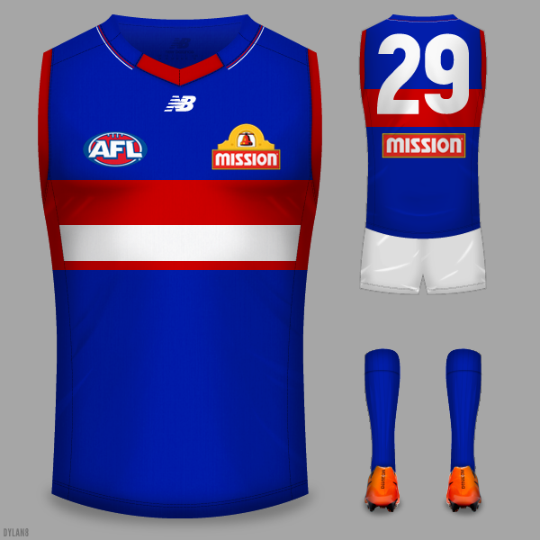
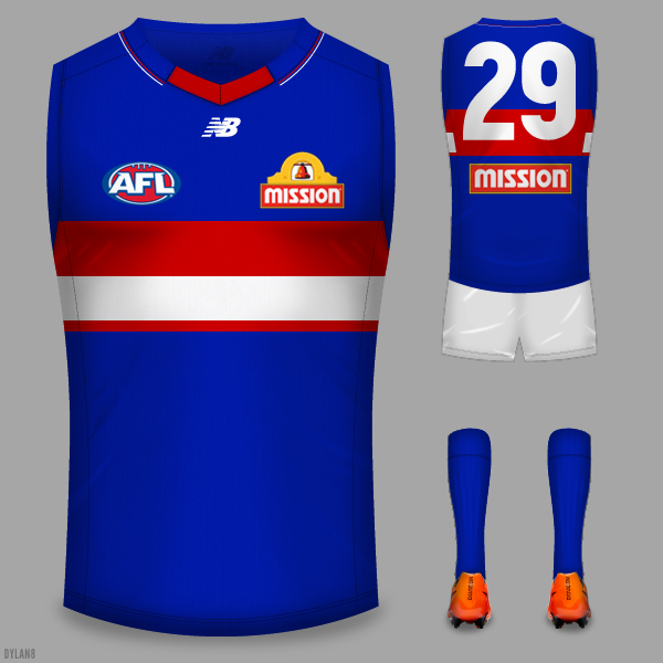
The collarTBH I like the 80s Footscray strips better than the seperate hoops and I had the idea to try and find a middle ground.


Navigation
Install the app
How to install the app on iOS
Follow along with the video below to see how to install our site as a web app on your home screen.
Note: This feature may not be available in some browsers.
More options
You are using an out of date browser. It may not display this or other websites correctly.
You should upgrade or use an alternative browser.
You should upgrade or use an alternative browser.
Workshop Jumper Ideas for 2017
- Thread starter Cody_
- Start date
- Tagged users None
- Status
- Not open for further replies.
DiamondGuy
Le goûter qui »BANG«
- Sep 25, 2013
- 972
- 2,265
- AFL Club
- Geelong
- Other Teams
- Norwich, St Kilda
middle ground
Good thinking... return the hoops is all well and good but the '54 look will eventually start to get boring and small tweaks will need to come in. My prediction would be removing the 1cm of blue between the two stripes before too long.
Edit: Just noticed it was actually like that in 1938.
Last edited:
Nice. Odds on favourite is that the hoops get moved back up so the red one is overlapped by the numbers on the back.Good thinking... return the hoops is all well and good but the '54 look will eventually start to get boring and small tweeks will need to come in. My prediction would be removing the 1cm of blue between the two stripes before too long.
brutus76
Premium Platinum
- Jul 26, 2016
- 5,533
- 7,695
- AFL Club
- Essendon
- Other Teams
- LFC, Brisbane Lions
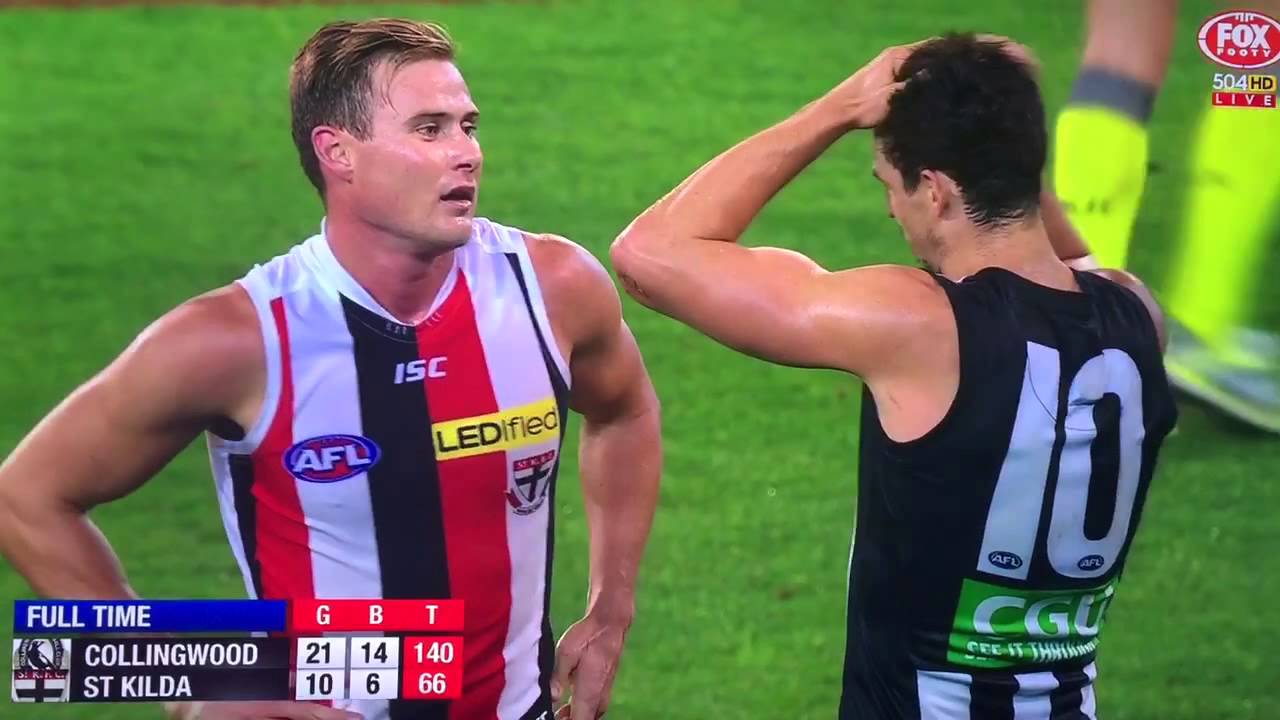
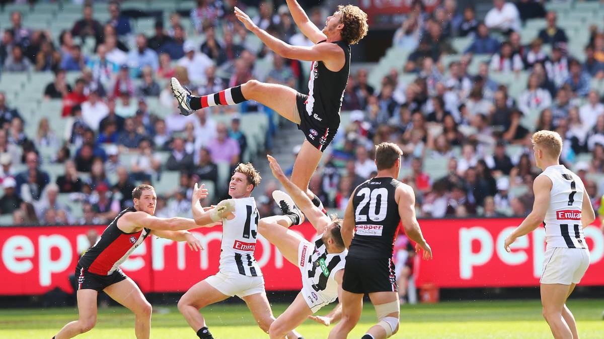
How about Collingwood finally having an AWAY strip?
Que?How about Collingwood finally having an AWAY strip?
hitthepost
Norm Smith Medallist
You're right.How about Collingwood finally having an AWAY strip?
It's terrible that they don't have a clash jumper.


Same jumper. Just with the colours switched so one is black with white strips and one is white with black stripes.
What more do they need?
To actually wear it.What more do they need?
hitthepost
Norm Smith Medallist
That's an entirely different topic. How about they have one? They doTo actually wear it.
- Moderator
- #734
To actually wear it.
To be fair we wore it a lot more this year than we have any other year.
And btw I love this board for always jumping down anyone's throat when it's suggested that Collingwood don't have an effective clash jumper. It's genuinely one of the best in the league.
TheLoungeLizard
The world's most handsome man
And the call it as it is, rather than a "heritage jumper"To be fair we wore it a lot more this year than we have any other year.
And btw I love this board for always jumping down anyone's throat when it's suggested that Collingwood don't have an effective clash jumper. It's genuinely one of the best in the league.
- Aug 21, 2007
- 31,682
- 99,063
- AFL Club
- Port Adelaide
- Other Teams
- Aston Villa, San Antonio Spurs
To be fair we wore it a lot more this year than we have any other year.
And btw I love this board for always jumping down anyone's throat when it's suggested that Collingwood don't have an effective clash jumper. It's genuinely one of the best in the league.
Yeah the argy bargy at Collingwood should definitely be about them wearing it, not it's existance.
I'd have them wearing it every time they wear white shorts. The black guernsey white shorts combo is the worst in their kit bag, even once is too often.
hitthepost
Norm Smith Medallist
To be fair it is a heritage jumper. Collingwood's and Essendon's both. In different ways, but they both are.And the call it as it is, rather than a "heritage jumper"
Seemingly in the minority, but I'm not a fan of the new roo.
It looks too front heavy, whereas the old one was a lot more balanced.
Maybe if the legs were pulled back and the arms were a little less bulky I'd be more sold on it.
I think I'd almost rather we keep the current logo.
It looks too front heavy, whereas the old one was a lot more balanced.
Maybe if the legs were pulled back and the arms were a little less bulky I'd be more sold on it.
I think I'd almost rather we keep the current logo.
- Aug 25, 2014
- 7,718
- 11,772
- AFL Club
- Richmond
- Thread starter
- #740
nice!!!
I agree with you, the balance does lean to the right too much and could use improvement.Seemingly in the minority, but I'm not a fan of the new roo.
It looks too front heavy, whereas the old one was a lot more balanced.
Maybe if the legs were pulled back and the arms were a little less bulky I'd be more sold on it.
That I can't agree with you on. Even with it's flaws, it's still 20 times better than the current logo.I think I'd almost rather we keep the current logo.
Maybe it's just a bit of bias, but I don't mind the current. Sure, it could be better, but I don't think it deserves some of what it cops.I agree with you, the balance does lean to the right too much and could use improvement.
That I can't agree with you on. Even with it's flaws, it's still 20 times better than the current logo.
That said, I'm more than happy with us going forward with any kind of bounding roo, so iconic, and among the best jumpers in the league.
Jack Stevens
#2 Ticket Holder
I was super keen on that North logo until I saw it on the guernsey mock-up. But even then, it's starting to look more natural given a bit of time.
In comparison, the old one looks like a fat old thing, leisurely hopping along. The new one looks muscular without being overly detailed, and looks like its really bounding forwards.
I think they've done a great job, even if it is a little right skewed. Remember there's nothing official on it yet, though.
Keep the ol' Kangaroo on the jumpers and use the refined new one on/as the logo.
Something Brisbane should absolutely do.
Something Brisbane should absolutely do.
The roo needs to be tilted to the right. Make the tail go above the head and bring the head down, I think that'll balance it a bit more hopefully
- May 16, 2015
- 8,449
- 19,629
- AFL Club
- North Melbourne
Just give it back legs. 

Fizzler
BBTB
- Dec 26, 2013
- 12,784
- 16,370
- AFL Club
- Port Adelaide
- Other Teams
- OKC, Coburg, Werribee, Storm, QPR
It does. They're just near the front.Just give it back legs.
"That's the joke"It does. They're just near the front.
- Sep 4, 2013
- 5,532
- 8,595
- AFL Club
- Carlton
Kangaroos only have two legs mateIt does. They're just near the front.
technically 4Kangaroos only have two legs mate
Edit: or even 5, if you count the tail as a supporting limb as well
Last edited:
- Status
- Not open for further replies.
Similar threads
- Replies
- 726
- Views
- 78K


