Navigation
Install the app
How to install the app on iOS
Follow along with the video below to see how to install our site as a web app on your home screen.
Note: This feature may not be available in some browsers.
More options
You are using an out of date browser. It may not display this or other websites correctly.
You should upgrade or use an alternative browser.
You should upgrade or use an alternative browser.
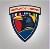
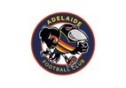
Opinion Adelaide Crows New Logo Discussion
- Thread starter Skinny_Love18
- Start date
- Tagged users None
🥰 Love BigFooty? Join now for free.
FR0GGY
Busy
It’s fantastic, but I don’t like it for us
Too colourful?It’s fantastic, but I don’t like it for us
Log in to remove this Banner Ad
FR0GGY
Busy
Yeah I think it’s the club colours and not a big shield guyToo colourful?
- Banned
- #456
It's the shieldToo colourful?
HmmmIt's the shield
- Banned
- #458
Also not sure we need to pay homage to all of the SANFL clubs nowHmmm
What about the SANFL colours?Yeah I think it’s the club colours and not a big shield guy
FR0GGY
Busy
Sorry that’s what I meant.What about the SANFL colours?
Saltpeter has the same thoughts as me.
It is where we came from...Also not sure we need to pay homage to all of the SANFL clubs now
I get we are an amalgamation of the SANFL clubs, but having a tiny bit of black and white on there gives me the icks given
1. They are scum
2. They tried to shaft all the other clubs and go alone.
1. They are scum
2. They tried to shaft all the other clubs and go alone.
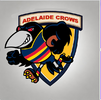
Don't mind it as a concept.View attachment 1827344
We need something like this but holding Adelaide instead
Needs less feathers (it's a bit busy) and obv red/blue/gold colouring
- Banned
- #464
Sometimes you just need to cut the umbilical cord thoughIt is where we came from...
We can still love the clubs, without the need to display it on our logos
I have to admit, it made my skin crawl just using that black and white!I get we are an amalgamation of the SANFL clubs, but having a tiny bit of black and white on there gives me the icks given
1. They are scum
2. They tried to shaft all the other clubs and go alone.
True, then I wouldn't have to include B+WSometimes you just need to cut the umbilical cord though
We can still love the clubs, without the need to display it on our logos
jackster83
Join The Ratpack!
- Jul 31, 2007
- 34,250
- 72,854
- AFL Club
- Adelaide
- Other Teams
- Sin City Swamprats, Tasmania
But they hate our guts.It is where we came from...
This is true!But they hate our guts.
🥰 Love BigFooty? Join now for free.
- Dec 18, 2007
- 10,520
- 18,314
- AFL Club
- Adelaide
I do like when we actually have the crow black, like in the WFAO graphics for example.
lacrow
Team Captain
This actually looks pretty bad ass. All the jagged edges give it a very aggressive look. Would love to see what it looks like with our colors. Maybe the word Crow is in red and keep the outline in yellow?View attachment 1827344
We need something like this but holding Adelaide instead
Would love to see a few different tweaks of this.
bomberclifford
Importer/Exporter
Use green?
Samcro24
Covered by the Cape
- Oct 28, 2014
- 12,868
- 35,403
- AFL Club
- Adelaide
Use green?

Similar threads
- Replies
- 10K
- Views
- 275K
- Replies
- 210
- Views
- 13K
- Sticky
- Replies
- 224
- Views
- 12K
- Replies
- 2K
- Views
- 77K


