Discussion 2016 AFL Finals Series - Photos and Discussion

Remove this Banner Ad

NM_Mitchell

Norm Smith Medallist
May 3, 2014
5,131
6,026
#westside
AFL Club
North Melbourne
Other Teams
We put the U in CGU
Screen Shot 2016-08-30 at 12.02.08 pm.png
Big week of nothing this week.

Then we get into the real stuff next week, get around it.

I reckon North will wear all white this week, and I'm hoping we pull out the White/Blue assuming we get through and GWS get up this week.

View attachment 282930For reference.
Screen Shot 2016-09-11 at 9.36.26 pm.png

Week 2 locked and loaded, coupla big games coming your way.
Screen Shot 2016-09-10 at 10.37.53 pm.png
Screen Shot 2016-09-18 at 12.19.19 pm.png
3 games left in the year, how badly can they mess this up?
Screen Shot 2016-09-18 at 12.16.07 pm.png
Here it is is!
The big dance.
Swans VS Bulldogs
Sydney VS Western
Red VS Blue
Coke VS Sprite (lol COLA)
Screen Shot 2016-09-24 at 8.51.15 pm.png
 
Last edited:

Log in to remove this ad.

We'll make this thread cover the whole of the finals series I think. Same number of games across the finals as there are in a regular round of footy, and it was a popular thread last year.

NM_Mitchell, if you could maybe try and keep the pathway graphic updated each week, that'd be great!
 

(Log in to remove this ad.)

And the E fell off!
hqdefault.jpg
 
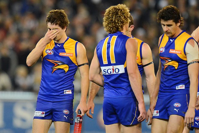
I just dont like how unbalanced the current eagle looks. I have seen some wonderfully redesigned eagles that would work, but instead of taking their designs I simply went is a slightly different direction.
The body of the eagle just melts into the jumper, especially on the navy. This means that although it's technically centered, it doesn't look so.
wingsbackportrait.jpg

Even on the royal it looks a bit funny, but not as bad due to the navy in the image creating somewhat of an outline against the royal background. It still has a lot of "blank space" inside the logo.
901483-pies-v-eagles.jpg

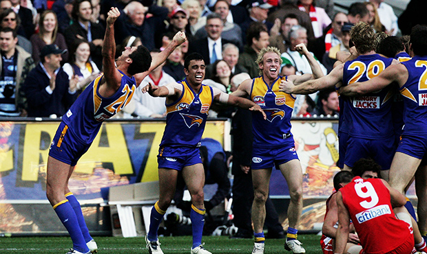
Back in the day of the stroke on the logo, I think it made it look a little more even, as it defined the shape:
GFreplaygoneland.jpg
IMO the navy outline on the royal jumper looks way worse. The navy jumper looks great
 
I'd expect the Dogs to be in the white clash v WCE. The AFL pays a lot more attention to presentation in finals and this would provide a far better contrast.
 
I'd expect the Dogs to be in the white clash v WCE. The AFL pays a lot more attention to presentation in finals and this would provide a far better contrast.
Their definition of "presentation" weighs very heavily with the belief that the best-presented games come with home jumpers. Unless it's a total no-go in their eyes they'll let it go. Can't be certain of that of course but when the AFL pay more attention to presentation they mean something different to just the best contrast.
 

Remove this Banner Ad

Back
Top