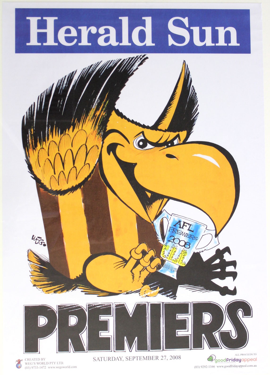
I remember buying Weg's last ever submission as I left the MCG on Grand final day 2008. Swiftly framed it and it's still hung up in my childhood bedroom.
Obviously biased, but I feel he saved one of his best efforts 'till last.

Obviously biased, but I feel he saved one of his best efforts 'till last.