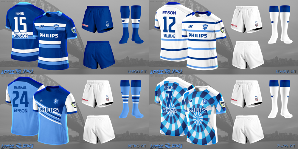
Klim
Brownlow Medallist
- Sep 17, 2013
- 12,532
- 10,363
- AFL Club
- Sydney
Hey guys, seeing as all of my kits have been displayed could I get some feedback in terms of overall design?

Follow along with the video below to see how to install our site as a web app on your home screen.
Note: This feature may not be available in some browsers.
Hey guys, seeing as all of my kits have been displayed could I get some feedback in terms of overall design?
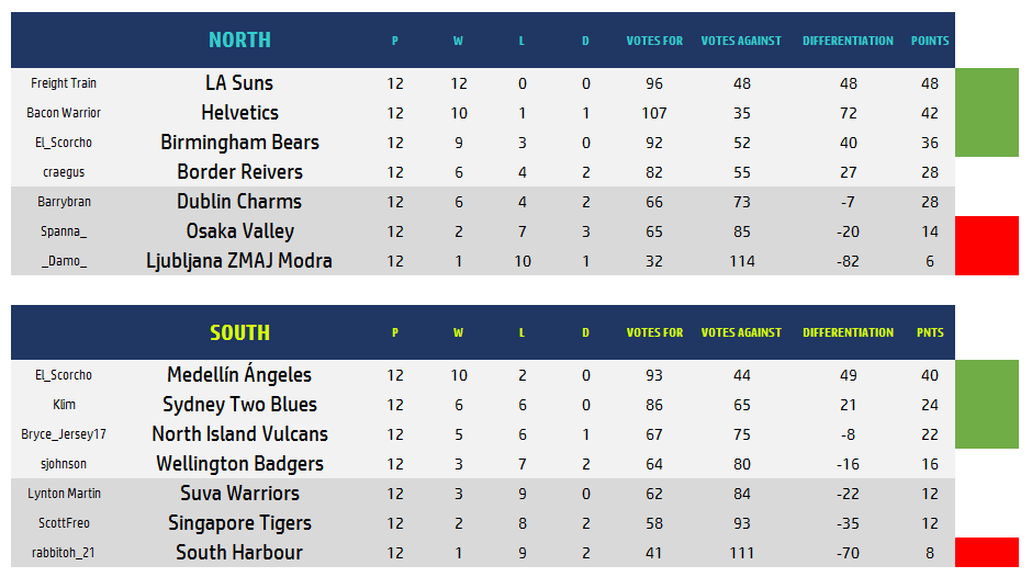
Could I please thank everyone who voted for getting the Suva Warriors a win for the season, We would like to thank the CCRC and all the competing clubs.

I do. I like the feeling of being a western conference NBA team. We have a lottery right? No? Oh crap.
I did try for Dubbo in one of the earlier rounds but I had no takers.You meant Dublin South Australia didn't you?
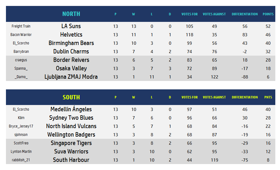
South QF2- I could play myself? That'll look weird for percentage
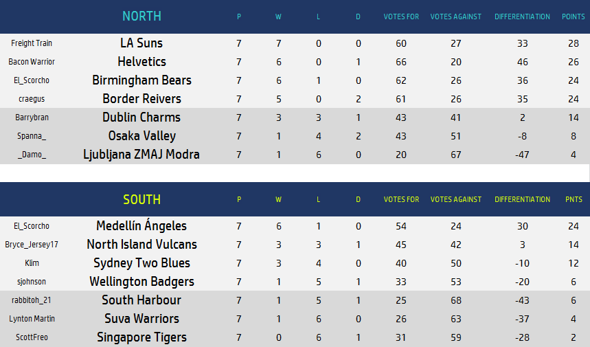
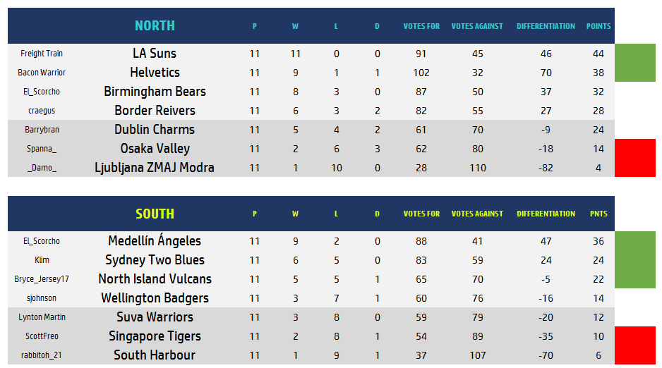
Five out of eight playoff berths have been clinched with two rounds remaining.
The playoff picture looks like the following
NORTH QF1: Suns/Helvetics vs. Bears/Reivers/Charms
NORTH QF2: Suns/Helvetics vs. Helvetics/Bears/Reivers
SOUTH QF1: Angeles vs. Vulcans/Badgers/Warriors
SOUTH QF2: Two Blues/Vulcans vs. Vulcans/Badgers
South QF2- I could play myself? That'll look weird for percentage
I know I know. Just a little ribbingYou could either be the home or the away team.
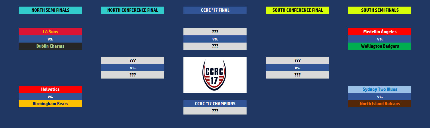
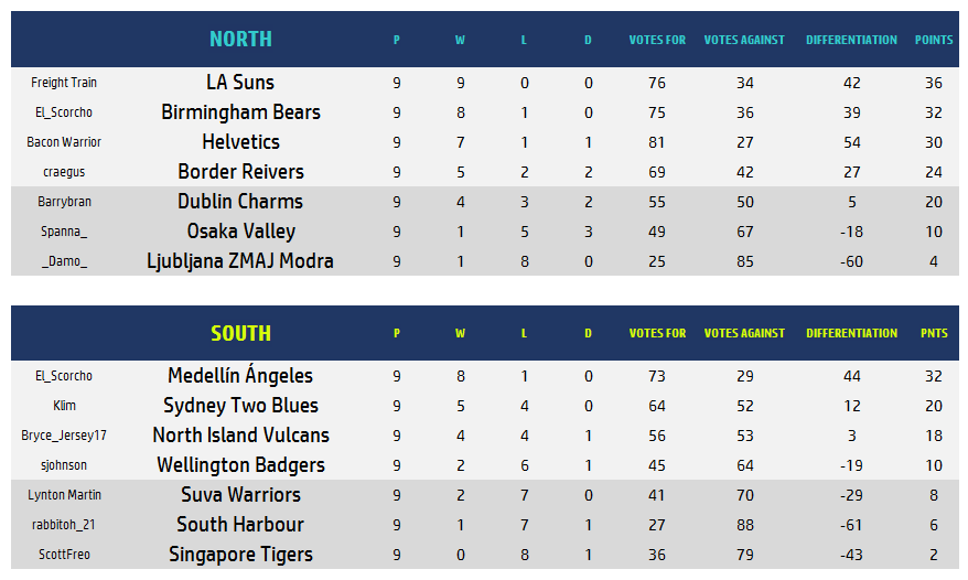
Freight Train, you should consider sending your LA Suns league and union designs in to the Catalan Dragons.
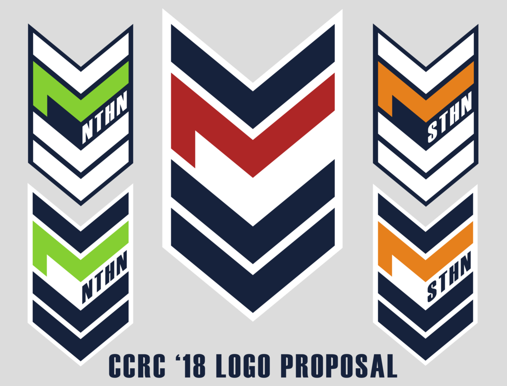
That's really cool. Have you tried a version at 90 degrees with the NTHN/STHN written vertically?Now that the season is over I wish to present to the board this redesign of the competition logo. I know that this years was not popular so I went back to the drawing board to create something completely new and unique that not only was able to work on a majority of designs (as it now has less cut in and is automatically bordered and removes most of the issues that were brought up with the last logo), but also simplified the design to something that could be recognised as being linked to the rugby codes.
So to describe the design, I decided to use the letters of the competition to be the focus of the design, but in doing so use them to also represent the sport itself, so the letters CCRC have been simplified and rotated to form V's/chevrons which as we know are common design elements of league and union uniforms. I then utilised the colours of the competition to separate the C's from the R and to also define the different logos (League, and two conferences). The addition of the NTHN and STHN to the conference logos was something that took a long time to decide on, but I included them as I felt that in reality they would be used to allow the casual observer to understand the difference between the logos. I also dropped the year from the logo as I don't think it was needed. Finally I made two versions that could be used for each conference, one with a dark border and light text and one with a light border with dark text so that they could be adapted to any kit.
Not bad. Don't think it needs the extra two chevrons under the n/sthn though.Now that the season is over I wish to present to the board this redesign of the competition logo. I know that this years was not popular so I went back to the drawing board to create something completely new and unique that not only was able to work on a majority of designs (as it now has less cut in and is automatically bordered and removes most of the issues that were brought up with the last logo), but also simplified the design to something that could be recognised as being linked to the rugby codes.
So to describe the design, I decided to use the letters of the competition to be the focus of the design, but in doing so use them to also represent the sport itself, so the letters CCRC have been simplified and rotated to form V's/chevrons which as we know are common design elements of league and union uniforms. I then utilised the colours of the competition to separate the C's from the R and to also define the different logos (League, and two conferences). The addition of the NTHN and STHN to the conference logos was something that took a long time to decide on, but I included them as I felt that in reality they would be used to allow the casual observer to understand the difference between the logos. I also dropped the year from the logo as I don't think it was needed. Finally I made two versions that could be used for each conference, one with a dark border and light text and one with a light border with dark text so that they could be adapted to any kit.
That's really cool. Have you tried a version at 90 degrees with the NTHN/STHN written vertically?
Not bad. Don't think it needs the extra two chevrons under the n/sthn though.
It started that way but instead of showing the chevrons with the CCRC text being secondary the CCRC is there but not the chevrons.
My thinking was that when players raise their arms to fend or catch the ball the patch would be rotated and would reveal the CCRC text, while when in the normal position it shows off the chevrons.
But then it would say RC NTHN/STHN not CCRC NTHN/STHN.
Then we could rename the comp? tbh I have no idea what ccrc even stands for. I just call it the rugby comp.It started that way but instead of showing the chevrons with the CCRC text being secondary the CCRC is there but not the chevrons.
My thinking was that when players raise their arms to fend or catch the ball the patch would be rotated and would reveal the CCRC text, while when in the normal position it shows off the chevrons.
But then it would say RC NTHN/STHN not CCRC NTHN/STHN.