


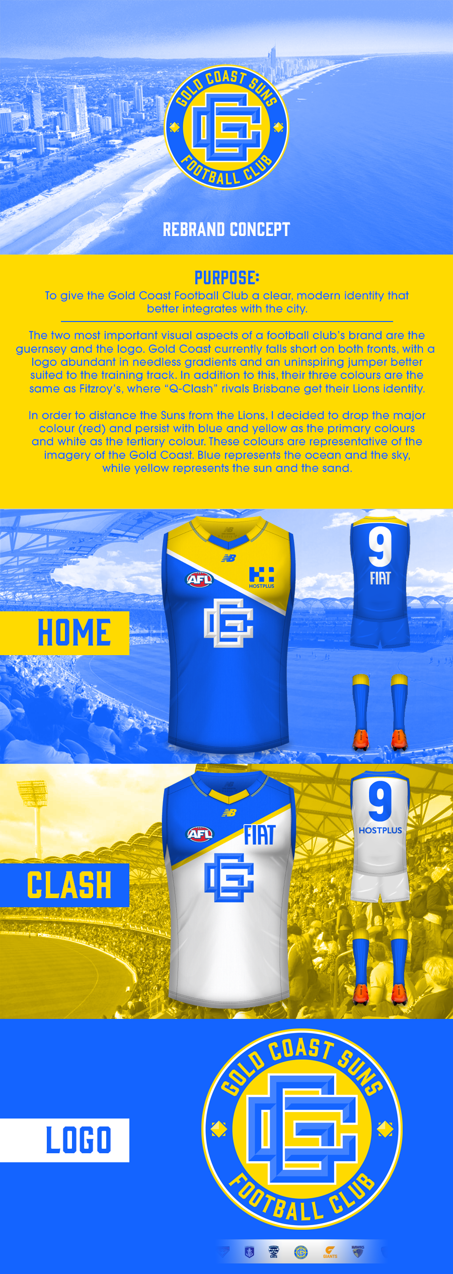
Why doesn't it suit them? What does suit them?Why do the suns need a monogram? Doesn't suit them.
Navigation
Install the app
How to install the app on iOS
Follow along with the video below to see how to install our site as a web app on your home screen.
Note: This feature may not be available in some browsers.
More options
You are using an out of date browser. It may not display this or other websites correctly.
You should upgrade or use an alternative browser.
You should upgrade or use an alternative browser.
Workshop Jumper Ideas for 2017
- Thread starter Cody_
- Start date
- Tagged users None
- Status
- Not open for further replies.
Javelin
All Australian
- Jun 6, 2013
- 849
- 1,116
- AFL Club
- West Coast
Tasmania?Why doesn't it suit them? What does suit them?
They can have Tassie once North's bled it dry.Tasmania?
Maybe a blazing sun image rather than a monogram? E.g.:Why doesn't it suit them? What does suit them?
 (quick hack job using Barrybran's jumper with a Clipart blazing sun)
My thinking was sort of a sky blue, having the whole thing represent the sun in the sky. But that will probably make the monogram hard to make out, so you might have to darken it a bitThanks Harry (and Dylan too). What are you thinking for the blue jumper? The blue GC currently use, a sky blue that people have been talking about or GC's current clash?

- Jun 18, 2016
- 51,681
- 99,056
- AFL Club
- West Coast
- Other Teams
- Perth Scorchers
Your hack jobs are neater than mine(quick hack job using Barrybran's jumper with a Clipart blazing sun)

Really like this..love the colour combo. I reckon they've steered away from this combo as there's been heaps of clubs that way that use them. But definitely think gold primary blue secondary and a bit of orange should've been their colours. Giants were clever getting on the orange. But one of them should've picked green!
PizzaChief
Debutant
The gold coast exit wounds has a good ring to it..Maybe a blazing sun image rather than a monogram? E.g.:
View attachment 265727(quick hack job using Barrybran's jumper with a Clipart blazing sun)
Scratch that, they will now be known as the gold coast ****holes
- Jun 18, 2016
- 51,681
- 99,056
- AFL Club
- West Coast
- Other Teams
- Perth Scorchers
My thinking was sort of a sky blue, having the whole thing represent the sun in the sky. But that will probably make the monogram hard to make out, so you might have to darken it a bit
I used Dylan's blue for this. This monogram doesn't look right on the clash so I abandoned it.
This logo looks very 80s to me. In fact, I could see them using this design if they were to release their own "retro" woolen jumpers.I'll throw my hat in the ring for a Gold Coast redesign. I actually don't mind their strip but the logo looks out of place. Here's what I came up with:

The idea is there though. I think if you experimented with it, it could be really good.
- Moderator
- #411
This logo looks very 80s to me. In fact, I could see them using this design if they were to release their own "retro" woolen jumpers.
The idea is there though. I think if you experimented with it, it could be really good.
It's almost an 80s shopping mall or cinema like logo, but in a good way
Yeah that's a ripper
I used Dylan's blue for this. This monogram doesn't look right on the clash so I abandoned it.
Javelin
All Australian
- Jun 6, 2013
- 849
- 1,116
- AFL Club
- West Coast
My graphic design skills are non-existent, but I've given some thought to the "GC problem" and wonder what they would look like in a tri-panel of sorts?
The tri-panel is made up of red and yellow only, with a logo (any logo) in the middle.
Think of the below Carlton jumper with a wider stripe down the middle, the same size as St Kilda's.
Anyone care to mock it up for me and prove my ideas are as bad as my graphic design skills?
The tri-panel is made up of red and yellow only, with a logo (any logo) in the middle.
Think of the below Carlton jumper with a wider stripe down the middle, the same size as St Kilda's.

Anyone care to mock it up for me and prove my ideas are as bad as my graphic design skills?
fancyscum
Radical Crommunist
I created something similar when I was doing my other concepts but decided not to post it for whatever reason.My graphic design skills are non-existent, but I've given some thought to the "GC problem" and wonder what they would look like in a tri-panel of sorts?
The tri-panel is made up of red and yellow only, with a logo (any logo) in the middle.
Think of the below Carlton jumper with a wider stripe down the middle, the same size as St Kilda's.
Anyone care to mock it up for me and prove my ideas are as bad as my graphic design skills?
Perhaps not exactly what you had in mind but I only had it as a png so I can't really go back and edit it.
Which in turn directly reminds me of the older 1980s buildings still around in Surfers ParadiseIt's almost an 80s shopping mall or cinema like logo, but in a good way
Javelin
All Australian
- Jun 6, 2013
- 849
- 1,116
- AFL Club
- West Coast
That's pretty much what I had in mind, only mine would be a full block of yellow (either down the middle or on the outside panels).I created something similar when I was doing my other concepts but decided not to post it for whatever reason.
Perhaps not exactly what you had in mind but I only had it as a png so I can't really go back and edit it.
My logic is that the side panels look like a Macca's box, so why not turn them into proper panels.
- Jul 1, 2014
- 1,138
- 1,840
- AFL Club
- Carlton
They'd look good in a version of East Freo's old jumper, maybe with yellow in the middle and reverse against Swans? Or else bring the blue in and have a tri-colour.That's pretty much what I had in mind, only mine would be a full block of yellow (either down the middle or on the outside panels).
My logic is that the side panels look like a Macca's box, so why not turn them into proper panels.

As an aside, I always thought WCE were working towards a proper, St Kilda-style tri-colour. If they'd cleaned up the back and maybe lost the logo they'd have had a much more traditional jumper. Having said that, I'm glad they've gone back to a proper wings design.
Javelin
All Australian
- Jun 6, 2013
- 849
- 1,116
- AFL Club
- West Coast
Yep. That's a much better way of explaining my thoughts!They'd look good in a version of East Freo's old jumper, maybe with yellow in the middle and reverse against Swans? Or else bring the blue in and have a tri-colour.
View attachment 266015
As an aside, I always thought WCE were working towards a proper, St Kilda-style tri-colour. If they'd cleaned up the back and maybe lost the logo they'd have had a much more traditional jumper. Having said that, I'm glad they've gone back to a proper wings design.
Nedland
Forward Pocket
- Jun 27, 2012
- 228
- 428
- AFL Club
- West Coast
- Other Teams
- East Perth Royals
Pretty much exactly what I said on the previous page! Would be a ripping jumper.They'd look good in a version of East Freo's old jumper, maybe with yellow in the middle and reverse against Swans? Or else bring the blue in and have a tri-colour.
View attachment 266015
As an aside, I always thought WCE were working towards a proper, St Kilda-style tri-colour. If they'd cleaned up the back and maybe lost the logo they'd have had a much more traditional jumper. Having said that, I'm glad they've gone back to a proper wings design.

That's actually not bad.
What about an inverse of that, I think an all gold kit ala Cleveland Cavs and LA Lakers would be minty fresh.
What about an inverse of that, I think an all gold kit ala Cleveland Cavs and LA Lakers would be minty fresh.
I had a similar idea last yearView attachment 266053
This is what I had in mind. Could put a blue circular band around the monogram to symbolise a sun in the sky.

Like this idea. Stretch the red to the sides for the top half but keep yellow cuffs.I had a similar idea last year
View attachment 266056
Like the idea of two shades of red and yellow. I think more stripes would be more effective, or a V.I created something similar when I was doing my other concepts but decided not to post it for whatever reason.
Perhaps not exactly what you had in mind but I only had it as a png so I can't really go back and edit it.
I'll throw my hat in the ring for a Gold Coast redesign. I actually don't mind their strip but the logo looks out of place. Here's what I came up with:
I had a go, using yours as inspiration. I still think mine might be a bit too retro looking (maybe it's the circles reminding me of the old channel 7 logo).

Here's how it would look on the current jumper.

And here it is with my proposed design.

Edit: I just realised that it's very similar to this concept too.
2014 Gold Coast Suns logo

Edit 2: Changed size/spacing of the letters.
Last edited:
- Status
- Not open for further replies.
Similar threads
- Replies
- 726
- Views
- 78K
