- Jun 18, 2016
- 51,696
- 99,076
- AFL Club
- West Coast
- Other Teams
- Perth Scorchers
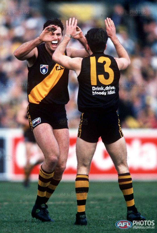
That's fair. Our wings are done pretty well by Puma.If they can print the wings on the side panels they can print the sash on the shoulder.
Follow along with the video below to see how to install our site as a web app on your home screen.
Note: This feature may not be available in some browsers.
That's fair. Our wings are done pretty well by Puma.If they can print the wings on the side panels they can print the sash on the shoulder.
They won't print our wings over the shoulder, why would they allow Richmonds sash to do that?If they can print the wings on the side panels they can print the sash on the shoulder.
Because the wings extend halfway between the shoulder panels, so having them where they are makes no difference.They won't print our wings over the shoulder, why would they allow Richmonds sash to do that?
Makes no difference? Excuse me? It makes a world of difference.Because the wings extend halfway between the shoulder panels, so having them where they are makes no difference.


Puma don't actually have shoulder panels the shoulder is part of the back piece.Shoulder panel wouldn't even need to be printed on, just made yellow a la Essendon
TouchéPuma don't actually have shoulder panels the shoulder is part of the back piece.
This but Puma logos.Richmond Tigers
Changes:
- Nike
- Deeper colours
- yellow collar
- Logo on GPS pocket
- New Away jumper
- New Pre season jumper
- Simple Anzac jumper
Home:
View attachment 238931
Away:
View attachment 238932
Clash:
View attachment 238933
Pre Season: (for the kids)
View attachment 238935
Anzac:
View attachment 238936

completely agreeNo back sash looks so much bolder for Richmond. I'm definitely an advocate.

why straight sash ? the punt rd ferals would lose it
the sash is not straight, groopy. There's clearly a little bend in it.why straight sash ? the punt rd ferals would lose it
make one with the thin curved sashthe sash is not straight, groopy. There's clearly a little bend in it.
anyway, I'm not worried about punt road ferals.
It would basically be an inverse of your clash.I'm probably in the minority, but the lack of a sash on the back doesn't fit too well with me. Especially with the way modern templates are, it would either be cut off slightly on the front, or overlap to the back a bit. It's sort of what I dislike a bit about Port's jumper with the chevrons not really 'attaching' to anything. I reckon yellow numbers with a (really) thick black outline would go alright on the yellow sash.
Yeah that one irks me a little too, although not as much as the 90s/00s versionIt would basically be an inverse of your clash.


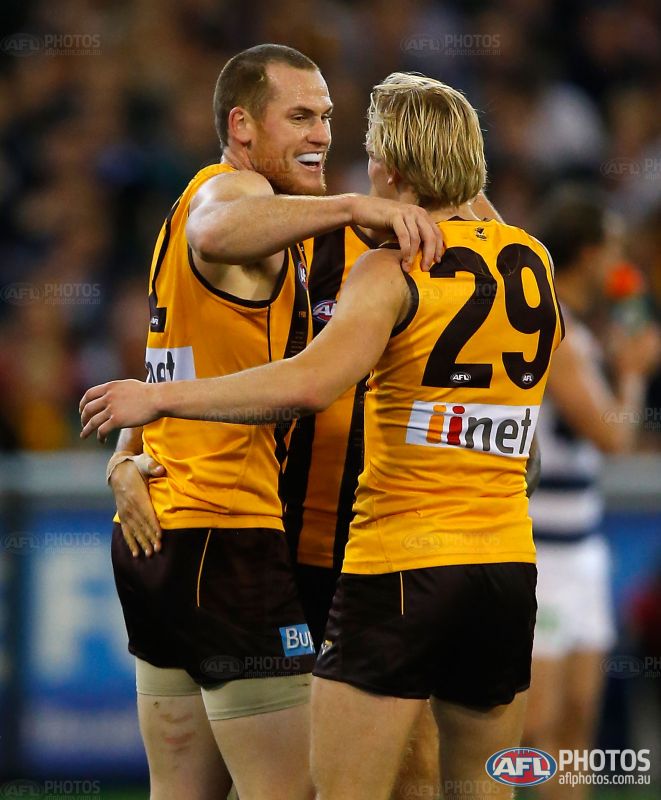
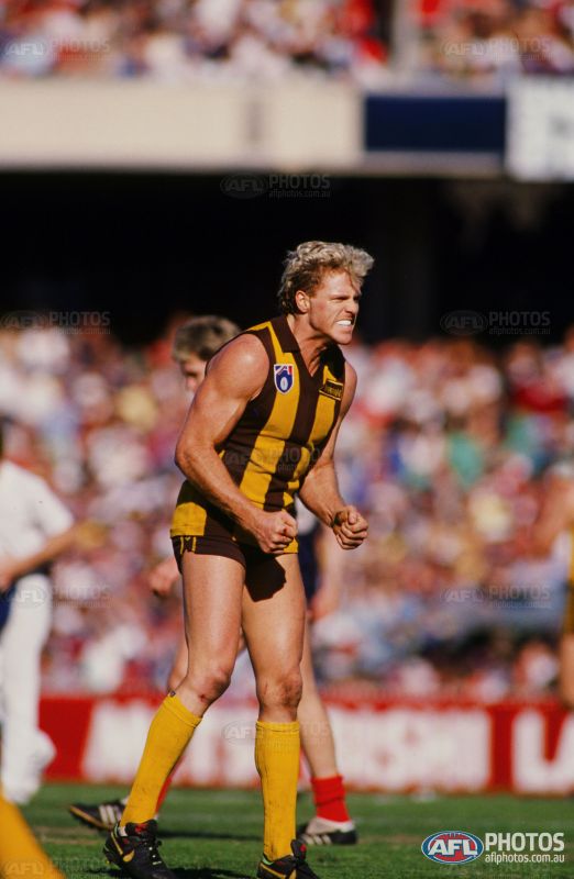
If Hawthorn dropped the back stripes it'd be classy. Looks like every other striped team at the moment. Need that point of difference back.This is similar to the changing of the Hawthorn jumper. A few years back the Hawks removed their white number panel in a throwback to the 80's.
Old panel:
View attachment 311803
New panel:
View attachment 311804
Old-old jumpers circa. 1980's (same as the current)
View attachment 311802
I think it might be a good move to change it back even for a few years just to see how it works. Even if it sucks they still make merchandise money so they can't lose
Back fangs!If Hawthorn dropped the back stripes it'd be classy. Looks like every other striped team at the moment. Need that point of difference back.
If Hawthorn dropped the back stripes it'd be classy. Looks like every other striped team at the moment. Need that point of difference back.


