


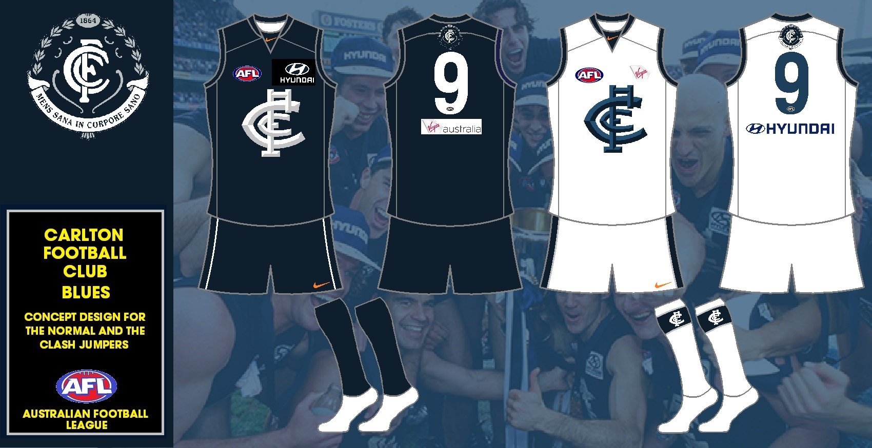
Nope. I'm sure we wouldn't care if Nike only coloured their logo orange..
Reading through what was on that thread about the orange I think that what I have done to the Carlton jumpers is what will be done. The Nike logo will probably be orange where the logo is now. It said it was a corporate colour of Nike going forward so it will be the Nike logo that will be orange.
Navigation
Install the app
How to install the app on iOS
Follow along with the video below to see how to install our site as a web app on your home screen.
Note: This feature may not be available in some browsers.
More options
You are using an out of date browser. It may not display this or other websites correctly.
You should upgrade or use an alternative browser.
You should upgrade or use an alternative browser.
Workshop Jumper Ideas for 2019
- Thread starter Silent Alarm
- Start date
- Tagged users None
- Status
- Not open for further replies.
Heardy_101
LET'S GO BRANDON
That black Hyundai box is annoying the s**t out of my OCD lol
- Jan 19, 2017
- 994
- 1,554
- AFL Club
- Fremantle
- Other Teams
- Essendon, Geelong, GWS, Port
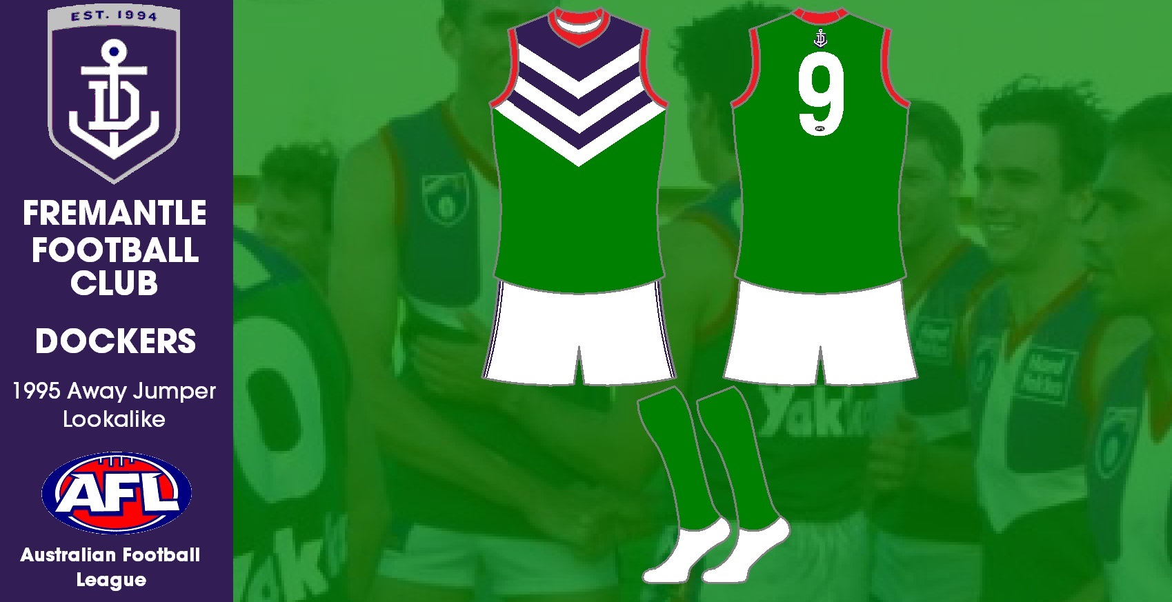
Here is a jumper for the 25 season celebrations of Fremantle. It is in the colours of the 1995 away jumper but in the current day style of the Fremantle jumper.
I approve. I'd pay to wear this
- Banned
- #129
hawks kit looks better with all gold socks
time for a change back i reckon
time for a change back i reckon
Heardy_101
LET'S GO BRANDON
All Gold back as well.
All Gold back as well.
hawks kit looks better with all gold socks
time for a change back i reckon
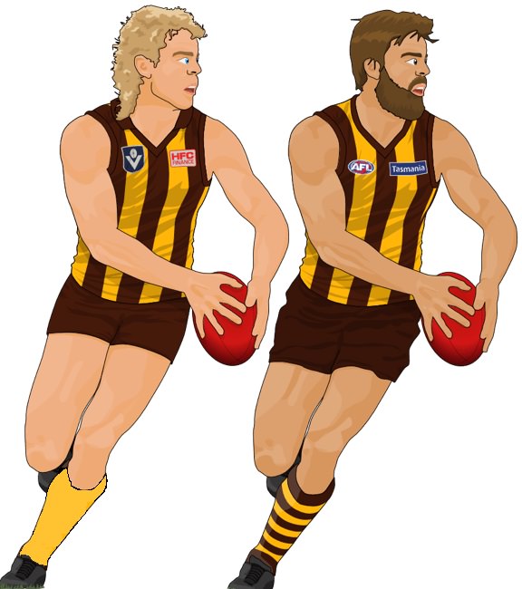
I was asking the club back in 1998, when they changed the socks back to brown and gold hooped socks to change back to the all gold socks. The reason why they changed was because with the gold socks the players looked like they had chicken legs (because they looked thin to the rest of the body).
I suggested the white box and brown and gold stripes design for the back of the jumper to Ian Dicker back in 2003 or 2004, but as a heritage round design. The jumper was worn in Round 5 2005 and the year after became the design for the back of the club jumper. Even though I was for a return to the all gold back, a gold back with brown stripes is ow my favourite. The all gold back now looks bare and empty now.
- Banned
- #132
see how much better the all gold socks look?
I was asking the club back in 1998, when they changed the socks back to brown and gold hooped socks to change back to the all gold socks. The reason why they changed was because with the gold socks the players looked like they had chicken legs (because they looked thin to the rest of the body).
I suggested the white box and brown and gold stripes design for the back of the jumper to Ian Dicker back in 2003 or 2004, but as a heritage round design. The jumper was worn in Round 5 2005 and the year after became the design for the back of the club jumper. Even though I was for a return to the all gold back, a gold back with brown stripes is ow my favourite. The all gold back now looks bare and empty now.
- May 29, 2017
- 520
- 1,127
- AFL Club
- Geelong
- Other Teams
- Port Adelaide Magpies

You didn’t read what Wizard wrote, did you?see how much better the all gold socks look?
- Banned
- #135
yeah i read it but looking at the pic next to eachother the gold socks look so much betterYou didn’t read what Wizard wrote, did you?
dont really care about the back of the jumper
- Jun 18, 2016
- 51,696
- 99,077
- AFL Club
- West Coast
- Other Teams
- Perth Scorchers
Sorry Hawks bros but brown & gold socks are better than plain gold sockssee how much better the all gold socks look?
The neverending cycle of designs
- Oct 27, 2016
- 5,949
- 10,676
- AFL Club
- Collingwood

- Other Teams
- Packers, Raptors, Renegades
Hawks gold socks
- Oct 27, 2016
- 5,949
- 10,676
- AFL Club
- Collingwood
- Other Teams
- Packers, Raptors, Renegades
Need I say more?

Get it done @ISC

Get it done @ISC
- May 29, 2017
- 520
- 1,127
- AFL Club
- Geelong
- Other Teams
- Port Adelaide Magpies
Need I say more?
View attachment 486776
Kochy wont be happy with the bars cutting off
On iPhone using BigFooty.com mobile app
- Oct 27, 2016
- 5,949
- 10,676
- AFL Club
- Collingwood
- Other Teams
- Packers, Raptors, Renegades
Well Kochy can suck a Koch

any chance you can put in a good word and bring back the gold vee and do away with the horrible reverse stripes? ie.:
I was asking the club back in 1998, when they changed the socks back to brown and gold hooped socks to change back to the all gold socks. The reason why they changed was because with the gold socks the players looked like they had chicken legs (because they looked thin to the rest of the body).
I suggested the white box and brown and gold stripes design for the back of the jumper to Ian Dicker back in 2003 or 2004, but as a heritage round design. The jumper was worn in Round 5 2005 and the year after became the design for the back of the club jumper. Even though I was for a return to the all gold back, a gold back with brown stripes is ow my favourite. The all gold back now looks bare and empty now.
Haha. The first design I made was the teal yoke'd PB. Dated Feb 2013.The neverending cycle of designs

And this,

And then the argument over "how great it looks V tradition" comes out.Haha. The first design I made was the teal yoke'd PB. Dated Feb 2013.
View attachment 487110
And this,
View attachment 487113
(The photoshop effort does look pretty good, you have to say..)
Zoops
Club Legend
- Apr 20, 2017
- 1,406
- 5,414
- AFL Club
- Melbourne
- Other Teams
- Vancouver Canucks, Southampton FC
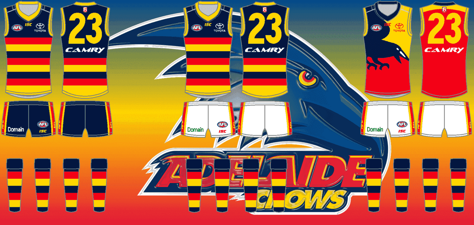
Adelaide
Home: Worn Home Vs Everyone.
Away: Worn Away vs Brisbane, Collingwood, Fremantle, Geelong, Gold Coast, North Melbourne, Port Adelaide, Sydney, West Coast, Western Bulldogs.
Clash: Worn vs Away Carlton, Essendon, GWS, Hawthorn, Melbourne, Richmond, St. Kilda.
Home: Worn Home Vs Everyone.
Away: Worn Away vs Brisbane, Collingwood, Fremantle, Geelong, Gold Coast, North Melbourne, Port Adelaide, Sydney, West Coast, Western Bulldogs.
Clash: Worn vs Away Carlton, Essendon, GWS, Hawthorn, Melbourne, Richmond, St. Kilda.
Last edited:
- Sep 19, 2007
- 19,083
- 17,645
- AFL Club
- St Kilda
- Other Teams
- Anaheim Ducks, PSV Eindhoven
Gold Coast Kits

- Jun 18, 2016
- 51,696
- 99,077
- AFL Club
- West Coast
- Other Teams
- Perth Scorchers
I love the background but you need some transparency as well as it takes attention away from the kits.Adelaide
Home: Worn Home Vs Everyone.
Away: Worn Away vs Brisbane, Collingwood, Fremantle, Geelong, Gold Coast, North Melbourne, Port Adelaide, Sydney, West Coast, Western Bulldogs.
Clash: Worn vs Away Carlton, Essendon, GWS, Hawthorn, Melbourne, Richmond, St. Kilda.View attachment 487538
- Sep 8, 2011
- 11,014
- 11,021
- AFL Club
- West Coast
IMO Gold Coast weaken their brand by having a blue and yellow strip. You need to own your identity, rather than broaden it
- Sep 8, 2011
- 11,014
- 11,021
- AFL Club
- West Coast
Yellow guernsey with red shorts would work
- Status
- Not open for further replies.
Similar threads
- Replies
- 726
- Views
- 78K
