Navigation
Install the app
How to install the app on iOS
Follow along with the video below to see how to install our site as a web app on your home screen.
Note: This feature may not be available in some browsers.
More options
Style variation
-


LIVE: Brisbane Lions v Geelong - Rd 10 - 7:30PM Thu
Squiggle tips Lions at 56% chance -- What's your tip? -- Injury Lists » -- All Rd 10 Games
You are using an out of date browser. It may not display this or other websites correctly.
You should upgrade or use an alternative browser.
You should upgrade or use an alternative browser.
Discussion Logo Discussion Thread
- Thread starter akkaps
- Start date
- Tagged users None
🥰 Love BigFooty? Join now for free.
RedmanWasHere
Rarely in kitchens at parties.
- Joined
- Aug 23, 2010
- Posts
- 31,033
- Reaction score
- 38,395
- Location
- Information Superhighway
- AFL Club
- Essendon
- Other Teams
- Exers, Gryffindor, Rich+Ess AFLW, Tassie
How would the logo look on its own?
- Joined
- Mar 20, 2012
- Posts
- 48,187
- Reaction score
- 33,537
- AFL Club
- Carlton
- Thread starter
- #1,203
FFS, It's 126 years. And 125th Anniversary. Get it right.
Log in to remove this Banner Ad
If you want to school people on terminology, get it right. It's the 125th Anniversary and 125 Years. It's the 126th SEASON.FFS, It's 126 years. And 125th Anniversary. Get it right.
TheLoungeLizard
The world's most handsome man
- Joined
- Oct 21, 2010
- Posts
- 13,599
- Reaction score
- 19,076
- Location
- England
- AFL Club
- Richmond
- Other Teams
- Newcastle United, New York Yankees
How is that Holden logo different enough to attract a new market?
They took one colour out.....
They took one colour out.....
- Joined
- Mar 20, 2012
- Posts
- 48,187
- Reaction score
- 33,537
- AFL Club
- Carlton
- Thread starter
- #1,210
- Joined
- May 7, 2013
- Posts
- 3,534
- Reaction score
- 3,729
- Location
- Sydney
- AFL Club
- Sydney
- Other Teams
- Too many
Creative and continuing their past branding but dumb af in my opinion
TheLoungeLizard
The world's most handsome man
- Joined
- Oct 21, 2010
- Posts
- 13,599
- Reaction score
- 19,076
- Location
- England
- AFL Club
- Richmond
- Other Teams
- Newcastle United, New York Yankees
This change has been in the works for a while
- Joined
- May 3, 2014
- Posts
- 5,140
- Reaction score
- 6,055
- Location
- #westside
- AFL Club
- North Melbourne
- Other Teams
- We put the U in CGU

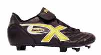
New X Blades logo
Gibbsy
Moderator
- Staff
- #1,214
'
New X Blades logo
Can they make up their mind as to what their name is?
Sometimes they'll run with the X logo, sometimes the XBlades, sometimes just Blades on its own
My first ever pair of footy boots back when I was 5 years old and playing Auskick were some black and yellow Blades, and I remember the tongue just had 'Blades' written on it in sentence case in yellow writing. And the shoelaces were ridiculously long so they had to be wrapped twice around the shoe before I could tie them up!
Jack Stevens
#2 Ticket Holder
At least it's centred
Gibbsy
Moderator
- Staff
- #1,216
Can they make up their mind as to what their name is?
Sometimes they'll run with the X logo, sometimes the XBlades, sometimes just Blades on its own
My first ever pair of footy boots back when I was 5 years old and playing Auskick were some black and yellow Blades, and I remember the tongue just had 'Blades' written on it in sentence case in yellow writing. And the shoelaces were ridiculously long so they had to be wrapped twice around the shoe before I could tie them up!
I am quoting my own post but I think I found the boots! Thank you Web Archive
RedmanWasHere
Rarely in kitchens at parties.
- Joined
- Aug 23, 2010
- Posts
- 31,033
- Reaction score
- 38,395
- Location
- Information Superhighway
- AFL Club
- Essendon
- Other Teams
- Exers, Gryffindor, Rich+Ess AFLW, Tassie
Kodak's turn now.
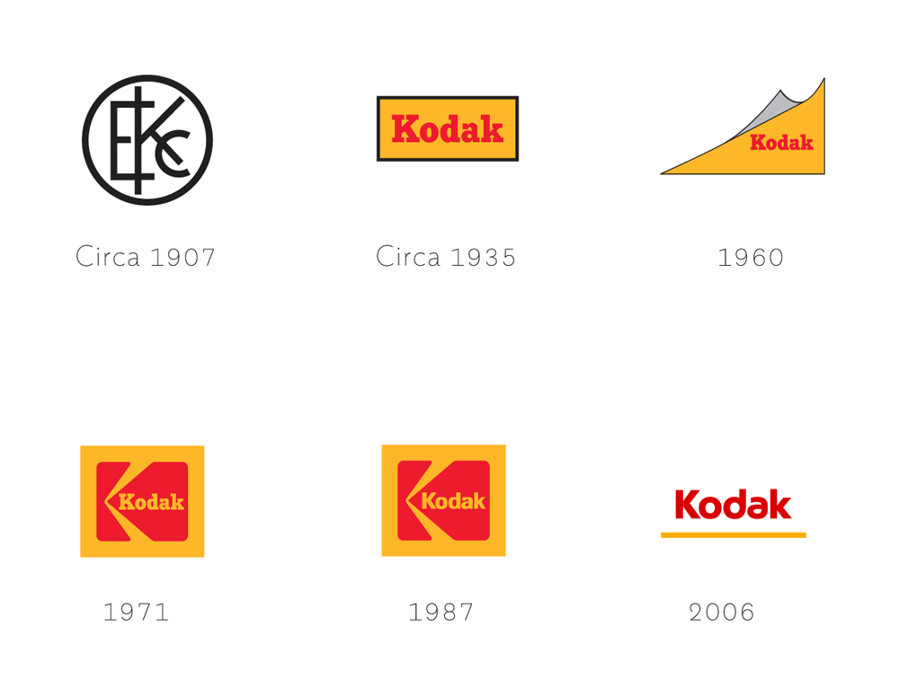
These previous logos have led to the following:


These previous logos have led to the following:

- Joined
- Mar 20, 2012
- Posts
- 48,187
- Reaction score
- 33,537
- AFL Club
- Carlton
- Thread starter
- #1,218
Aren't they releasing a smartphone as well, soon.
Matele
Eh?!
- Joined
- Jul 14, 2014
- Posts
- 16,213
- Reaction score
- 22,385
- Location
- Perth
- AFL Club
- West Coast
- Other Teams
- Liverpool FC.
Yesssss. http://www.theverge.com/2016/10/20/13333632/kodak-phone-ektra-bullittAren't they releasing a smartphone as well, soon.
🥰 Love BigFooty? Join now for free.
- Joined
- Aug 11, 2011
- Posts
- 2,623
- Reaction score
- 1,455
- Location
- Dingley
- AFL Club
- Hawthorn
- Other Teams
- Box Hill (VFL)
Here are a few pages I have found on Logos and Logo Design.


Gibbsy
Moderator
- Staff
- #1,221
I saw that first infographic on reddit a few months ago; what a load of shit it is. "Be timeless", "be new". A bit contradictory isn't it?! In fact the entire thing is terrible. "Leverage your negative space"? Maybe 1% of logos have negative space. Ridiculous.
The only worse thing I've seen is will.i.am on how to create a logo
The only worse thing I've seen is will.i.am on how to create a logo
Spanna_
The secret ingredient is crime
- Joined
- Jul 3, 2014
- Posts
- 4,827
- Reaction score
- 4,564
- Location
- Perth
- AFL Club
- West Coast
- Other Teams
- West Perth, Wildcats, Scorchers
Can somebody tell me what the **** was Will.I.am on about? He clearly had no idea what he was doing, especially when he suddenly brought the topic to India. Made me cringe.
- Joined
- Mar 20, 2012
- Posts
- 48,187
- Reaction score
- 33,537
- AFL Club
- Carlton
- Thread starter
- #1,224


fancyscum
Radical Crommunist
Doesn't really look very sporty to me, preferred the old one tbh.
Similar threads
- Replies
- 22
- Views
- 723


