Remove this Banner Ad

Discussion Logo Discussion Thread

  • Thread starter Thread starter akkaps
  • Start date Start date
  • Tagged users Tagged users None

🥰 Love BigFooty? Join now for free.

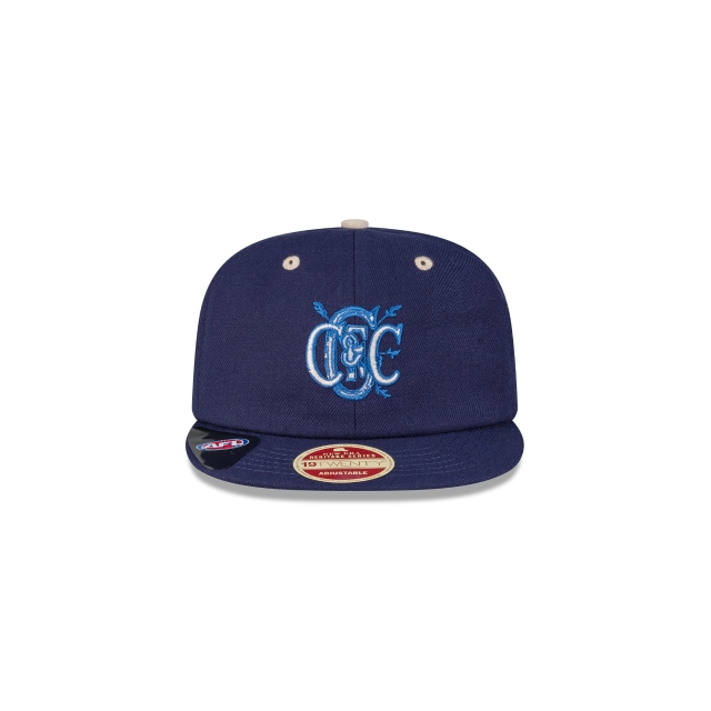
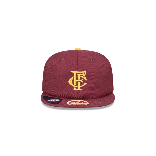
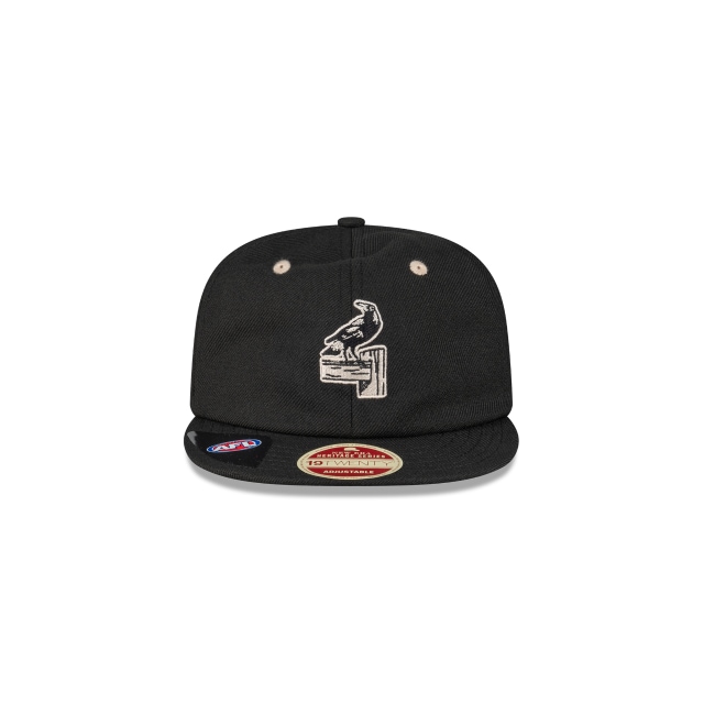
Not sure if this is the right thread for this but there are some interesting logos here, some I've never seen before.

9518751055902.png
9518752890910.png
9518756036638.png
 
Not sure if this is the right thread for this but there are some interesting logos here, some I've never seen before.

9518751055902.png
9518752890910.png
9518756036638.png
Mine just came, too bad I look like Elmer Fudd in it..
Screen Shot 2020-06-21 at 2.05.13 pm.png
 

Log in to remove this Banner Ad

Not sure if this is the right thread for this but there are some interesting logos here, some I've never seen before.

9518751055902.png
9518752890910.png
9518756036638.png
1592820035007.png
Out of stock already! Ah well, I can't really justify buying one at the moment anyway. Nice to see our history & heritage being honoured & recognised though.
 
Google Photos has a tweaked logo.

1593160600389.png 1593160613058.png


They go from the nice looking and similar to the National Sports Museum logo to a painfully generic Google colour palette.
 

Remove this Banner Ad

The 'Optus' WAFL tidied up their logo mid-2019 thankfully. However, they still use both versions of the logo which is odd.

First version
old wafl.png
Second tidier version
seond wafl.jpg
 

🥰 Love BigFooty? Join now for free.

How are they being used?
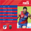
Well, from just yesterday, on the club specific fixtures the newer logo was used whereas on the whole comp fixtures the landscape logo was used.
1593247789416.png 1593247848687.png
 
Well, from just yesterday, on the club specific fixtures the newer logo was used whereas on the whole comp fixtures the landscape logo was used.
View attachment 901310 View attachment 901312

They probably just have two different lockups for different applications. Just like the AFL have the horizontal version which you see painted on the ground, but they also have the vertically stacked version.
 
Same style as the logo used from 2010-2014. Always felt the Mcdonalds logo contrasted nicely with the logo too for some reason. 1593326907016.png 1593327222707.png
 

Remove this Banner Ad

Remove this Banner Ad

🥰 Love BigFooty? Join now for free.

Back
Top Bottom