Navigation
Install the app
How to install the app on iOS
Follow along with the video below to see how to install our site as a web app on your home screen.
Note: This feature may not be available in some browsers.
More options

You are using an out of date browser. It may not display this or other websites correctly.
You should upgrade or use an alternative browser.
You should upgrade or use an alternative browser.
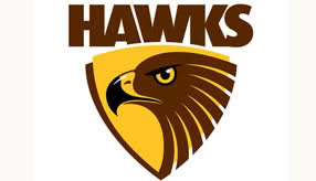
New Hawthorn logo
- Thread starter Hawkk
- Start date
- Tagged users None
This is my personal favorite.

Best logo ever

agree with the above poster!!!!!
- Thread starter
- #103
It is actually starting to grow on me after having a few more looks at it. I still don't like the fact it doesnt say "Hawthorn" anywhere.
The problem with putting 'Hawthorn' on it is that because of the logos shape, the caption would be hardly recognizable without taking away from the Hawk itself.
With that said, we're really only Hawthorn in name only these days. We train at Waverley, play home games at the MCG and York Park and draw support from all around Australia...heck we don't even have a social drinking hole in Hawthorn anymore!
I love Hawthorn, but I can understand why they didn't put it on the logo - we just don't have the link to our old home that the Richmond's, Carlton's etc have
I agree with the above poster, the Hawk itself actually looks alright...but the shield, yellow and 'Hawks' capturing is just off.
adwardobulldog
Cancelled
- Banned
- #106
looks like they trying to relive the 80's. Looks very old the design. And as a outsider looking in how can you not have chosen Luke Hodge as your Captain. One of the most courageous players in the league.
Ghostwriter
Cancelled

This ones better.
rfctigerarmy
🏆🏆🏆🏆🏆🏆🏆🏆🏆🏆🏆🏆🏆
Thanks a nice logo. NHL-like.
Dont like the typo though
Dont like the typo though
The old one: horrible.
The new one: ordinary.
Thus, the new one is an improvement.
The new one: ordinary.
Thus, the new one is an improvement.
toddys10
Senior List
This is much better:
Made it my self.

Made it my self.
looks like they trying to relive the 80's. Looks very old the design. And as a outsider looking in how can you not have chosen Luke Hodge as your Captain. One of the most courageous players in the league.
Sometimes ill-disciplined (both towards the opposition and umpires). In this regards, Hodge is not a role-model.
- Thread starter
- #112
This is much better:
Made it my self.
It could be worse, we could have a 'tragic' history, no money and no supporters
- Thread starter
- #113
Azzballz Deluxe
All Australian
Yeah, nothing wrong with the bird itself. Looks like a noble, wise, not to be ****ed with hawk.
Could of done better though..
Could of done better though..
- May 8, 2006
- 13,700
- 11,422
- AFL Club
- Essendon
- Other Teams
- NYJ
It looks nothing like a footy club logo...it looks like something borrowed from the front page of a Year 7 bird book about Hawks.
Its crap.
Its crap.
Really really really worried bout the tassie shape though...
Looks like a bit of ye olde logo phasey inny to me
toddys10
Senior List
http://hawthornfc.com.au/ said:The Hawks will play under the new logo in 2008, which displays a strong and determined Hawk, focused and ready to hunt.
The brave new shield represents an unwavering horizon for the club which has re-built itself both on and off the field to be one of the most exciting young and talented teams in the AFL, as well as one of the most professional administrative teams in Australian sport.
So the shield isn't supposed to be Tasmania.
- Aug 29, 2006
- 4,309
- 4,621
- AFL Club
- Hawthorn
- Other Teams
- Chicago Bulls
This is much better:
Made it my self.
hahah ill pay that.
It could be worse, we could have a 'tragic' history, no money and no supporters
LOL, gotta pay that one.
GO TIGES!!!
Alkaline
Norm Smith Medallist
NOt too bad i guess. Will take a bit to get use to though.
I think it would be more effective if the Hawks hair was styled into a faux hawk.
Look like a tame American budgie shaped like Tasmania that is looking backwards. Good choice...
Similar threads
- Replies
- 35
- Views
- 874
- Replies
- 0
- Views
- 118
