News New Jumpers for 2024

Remove this Banner Ad

Looks like the home jumper is locked, Fuijisu is the home sponsor and the piping is gone off the sleeves
GAKP0ufbMAA_YSd
 

Log in to remove this ad.

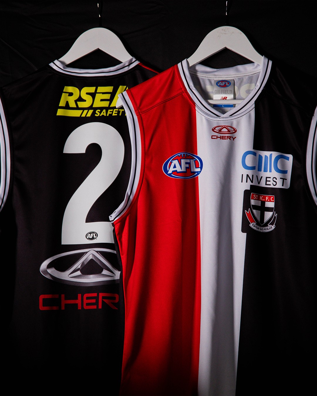
Still curious what the Dutton logo on the back will look like. I think the draft day jumpers had a black box on them, but they also did for Fujitsu on the front, while the announcement had plain white text, but it’s not unheard of for clubs to make one off jumpers for announcement (like West Coast revealing their new logo).
 
Old logo in the top right. I remember a few weeks ago they hinted at a change on their FB page.

GAFu6YaaEAA1YA2
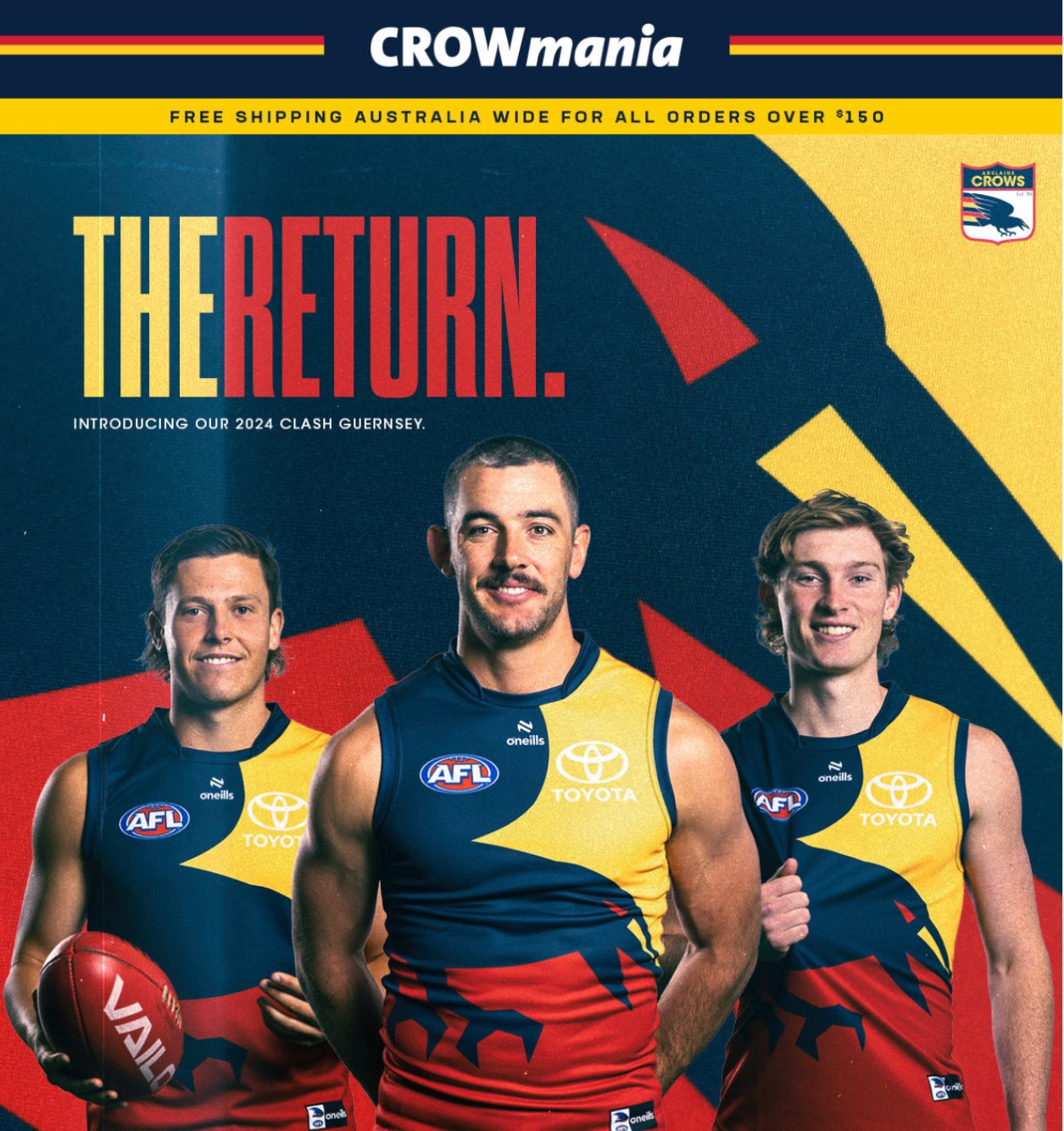
How is that a clash jumper? Is it dark? Is it light ?

The back may work - but that doesn't help from the front. Both sides of a jumper need to be consistent.

Totally misses the point.

It also may look good with the blue shorts - but it will be worn with white shorts, so why show it like that?
They should have a mostly yellow (or white) clash jumper.
 
Last edited:
do we have any concrete info if Collingwood will be getting a revamped template? 4 seasons with the same template just doesn't sit right with me...
 

(Log in to remove this ad.)

Noticed the recruits for Geelong had a photo with the new polo on this week, no GMHBA on the sleeves, is there something in it?
 
Big rumours going around that instead of Black and white stripes, they will be wearing black and white stripes.
do we have any concrete info if Collingwood will be getting a revamped template? 4 seasons with the same template just doesn't sit right with me...
 
How is that a clash jumper? Is it dark? Is it light ?

The back may work - but that doesn't help from the front. Both sides of a jumper need to be consistent.

Totally misses the point.

It also may look good with the blue shorts - but it will be worn with white shorts, so why show it like that?
They should have a mostly yellow (or white) clash jumper.
This.

Red is fine for most away games but a yellow back would provide more contrast in a few games.
 
The Murder of Crows was horrendous. As were quite a few of their clash designs.

And let's not forget the poll for a new clash jumper they tried to rig, but then this entire board united and rigged it back in their face 😝😝😝😝😝

I disagree, crows fans are happy and the ones that they have uniquely done, like the murder of crows, were universally hated.

I'm not against clubs catering to their supporter base than jumper nuffies like us.
 
Not when it's a dark (ish) red. The yellow one provided more contrast in some games where neither the red nor the home were strong enough.
Didn't look dark red to me, all they need is a navy and red uniform. Sydney and Gold Coast are good examples of red coloured teams never really clashing, except on rare occasions.
 

News New Jumpers for 2024

Remove this Banner Ad

Back
Top