Workshop Port Adelaide's perfect logo

Remove this Banner Ad

I guess he had no copyright and also no right to use the PA new era logo so port and New Era could sue him if he's trying to claim ownership so no leg to stand on really.

Thats not how copyright works at all. It subsists as soon as you produce a 'work'.

There'd be other IP law issues here, that would likely prevent the author from pursuing action, but the general trend is towards extending protection to works communicated via social media.
 
That's hilarious. It's a blatant copy and as clear as stealing IP can be.

I don't love the logo, I don't hate it either, but the original poster there surely has a claim that their IP has been used here without permission.

Also my understanding is there is now more protection to the author/publisher if you publicly put something out there- it's yours. You don't need to go and get or state a copyright specifically and this has been done to protect artists, authors, designers, etc. There would be technicalities on the platform used and other IP you may be using or infringing upon but there's a discussion here.

Seemingly as well PAFC supposedly paid other designers and consultants for this logo, yet the logo it's clearly based on gets no credit....
 
Last edited:
That's hilarious. It's a blatant copy and as clear as stealing IP can be.

I don't love the logo, I don't hate it either, but the original poster there surely has a claim that their IP has been used here without permission.

Also my understanding is there is now more protection to the author/publisher if you publicly put something out there- it's yours. You don't need to go and get or state a copyright specifically and this has been done to protect artists, authors, designers, etc. There would be technicalities on the platform used and other IP you may be using or infringing upon but there's a discussion here.

Seemingly as well PAFC supposedly paid other designers and consultants for this logo, yet the logo it's clearly based on gets no credit....

but he has used PA’s IP, so really he has no leg to stand on.
 

Log in to remove this ad.

It's not even the same. It's a roughly equivalent assembly of pre-existing elements.

The only unique part of his design is his version of the PA monogram, which is the thing that is most different to the new Port logo.
 
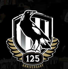
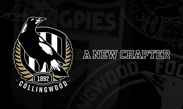
Similar case with this poster who mocked up an alternate Collingwood 125 logo using the existing elements that ended up looking strikingly similar to what we ended up with. FWIW, I don't think anybody copied anyone, very easy to produce these two logos if you've been asked to design a simplistic emblem-style logo.
um.....

291301_ec1dd8a3ac336f8ee297b2a302e45c45.jpg


171004_logo620.jpg
 
Last edited:
Not quite as egregious as the Collingwood one, but still lazy
Also what exactly was wrong about it? I thought it laid solid foundation for a modern logo and what we have now, while also being a nicely balanced logo and having enough symbolism.
 
What existed similar to his logo that Port was using before his logo?

The PA monogram & The Prison Bar stripes.

Where do you think he got the idea to use them?
 
The PA monogram & The Prison Bar stripes.

Where do you think he got the idea to use them?
Are they protected? Would be interesting if anyone here had a genuine legal background to give perspective. For me it's a clear, blatant, copy of someone else's work without permission. Maybe that's legal here, but there's no doubt they've done it.
 

(Log in to remove this ad.)

FWIW, and whilst I have no doubt the designers have come across BigFooty and potentially seen that logo, but I swear I've seen people do this design at least five other times. It's a pretty generic, logical logo concept.

I've seen a couple comments like this around - "it's generic anyone could think of that, there are heaps like that going round" - can anyone actually produce another logo similar to the one Dean made that the club ripped off?
 
I've seen a couple comments like this around - "it's generic anyone could think of that, there are heaps like that going round" - can anyone actually produce another logo similar to the one Dean made that the club ripped off?

20 second Google search uncovered this triple treat.

7C22AE3A-C2AE-49A7-842A-FD48D7998250.png
 
Its blatant plagiarism. Port had a child design their guernsey, and now bigfooty design their logo!
Designer deserves to be paid. Clubs pay big money for rebrands.

Its an interesting discussion, we see so many people have a crack at a logo on here that I am sure every logo going forward would be close to the product a club releases.

I think there is enough difference there, and I think that concept with the PA and prision Bars has been mocked and discussed enough that the degree of seperation is enough.
 
The monogram and the prison bars were elements that comfortably pre-dated the 2015 concept posted on this board. If Port had come out with the same sort of monogram, with the longer loop of the P forming the crossbar of the A etc, then i'd absolutely be in agreement.

But the monogram is totally different and outside of that it's just 2 well established Port Adelaide design elements put together in a fairly simple and generic way. Part of my problem with the new Port logo is that it is way too generic.
 

Remove this Banner Ad

Back
Top