Workshop Port Adelaide's perfect logo

Remove this Banner Ad

My contribution:


Port Adelaide Football Club

Port%2BAdelaide%2BFC%2B%2528Club%2529.jpg

Port Adelaide Power
Port%2BAdelaide%2BFC%2B%2528Power%2529.jpg
 
Last edited:

Log in to remove this ad.

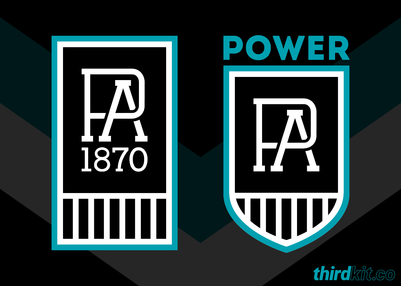
Port Launching a one-season 150th Aniversary logo later today. One club one logo for both the Reserves team in the SANFL and the firsts in the AFL. the leak going around the 'net has a PA monogram on a beer can ( the launch is at a local Port Brewery New Port logo2019.jpg
 
I'm not one to dig up old threads, but...

🤔
If there was any doubt that footy clubs actually look at BigFooty for inspiration before... there isn't any now.
 
Last edited:
Comes down to how long the PA logo has been around, if it’s before 2015 think the club could chase for use of their design, if the 2015 one is all original could be an interesting discussion, but with no copy right right on the logo and the prision bars being such a large part of their history can’t see an argument being won
 

(Log in to remove this ad.)

FWIW, and whilst I have no doubt the designers have come across BigFooty and potentially seen that logo, but I swear I've seen people do this design at least five other times. It's a pretty generic, logical logo concept.
 
FWIW, and whilst I have no doubt the designers have come across BigFooty and potentially seen that logo, but I swear I've seen people do this design at least five other times. It's a pretty generic, logical logo concept.

It’s also standing on the shoulders of our existing symbols. The PA monogram designed by NewEra was already widely used and the Bars are probably our most famous icon, so combining the two is barely creating something new. In any event the monogram’s are poles apart in terms of style.
 
It’s also standing on the shoulders of our existing symbols. The PA monogram designed by NewEra was already widely used and the Bars are probably our most famous icon, so combining the two is barely creating something new. In any event the monogram’s are poles apart in terms of style.

Oh and don’t get me started on the four different lineweights...
 
Oh and don’t get me started on the four different lineweights...

...and four fonts ffs! PA, 1870, Port Adelaide Football Club and 150 years (granted this last one will be dropped in 2021) are all different from one another.

Between that, the line weights and the off-centre barely legible why even have it there 1870 it’s doing my head in.

Should be an easy 8/10 but it’s a 5/10 due to the execution.
 

Remove this Banner Ad

Back
Top