- Aug 25, 2014
- 7,718
- 11,772
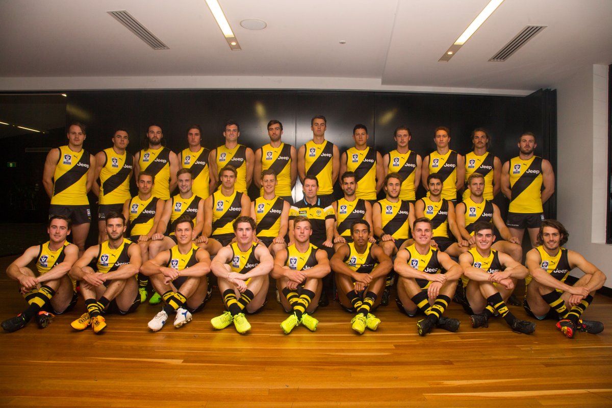
- AFL Club
- Richmond
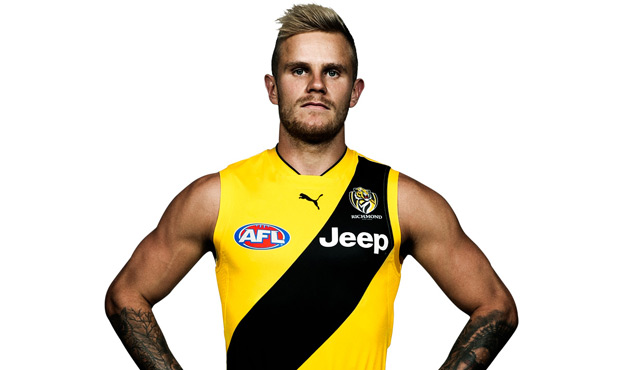
They decided to chuck the big ass ugly logo on it....

To be worn Round 6 for the first time.
To be worn Round 6 for the first time.
Follow along with the video below to see how to install our site as a web app on your home screen.
Note: This feature may not be available in some browsers.
Did he get a spray tan?They decided to chuck the big ass ugly logo on it....
To be worn Round 6 for the first time.
Did he get a spray tan?
Against Adelaide. They play Brisbane away before this.They decided to chuck the big ass ugly logo on it....
To be worn Round 6 for the first time.
Black teams wear black against BL though. It's not too bad but it's darkish vs dark, not a huge amount of contrast.Against Adelaide. They play Brisbane away before this.
http://www.richmondfc.com.au/news/2017-03-29/2017-clash-guernsey
I think you're over-emphasizing the effect of a yellow line that's only visible on close-up shots...Yellow cuffs and collar are an improvement, as is yellow over mustard. But that logo is so pointless, especially when every other element on the jumper is so bold and its so complex at that scale.
Also, I now agree with those in the preseason saying that the yellow piping on the collar was a bad look for Richmond. Puma have done a great job on Richmond but I couldn't help thinking on Thursday that the sash would stand out even more without the extra yellow.
Logo should've been on the bottom of the jeep or just watermarked like the home one.They decided to chuck the big ass ugly logo on it....
To be worn Round 6 for the first time.

Nah I agree with him; just pointless.I think you're over-emphasizing the effect of a yellow line that's only visible on close-up shots...
Pointless is different to reducing how much the sash stands out.Nah I agree with him; just pointless.
Yeah I can get how it sounds dumb, but I get that for sure. It just seems a little cheap – keep those sort of things to clash jumpers. It generally doesn't add to the jumper at all.Pointless is different to reducing how much the sash stands out.
Brisbane, Adelaide, West Coast take note... this is how you watermark. I didn't know the Tigers had one until now.Logo should've been on the bottom of the jeep or just watermarked like the home one.
Brisbane, Adelaide, West Coast take note... this is how you watermark. I didn't know the Tigers had one until now.
Might not have been ready, surely we would've had an announcement of the jumper before the season if it was ready.Pretty much as expected, though the choice to add the logo is slighty strange, given its not on the home jumper.
Still should have been worn last week.
I didn't get your point until I saw it in motion on the TV and I agree completely now.Nah I agree with him; just pointless.
I just think it makes the Richmond home jumper look like a clash jumper, much like how the Collingwood clash strip now just looks like a clash, and not a heritage, now it has white and not black cuffs.I didn't get your point until I saw it in motion on the TV and I agree completely now.
I also agree that the yellow Reebok used was the best shade (going off a post you made a few weeks back)
I used to knock Reebok big time when we were with them but I think that we really miss their presence in the AFL
I thought the same thing about the Richmond piping first time I saw it, guessing they were thinking that if people wanted real yellow, they should give them all the f**kin yellow. Getting the colours right has accentuated how s**t Richmond look with white numbers for mine, though.much like how the Collingwood clash strip now just looks like a clash, and not a heritage, now it has white and not black cuffs.
I have to disagree on the Collingwood cuffs, I think it looks much better and cleaner with white.I just think it makes the Richmond home jumper look like a clash jumper, much like how the Collingwood clash strip now just looks like a clash, and not a heritage, now it has white and not black cuffs.