


You mean 'less terrible'? Agreed.I appreciate that the AFL has standardised the Grand Final logo. I just wish it was........nicer looking.
Navigation
Install the app
How to install the app on iOS
Follow along with the video below to see how to install our site as a web app on your home screen.
Note: This feature may not be available in some browsers.
More options
You are using an out of date browser. It may not display this or other websites correctly.
You should upgrade or use an alternative browser.
You should upgrade or use an alternative browser.
Discussion State League Guernseys
- Thread starter ULTIMATE_WARRIOR
- Start date
- Tagged users None
fegz222
Senior List
- Aug 6, 2020
- 225
- 190
- AFL Club
- Richmond
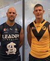
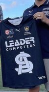
Does anyone know if Werribee ever sold their 2022 indigenous player issue/match worn jumpers? Was told that they would, and have messaged their fb page a few times since mid-year but have been left on seen.
It’s a design I’d love to get a hold of.
Sent from my iPhone using BigFooty.com
It’s a design I’d love to get a hold of.
Sent from my iPhone using BigFooty.com
EightyFour
Senior List
Fizzler
BBTB
- Dec 26, 2013
- 12,781
- 16,367
- AFL Club
- Port Adelaide
- Other Teams
- OKC, Coburg, Werribee, Storm, QPR
They haven’t switched to a yellow home kit have they?South and Glenelg kit for 2023.
EightyFour
Senior List
Not sure. First year with O’N so not much info yet.They haven’t switched to a yellow home kit have they?
EightyFour
Senior List
The lack of sponsors makes me think it’s just a prototype.
Hopefully that's Glenelg's clash kit for 2023 (would make the most sense). I think their Richmond-style sash main jumper is rusted on.They haven’t switched to a yellow home kit have they?
Heardy_101
LET'S GO BRANDON
The Glenelg jumper above is being worn with home shorts in the promo.... Be nice to see them don a throwback for a season or two.
Blue Smithy's on the VFL logo

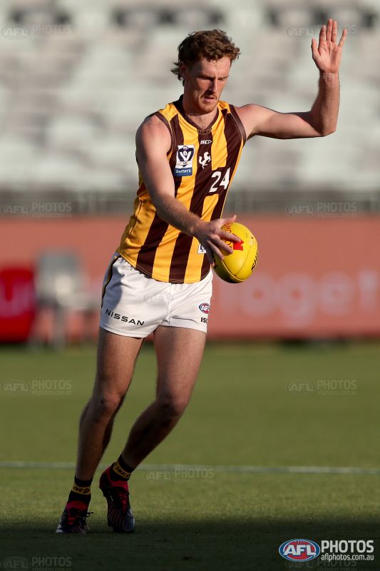
Lions also wearing this new VFL logo


Rubber Arm
AFL Sucks
- Oct 10, 2018
- 1,643
- 3,575
- AFL Club
- North Melbourne
- Other Teams
- ^ I don't actually go for North.
Hmm would have expected the front numbers to be whiteLions also wearing this new VFL logoView attachment 1615534
fegz222
Senior List
- Aug 6, 2020
- 225
- 190
- AFL Club
- Richmond
Lions also wearing this new VFL logoView attachment 1615534
Love it, looks great!
Sent from my iPhone using BigFooty.com
Zoops
Club Legend
- Apr 20, 2017
- 1,406
- 5,414
- AFL Club
- Melbourne
- Other Teams
- Vancouver Canucks, Southampton FC
Didn't know whether to post it here or in the logo discussion thread but reckon it's more fitting here.
Centrals rebrand concept harkening back to the circle logo era. When the dog had some character!

Centrals rebrand concept harkening back to the circle logo era. When the dog had some character!

Fizzler
BBTB
- Dec 26, 2013
- 12,781
- 16,367
- AFL Club
- Port Adelaide
- Other Teams
- OKC, Coburg, Werribee, Storm, QPR
Bendigo Pioneers seem to have a new logo, only visible through here but I assume it'll result in a new guernsey since the old one features heavily on the jumper.
 www.afl.com.au
Coates Talent League Clubs - AFL.com.au
Australian Football League. All the latest AFL news, video, results and information
www.afl.com.au
Bendigo Pioneers seem to have a new logo, only visible through here but I assume it'll result in a new guernsey since the old one features heavily on the jumper.
Coates Talent League Clubs - AFL.com.au
Australian Football League. All the latest AFL news, video, results and information


Fizzler
BBTB
- Dec 26, 2013
- 12,781
- 16,367
- AFL Club
- Port Adelaide
- Other Teams
- OKC, Coburg, Werribee, Storm, QPR
Interesting that the photos all have boys in one jumper and girls in another. I wonder if this means they’ll have different jumpers. In previous instances where there’s a difference between the boys and girls teams there’s at least a reason (Dandenong girls having pink on their jumper, Oakleigh girls wearing Collingwood colours due to some partnership) but in this case I’m not sure why they’d choose to.
- May 23, 2016
- 713
- 836
- AFL Club
- St Kilda
- Other Teams
- Port Melbourne; Kalkee; Horsham Demons
Port Melbourne looks like they have a new clash guernsey, two blue stripes on red with a plain back. Worn in yesterdays practice match vs Coburg


Fizzler
BBTB
- Dec 26, 2013
- 12,781
- 16,367
- AFL Club
- Port Adelaide
- Other Teams
- OKC, Coburg, Werribee, Storm, QPR
Surprised it actually was able to break the clash yesterday, looks good and very traditional for a team like PortPort Melbourne looks like they have a new clash guernsey, two blue stripes on red with a plain back. Worn in yesterdays practice match vs Coburg
View attachment 1621966View attachment 1621969View attachment 1621971View attachment 1621972
fegz222
Senior List
- Aug 6, 2020
- 225
- 190
- AFL Club
- Richmond
Port Melbourne looks like they have a new clash guernsey, two blue stripes on red with a plain back. Worn in yesterdays practice match vs Coburg
View attachment 1621966View attachment 1621969View attachment 1621971View attachment 1621972
Yeah that’s definitely new, I like it! Looks classy
Sent from my iPhone using BigFooty.com
Subi with a new jumper this year?
EDIT: throwback to '73 premiership - 1973 Premiership 50 Year Reunion | Subiaco Football Club Official Team Store

EDIT: throwback to '73 premiership - 1973 Premiership 50 Year Reunion | Subiaco Football Club Official Team Store

New Northern knights guernsey


Stickman90
Rookie
Mero
Norm Smith Medallist
And it's not just a stretched copy of Yale's logoDidn't know whether to post it here or in the logo discussion thread but reckon it's more fitting here.
Centrals rebrand concept harkening back to the circle logo era. When the dog had some character!
East Fremantle 125th Anniversary


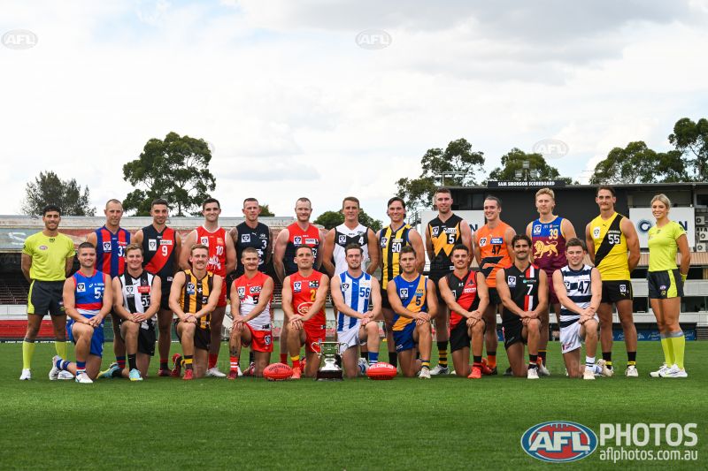
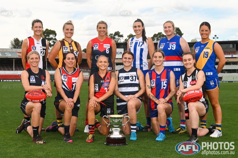
Port Melb, Casey, Southport, Sandy, Werribee, Brisbane, Collingwood, Box Hill, Sydney, Gold Coast, Williamstown, Frankston and Geelong all have new jumpers for 2023 with the new Smithy's VFL logo on them.
Other clubs using last seasons jumpers including Essendon wearing their 150 years jumper.
Similar threads
- Replies
- 29
- Views
- 3K
