Navigation
Install the app
How to install the app on iOS
Follow along with the video below to see how to install our site as a web app on your home screen.
Note: This feature may not be available in some browsers.
More options
Style variation
You are using an out of date browser. It may not display this or other websites correctly.
You should upgrade or use an alternative browser.
You should upgrade or use an alternative browser.
The Jumper Thread
- Thread starter Monocle
- Start date
- Tagged users None
🥰 Love BigFooty? Join now for free.
- Joined
- Jul 1, 2005
- Posts
- 4,095
- Reaction score
- 5,321
- Location
- Perth
- AFL Club
- West Coast
- Other Teams
- Wildcats, Subiaco Lions, Bulls
A night jumper? No thanks - overly complicated. Royal looks great under lights anywayI think we should play in the Navy wings for Night Games
- Joined
- Jul 1, 2005
- Posts
- 4,095
- Reaction score
- 5,321
- Location
- Perth
- AFL Club
- West Coast
- Other Teams
- Wildcats, Subiaco Lions, Bulls
We don't have a Home and Away strip - we have Home strip and clash strip.Agree with this but the AFL being what it is our away jumper clashes more with some teams than our home jumper.
I would just go royal blue with gold wings home + away vs Hawthorn and possibly Richmond and then inverted version for all other away games and leave it at that. Home we wear blue, away we wear blue or gold based on who we are playing.
But then the AFL think black and white vertical stripes vs blue and white vertical stripes or dark blue and white horizontal stripes looks good so...
But we literally do what you say - wear blue at home - and blue or yellow away depending on who we play. But the preference is blue.
- Joined
- Mar 21, 2017
- Posts
- 17,592
- Reaction score
- 38,425
- Location
- Perf
- AFL Club
- West Coast
- Other Teams
- Arsenal, Ferrari
Never forget the woolen scarves of the 00's-10's which were Navy, Gold, White, and Ochre....Absolutely. We had 20 years of dullification to put up with. Not to mention a weird identity crisis as to what our colours actually were.
Log in to remove this Banner Ad
- Joined
- Aug 15, 2009
- Posts
- 14,529
- Reaction score
- 11,090
- Location
- Jakarta
- AFL Club
- West Coast
- Other Teams
- East Perth, Donnybrook, Chelsea
Never forget the woolen scarves of the 00's-10's which were Navy, Gold, White, and Ochre....
Bring back the ochre!
WAFoozy
Debutant
- Joined
- Feb 9, 2026
- Posts
- 56
- Reaction score
- 61
- AFL Club
- West Coast
Jumpers and merch are a mess.
Blue and gold with wings is essential for home, but I'd look at figuring out a way to still improve the design. The new eagle head is atrocious with the wings.
We should be getting creative for clash jumpers, we've used white before, why not have a gold and white jumper? A stealth jumper, charcoal / dark grey with with a golden eagle head in the middle that's it. Simple, but classy.
Current clash jumper is terrible. It does look like we are bringing the ochre back and a retro jumper which from first instance, both look good.
Also what's with training and pre game t-shirts and their logo placements? Looks half assed and unprofessional. Whoever runs this side of the organisation. Get better. Wearing the wings should feel like something.
- Joined
- Jul 26, 2020
- Posts
- 14,677
- Reaction score
- 25,452
- AFL Club
- West Coast
Current clash is our best clash. The head sucks but it’s a billion times better than the tableloth.Jumpers and merch are a mess.
Blue and gold with wings is essential for home, but I'd look at figuring out a way to still improve the design. The new eagle head is atrocious with the wings.
We should be getting creative for clash jumpers, we've used white before, why not have a gold and white jumper? A stealth jumper, charcoal / dark grey with with a golden eagle head in the middle that's it. Simple, but classy.
Current clash jumper is terrible. It does look like we are bringing the ochre back and a retro jumper which from first instance, both look good.
Also what's with training and pre game t-shirts and their logo placements? Looks half assed and unprofessional. Whoever runs this side of the organisation. Get better. Wearing the wings should feel like something.
We should not have white as it’s not part of our colour. Heck no club should be using white if it ain’t part of their colours. We actually have two really good colours. Like someone mentioned, current clash should just he the og peril jumper from 1987. It can be our homage to our history in a similar way lions have a fitzroy kit.
The gather round kit should be the only time we experiment with a kit tbf
WAFoozy
Debutant
- Joined
- Feb 9, 2026
- Posts
- 56
- Reaction score
- 61
- AFL Club
- West Coast
Current clash is our best clash. The head sucks but it’s a billion times better than the tableloth.
We should not have white as it’s not part of our colour. Heck no club should be using white if it ain’t part of their colours. We actually have two really good colours. Like someone mentioned, current clash should just he the og peril jumper from 1987. It can be our homage to our history in a similar way lions have a fitzroy kit.
The gather round kit should be the only time we experiment with a kit tbf
Agree to disagree.
White has been apart of our history, our tri colour had white. Our previous clash jersey was white (Subi Oval days).
Current clash just ain't it. Would represent the current club logo a million times better than what we have now.
Spanna_
The secret ingredient is crime
- Joined
- Jul 3, 2014
- Posts
- 4,820
- Reaction score
- 4,553
- Location
- Perth
- AFL Club
- West Coast
- Other Teams
- West Perth, Wildcats, Scorchers
Clash jumpers need to be good enough that you wouldn't be embarrassed wearing them on grand final day, should it be required as a last resort.
Does our current clash pass this test? I would say yes.
Does our current clash pass this test? I would say yes.
Oh boy.Agree to disagree.
White has been apart of our history, our tri colour had white. Our previous clash jersey was white (Subi Oval days).
Current clash just ain't it. Would represent the current club logo a million times better than what we have now.
I see you are new here so just saying that this is a horrendously unpopular take in these parts.
You are of course entitled to your opinion - however terrible and objectively wrong it is.
White is not one of our colours and the tripanel (along with that clash you mention) was a horrendous abomination that we should be glad to be rid of, not looking back to it as inspiration to put white back on our jumpers.
WAFoozy
Debutant
- Joined
- Feb 9, 2026
- Posts
- 56
- Reaction score
- 61
- AFL Club
- West Coast
Hahahaha, so what I have to agree with everyone? Not once did I say I like those kits, I'm referencing them because it's relevant to what I'm saying.
Modern times require modern thinking. I'm not saying it has to be white, but what we have now is lazy and I think a white / gold would be classier. Like you said that's my opinion. Do I care if you guys agree? No, it's a forum.
Modern times require modern thinking. I'm not saying it has to be white, but what we have now is lazy and I think a white / gold would be classier. Like you said that's my opinion. Do I care if you guys agree? No, it's a forum.
- Joined
- Mar 21, 2017
- Posts
- 17,592
- Reaction score
- 38,425
- Location
- Perf
- AFL Club
- West Coast
- Other Teams
- Arsenal, Ferrari
White has been apart of our history, our tri colour had white. Our previous clash jersey was white (Subi Oval days).
Current clash just ain't it. Would represent the current club logo a million times better than what we have now.

We really getting people wanting to bring back a generic, boring, soulless white clash uniform in the big 2026
You're entitled to your opinion but that's gonna be a super unpopular one around here.
Our current setup is perfect. We predominantly wear the Royal Blue, and a few times a year the Gold comes out for clash games. It has been diluted due to the fact we now wear the First Nations design 2-3 times as well.
Gather Round should be used for a Retro based design each year, we have so many great ones to choose from.
We nailed the 2024 Gather Round, great navy retro design that was able to be worn once Away and once at Home.
Gather Round should be used for a Retro based design each year, we have so many great ones to choose from.
We nailed the 2024 Gather Round, great navy retro design that was able to be worn once Away and once at Home.
Ochre
Premium Platinum
- Joined
- Aug 25, 2008
- Posts
- 40,066
- Reaction score
- 52,218
- Location
- Door City
- AFL Club
- West Coast
- Other Teams
- Claremont
My slightly controversial opinion is we shouldn't have a home/clash jumper and just wear both the wings kits interchangeably home and away based on match ups/time of game/ability to wear blue shorts with the yellow kit/vibes.
And also that anyone that prefers navy/the tablecloth/the tri-panel should be executed.
And also that anyone that prefers navy/the tablecloth/the tri-panel should be executed.
DorothyG
Club Legend
- Joined
- May 24, 2024
- Posts
- 2,693
- Reaction score
- 6,376
- AFL Club
- West Coast
IIRC the bad days of the '10s with the majority white was an AFL directive.White has been apart of our history, our tri colour had white. Our previous clash jersey was white (Subi Oval days).
They thought the best way to deal with clashes was to put the away team in all white. Clubs didn't realise have a say.
Hawks, GC, Adelaide, Brissy, Us, all had horrible majority white away jumpers at the time.
They have thankfully binned that directive and now clubs have a bit more leeway in their clash design.
We don't need white as the majority royal and it's inverse don't really have any natural clashes. Maybe north, but north in the white stripes and white shorts with us in all blue works fine.
The easy solve to most clashes would be to get rid of the requirement for white shorts. The AFLW have show that full colours work.
- Joined
- Mar 31, 2007
- Posts
- 3,960
- Reaction score
- 1,513
- Location
- Perth
- AFL Club
- West Coast
- Other Teams
- East Perth
I've long wanted the AFL to return Heritage Round. Even if it's done every second or third year, it's worth it IMO.Our current setup is perfect. We predominantly wear the Royal Blue, and a few times a year the Gold comes out for clash games. It has been diluted due to the fact we now wear the First Nations design 2-3 times as well.
Gather Round should be used for a Retro based design each year, we have so many great ones to choose from.
We nailed the 2024 Gather Round, great navy retro design that was able to be worn once Away and once at Home.
DorothyG
Club Legend
- Joined
- May 24, 2024
- Posts
- 2,693
- Reaction score
- 6,376
- AFL Club
- West Coast
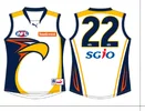
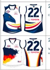
These are all objectively terrible, generic jumpers. There is no identity or uniqueness which differentiates them from one another.
They all look like they have come from the same template.
Not one of these teams colours contains white.
What we have now, although in some cases may not be perfect, they are a hell of an improvement to these.
(
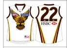
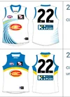
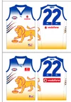
 (I actually I feel our current line up is almost perfect, ditch the white shorts and it may just be perfect),
They all look like they have come from the same template.
Not one of these teams colours contains white.
What we have now, although in some cases may not be perfect, they are a hell of an improvement to these.
(


 (I actually I feel our current line up is almost perfect, ditch the white shorts and it may just be perfect),
I don't know why we complicate things.
Home and Away: royal blue with gold wings
Clash: gold with royal blue wings (aka yellow peril)
**** off with any other colours and design suggestions.
Home and Away: royal blue with gold wings
Clash: gold with royal blue wings (aka yellow peril)
**** off with any other colours and design suggestions.
- Joined
- Apr 30, 2015
- Posts
- 16,121
- Reaction score
- 28,731
- AFL Club
- West Coast
🥰 Love BigFooty? Join now for free.
- Joined
- Jul 26, 2020
- Posts
- 14,677
- Reaction score
- 25,452
- AFL Club
- West Coast
Club tried to modernise the kit and ****ed it up big time in the 2000’s. Out of all the logos the ones that seem to age the best are our older ones. 2000’s onwards all aged badly and this current one is on the same trajectory .Hahahaha, so what I have to agree with everyone? Not once did I say I like those kits, I'm referencing them because it's relevant to what I'm saying.
Modern times require modern thinking. I'm not saying it has to be white, but what we have now is lazy and I think a white / gold would be classier. Like you said that's my opinion. Do I care if you guys agree? No, it's a forum.
You should read the first pinned thread on this board. You’ll see how much hard work the the late great QS and his mates did to bring the clubs kits and colours back to it’s roots.
We are entering our 40th season and I hope in another 40 years time the royal/gold and the wings are as sacred as black/white and the prison bars and like other big victorians clubs colours and kits.
gather and indigenous round is enough to **** around with designs and colours.
- Joined
- Jul 26, 2020
- Posts
- 14,677
- Reaction score
- 25,452
- AFL Club
- West Coast
Peril/royal shots should always be worn against the tigers in H/A games as a nod to our first gamw. That kit is way too good to be treated this poorly.My slightly controversial opinion is we shouldn't have a home/clash jumper and just wear both the wings kits interchangeably home and away based on match ups/time of game/ability to wear blue shorts with the yellow kit/vibes.
And also that anyone that prefers navy/the tablecloth/the tri-panel should be executed.
- Joined
- Jul 26, 2020
- Posts
- 14,677
- Reaction score
- 25,452
- AFL Club
- West Coast
Would love a 40th year one this year but I heard the AFL is limiting the amount of kits this year so suspect we’ll get one for the 20th anniversary of 06 (someone if the boys wearing 20th year anniversary caps at training).
Also 1.23-1.43 mark epitomises Darlings career
Similar threads
- Replies
- 199
- Views
- 7K
- Replies
- 4K
- Views
- 96K


