


Topkent
Confirmed ITK Drafting King
How the * did the OP get players walking off the ground smiling is what I want to know
Follow along with the video below to see how to install our site as a web app on your home screen.
Note: This feature may not be available in some browsers.
Came here to ask this.How the **** did the OP get players walking off the ground smiling is what I want to know
Could be a preseason gameCame here to ask this.
What game is that? We won a game with that lot playing?
Some google detective work shows you're correct. Appears to be after the NAB Challenge match against Richmond.Could be a preseason game
Some google detective work shows you're correct. Appears to be after the NAB Challenge match against Richmond.
It's where the egg giving birth to the jumper first hatches.What the heck is a "yolk" on a football jumper?
Somebody's got egg on their face...Yoke
The clash policy people are clearly colour blind anyway. Half the rounds of the season have clash strips clashing with other clash strips. I love watching footy from before it was 'managed.' It seems like it was a miracle that clubs could just play in their jerseys and umpires wore white. The hundred thousand people in the crowd every week just musn't have known who was who I guess..I second the idea of the disco blue jumper as a clash strip but good luck getting that past the Anti Fun League who like everything to be white.
I actually think the AHG logo is pretty neat. It's certainly much better than True Value Solar on Essendon's guernsey, Renault on Port's or Emirates on Collingwood's. All those are slapped on eyesores that don't mesh with the jumper design at all.
Personally I reckon our away jumper should just be a lihht blue like our early 80s jumperSponsors don't want their logos to blend in - otherwise what's the point of paying for the exposure? As an opposition fan I've always liked your jumper especially with the navy blue. Agree with the comment about removing the ahg website.
As for a clash jumper have you considered red with a blue yoke?
I ******* hate that logo - love the monogram, dislike the trident, the southern cross and all that other crap. Also adamantly against the white jumper. Not a fan of Melbourne in white, looks wrong.
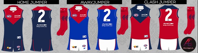
Preferably, I would be for something like this:

They look good but I don't think they fit the AFL requirements for a clash. I think both the royal blue and red would be classified as 'dark' colours. It's stupid I know.
Tbh I don't mind the white clash all that much. I think it's simple and does the job. A necessary evil. In a weird way it makes you appreciate our home guernsey more as well.
Socks should be disco blue with the away jumper IMO, also all blue shorts might work better than white. The "white shorts" rule is stupid, why would we wear white and introduce a third colour?I ******* hate that logo - love the monogram, dislike the trident, the southern cross and all that other crap. Also adamantly against the white jumper. Not a fan of Melbourne in white, looks wrong.
Preferably, I would be for something like this:
