
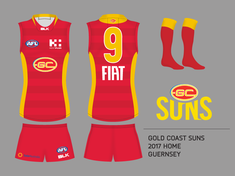
It's just not an attractive colour set from the Suns. The blue doesn't work with the red and yellow as secondary colours in large portions...
Navigation
Install the app
How to install the app on iOS
Follow along with the video below to see how to install our site as a web app on your home screen.
Note: This feature may not be available in some browsers.
More options
You are using an out of date browser. It may not display this or other websites correctly.
You should upgrade or use an alternative browser.
You should upgrade or use an alternative browser.
Workshop Jumper Ideas for 2017
- Thread starter Cody_
- Start date
- Tagged users None
- Status
- Not open for further replies.
- Sep 19, 2007
- 19,084
- 17,645
- AFL Club
- St Kilda
- Other Teams
- Anaheim Ducks, PSV Eindhoven
Looks OK to me, doesn't look any worse than their home jumper, I think the colour swap on the logo definitely helps with that. The red is as minimised as the blue is on the home jumper.It's just not an attractive colour set from the Suns. The blue doesn't work with the red and yellow as secondary colours in large portions...
Would definitely work away vs Brisbane and Sydney which is what it is needed for.
Any other combination of the colours would be worse i.e a inversion (Red/Yellow) would look absolutely horrid as would a blue/red combination. If you remove the side panels it would be too Carlton I think.
Freight Train
Once hit the sign at the Mercantile Mutual Cup
- Moderator
- #628
3/??
View attachment 248510
Swapped royal yoke out for navy, returned it to the classic size, brought in navy shorts and borrowed El_Scorcho's updated lion (hope you don't mind). I also made their dairy sponsor's logo visible. Just like with the Crows, I BLK'ed the colours and brought in a custom number font.
4/??
View attachment 248514
New design inspired by the Parramatta Eels yellow getup for this year. No lion as I couldn't get it to fit while still looking neat and uncluttered.
Dunno how I missed this but * me, the Lions in that colour set gives me an erection.
How would it look if you swapped the yellow and red?
fancyscum
Radical Crommunist
I don't want to see the Suns rebrand themselves at this early stage in their existence, perhaps 5-10 years down the line if things are stable yet no premiership success. If they wanted to change the jumper I'd go for some dark red hoops, a traditional element executed in a modern style which would hopefully keep both camps happy.

- Sep 4, 2013
- 5,532
- 8,595
- AFL Club
- Carlton
One thing i simply dont understand is why there is a white outline on some jumpers. It looks horrible. Adelaide's especially.
I don't want to see the Suns rebrand themselves at this early stage in their existence, perhaps 5-10 years down the line if things are stable yet no premiership success.
I don't think they can afford to wait that long to be honest. They need fans and they need them quickly.
fancyscum
Radical Crommunist
They do, but my concern is that they would look pretty weak and amateurish if they change after just a few years. Once they have a path to success then they can make the change.I don't think they can afford to wait that long to be honest. They need fans and they need them quickly.
- Sep 19, 2007
- 19,084
- 17,645
- AFL Club
- St Kilda
- Other Teams
- Anaheim Ducks, PSV Eindhoven
In this blue clash or just invert the jumper colours?How would it look if you swapped the yellow and red?
I think a mostly yellow with red would look pretty horrid. But when i get home tonight I can make one up.
- Sep 19, 2007
- 19,084
- 17,645
- AFL Club
- St Kilda
- Other Teams
- Anaheim Ducks, PSV Eindhoven
It can help the numbers stand out better on some jumpers but it really depends on the background colour it is on whether it looks good or not.One thing i simply dont understand is why there is a white outline on some jumpers. It looks horrible. Adelaide's especially.
Hard to find a decent photo, but:In this blue clash or just invert the jumper colours?
I think a mostly yellow with red would look pretty horrid. But when i get home tonight I can make one up.
- Sep 19, 2007
- 19,084
- 17,645
- AFL Club
- St Kilda
- Other Teams
- Anaheim Ducks, PSV Eindhoven
Yeah but that's without the side panels.Hard to find a decent photo, but:
Thinking GWS to have Black and Orange Hoops, or maybe, like the Bulldogs, a Predominantly Orange Jumper with 1 Black, and 1 White hoop.
GC should have Red with 2 thick, or 3 Thinner Yellow V's
Say they are modern teams and need modern jumpers all you want...Freo and Port went traditional and their jumpers have never looked better.
Maybe GWS to have All Orange with a thick Black Sash...or even better.....an "X"
GC should have Red with 2 thick, or 3 Thinner Yellow V's
Say they are modern teams and need modern jumpers all you want...Freo and Port went traditional and their jumpers have never looked better.
Maybe GWS to have All Orange with a thick Black Sash...or even better.....an "X"
GC should also keep their Letters on their jumper...but maybe make them an old school logo..not GCFC...just GC
Fizzler
BBTB
- Dec 26, 2013
- 12,785
- 16,370
- AFL Club
- Port Adelaide
- Other Teams
- OKC, Coburg, Werribee, Storm, QPR
Bring back this!

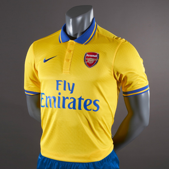
Would love for them to go full yellow+blue for their clash strip ala classic Arsenal


fancyscum
Radical Crommunist
I was sure at the beginning that this would end up being their home guernsey. The only thing that I didn't like about it was how it linked up on the side.Bring back this!
I was more hoping, but agreed with the joining up at the side. It is a tough design to join perfectly haha.I was sure at the beginning that this would end up being their home guernsey. The only thing that I didn't like about it was how it linked up on the side.
Bring back this!
Nope. Thats shithouse, and not befitting of a footy jumper.
That jumper is basically the same principal as the Crows' first white clash jumper. A curvy bit up the side with a logo in the middle, just stylised differently. And much like the Crows one, its s**t.
on the blue oneIn this blue clash or just invert the jumper colours?
I think a mostly yellow with red would look pretty horrid. But when i get home tonight I can make one up.
- Sep 19, 2007
- 19,084
- 17,645
- AFL Club
- St Kilda
- Other Teams
- Anaheim Ducks, PSV Eindhoven
on the blue one

Yeah it really doesn't work very well.
Here the inverse:

Just as horrid as I thought looks like a rejected outfit for Ronald McDonald
Last edited:
TheLoungeLizard
The world's most handsome man
I think the orange v red looms pretty good anyway
Well, not in congestion anyway
Well, not in congestion anyway
- Moderator
- #649
I think the orange v red looms pretty good anyway
Well, not in congestion anyway
It's probably only tolerable if you put Sydney in white shorts with their home guernsey yet the AFL haven't done that in 17 years and they won't be doing it any time soon
TheLoungeLizard
The world's most handsome man
Or give Sydney a white back clash version of the home?It's probably only tolerable if you put Sydney in white shorts with their home guernsey yet the AFL haven't done that in 17 years and they won't be doing it any time soon
- Status
- Not open for further replies.
Similar threads
- Replies
- 726
- Views
- 78K
