fancyscum
Radical Crommunist
I came up with something similar when I was messing around today:what about this as a quick mock up?


Last edited:
Follow along with the video below to see how to install our site as a web app on your home screen.
Note: This feature may not be available in some browsers.
I came up with something similar when I was messing around today:what about this as a quick mock up?
that's class, I like the idea of a black crow, but this is near perfect otherwise.I came up with something similar when I was messing around today:

I came up with something similar when I was messing around today:

Yep, you win. Now to get this to the club somehow..I came up with something similar when I was messing around today:
This is a win win. We pretty much keep the same white away guernsey and the club gets a variation to make more cash. Would still love a red option based on white and yellow one.Yep, you win. Now to get this to the club somehow..
Can you extend the colours to the other wing of crow? Interested to see how that looks.I came up with something similar when I was messing around today:
Or have it *almost* catching up to the start of the hoops?Can you extend the colours to the other wing of crow? Interested to see how that looks.
I've just had a go at that and it looks alright, but it kind of loses the the subtle throwback to the 'hooped' feathers of the old logo when you do that. The only real upside of having the hoops on both sides of the crow is that it allows for the hoops to continue onto the back of the jumper (like the current clash) without looking unbalanced.Can you extend the colours to the other wing of crow? Interested to see how that looks.
*the little bit between the wingsCan you extend the colours to the other wing of crow? Interested to see how that looks.
Nah **** em. Those crappy designs should never have been an option. Opposition trolls are voting maliciously, so it balances out.I'm sorry, but I don't agree with this vote manipulation..
A Port fan must have written a bot.I'm really, really curious what the club does now. There are questions marks over the legitimacy of the E and D votes, and D finished higher by a very small amount.
I estimate I added around 5,800 votes in 7 hours, which accounted for 21% of the entire vote. That's approximately 28,000 votes in total, of which 11,000 or so were for E. The rate at which E votes was added was insignificant during the 7 hours I was adding votes, and I was adding votes at a rate of 14 per minute. That suggests almost all the votes for E happened in the space of 6 hours, at one every two seconds for the entirety of the 6 hour period (if legitimate)
Nice work! Im not big on any of the designs from the club, yours is much better
What annoys me most about the rubbish the club has put out this time is that they would have pissed thousands of dollars up the wall paying some hack marketing guru when all they needed to do was spend an afternoon on footy forums to see the fantastic mock designs of actual footy fans who often take inspiration from other passionate footy fans. I don't get why they don't do this...
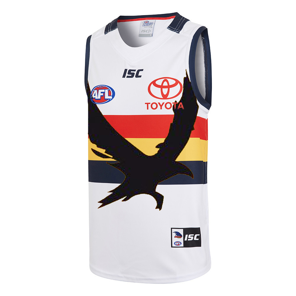
This could work, but only really work with the black crow, which I'm not overly keen on using because we already have one non club colour being used (white). If you do this with the crow in navy, then the extra blue that would fill up the negative space between the wings means the crow shape isn't as strong. Might post the different variations (along with a couple of other designs) over on the FJGD board's jumper ideas thread, rather than in this thread which it really isn't suited to.
i think this is great. Throwback with a new twist and ties into WFAO branding rather than raptorThis could work, but only really work with the black crow, which I'm not overly keen on using because we already have one non club colour being used (white). If you do this with the crow in navy, then the extra blue that would fill up the negative space between the wings means the crow shape isn't as strong. Might post the different variations (along with a couple of other designs) over on the FJGD board's jumper ideas thread, rather than in this thread which it really isn't suited to.
Have you emailed your design to the club?I've just had a go at that and it looks alright, but it kind of loses the the subtle throwback to the 'hooped' feathers of the old logo when you do that. The only real upside of having the hoops on both sides of the crow is that it allows for the hoops to continue onto the back of the jumper (like the current clash) without looking unbalanced.
I have the snowflake beanie and that is the most popular beanie by far (for the last 4 home games it has been impossible to buy it at the ground in any of the merch outlets). A lot people I've talked to that got it, or asked me where I got mine because they want one mentioned they love that it has the old crow logo on it as one of the reasons for why they want it.


My sister gave that to me for my birthday this year, best beanie ever it's so warm!Similar story here. I've been wearing this guy to games this year. The colours are perfect, has the old logo and also has a nice feel being merino.
I got it from the crowmania online, have never seen them selling it at games.
View attachment 416609
View attachment 416610
My sister gave that to me for my birthday this year, best beanie ever it's so warm!
I have made it a bit bigger, but as you pointed out, the crow would be massive if you made it standard hoop size. Only just seen that hoop order change suggestion so I'll add that to my post on the FJGD jumper ideas thread in a minute, but it does actually work well!i think this is great. Throwback with a new twist and ties into WFAO branding rather than raptor
Can you mock it up with everything a bit larger? i.e. hope thickness and crow all a bit bigger. Essentially so the hoops are the same size as those on the home guernsey. Reckon this would be even better as it'd still be white enough but a bit stronger design with that bit more size to it
Edit: on 2nd look of the home guernserny that ay not work as the Crow would need to be so big that it wouldnt have enough length in the hoops.
BUT maybe keeping in line with the previous suggestion on the hoop going to the inner tip of the other wing, what would thicker hoops with the red on top rather than blue, then the red could go all the way through without the crow needing to be black perhaps?
I came up with something similar when I was messing around today:
Yeah, I probably should have put it out there that I'm happy with the current clash jumper. Let ISC or any manufacturer screw around with the Alternate that we only see 2-3 times a year, but the clash needs to be traditional enough to be worn in a GF.I'm happy with the one we have. It's taken so long to get one that isn't awful. However, if we are going to change again, this is something I can get behind. Top work!
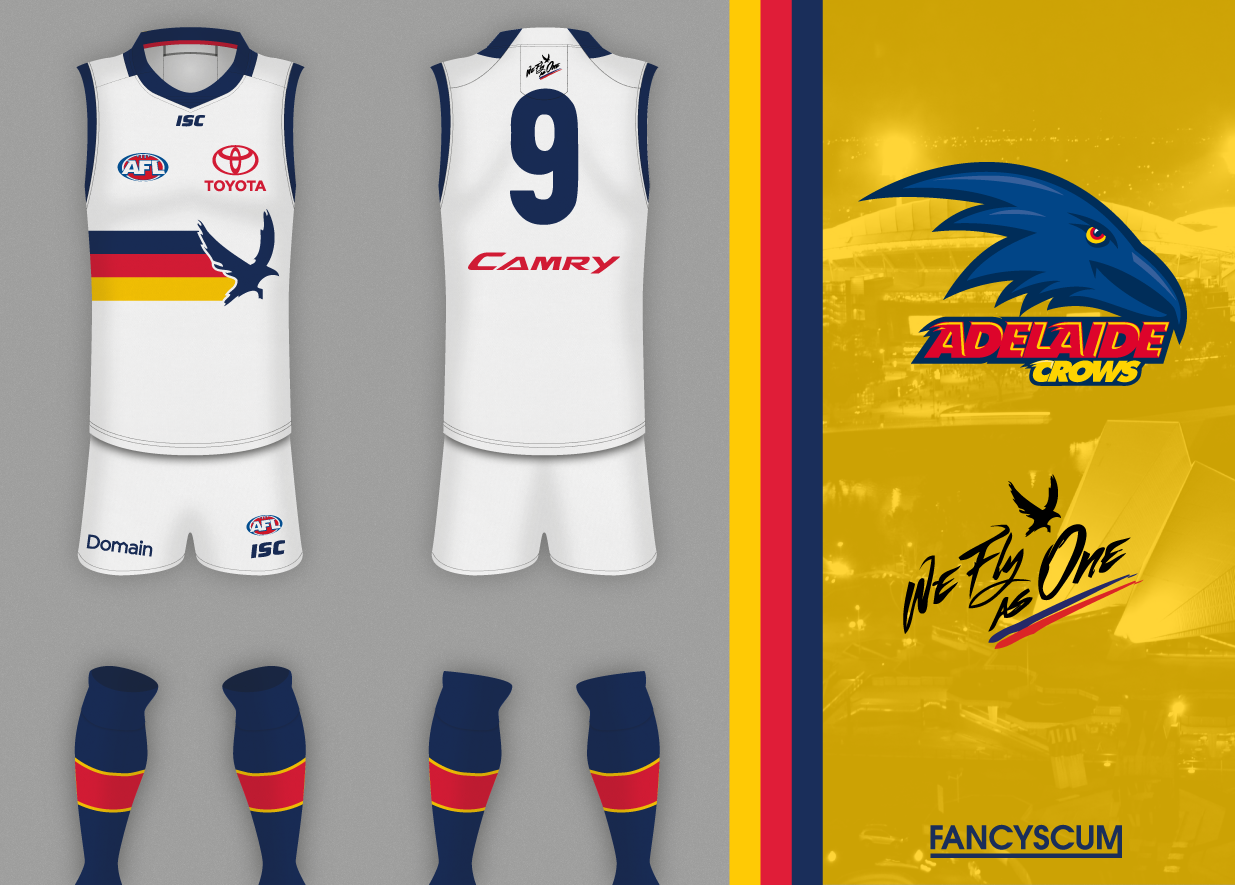
Posted this up on the crows board but it probably is worth a post on here too. Basically I tried to blend option D and E from the poll, with a subtle throwback to the old crows logo with the hooped feathers out the back.
There's also a couple of different variations based on suggestions from other members over there.
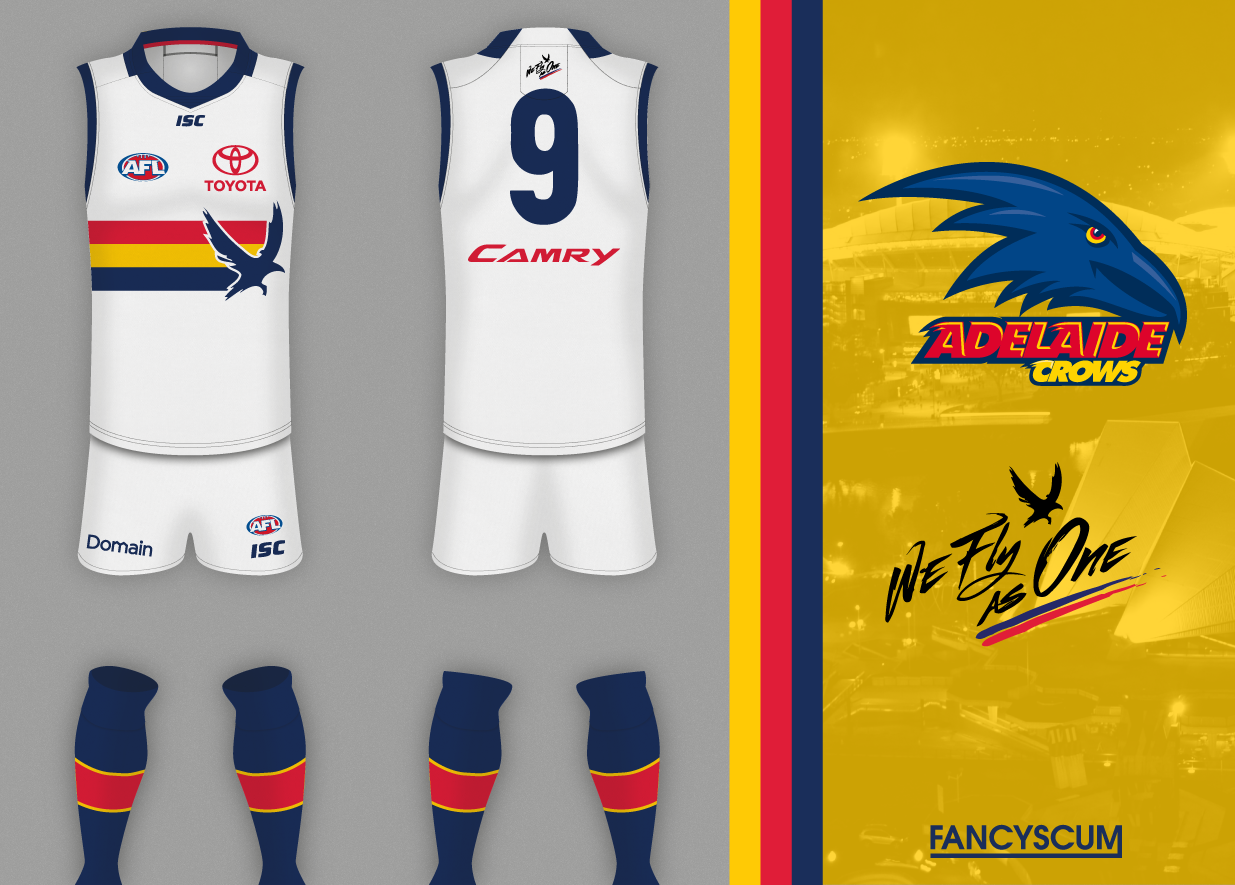
EDIT: just seen a suggestion from Tex Danger to fix up the design in the first spoiler by going with the colour order from this years clash, works a lot better.
Still want s black on black crows hat. I asked AFC about it the other day on Facebook and they tagged crowmania and said it was a question for them. 15 mins later my post was deleted....