Discussion Finals Series 2017: Photos and Discussion

Remove this Banner Ad

I assume that clubs do it in order to theoretically broaden their support. People new to football might be less likely to support a team called "Geelong" or "Adelaide" if they have never even been to those places. It's more plausible to say they like the "Cats" or "Crows". As far as I can tell, that's the reason. But in practice, I really doubt they would sell any more than about 3 extra memberships by doing it. It would look a lot better if the AFL standardised things. It just looks like incompetence if you don't know the reasons behind it.
 
West Melbourne is a suburb that really has more to do with North Melbourne. North Melbourne and South Melbourne were their own cities adjacent to Melbourne city so the word Melbourne in our name would not have much relavance to us. Western Suburbs didn't sound right either. We always played at the Western Oval so just Western it was. Not as good as Footscray but better than all the rest.
Ah, interesting - makes sense when you take all this into account. I remember thinking at the time of all those merger talks in the 1990s that a good match might be Footscray and North Melbourne given their relative proximity and team colours; named North-west Melbourne to cover all bases. All academic now!
 

Log in to remove this ad.

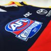
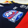
That is really cool. I figured they just made new guernseys up and the GF logo was sublimated on instead of the normal AFL logo. That heat transferred logo is interesting, wondering if the red area is a fabric, noticed it was blue before it was pressed on as well.
 
I do like that the Tiger is in the 'fend off' position as a nod to Dusty (and that the Tiger isn't covered it tattoos).

I don't like that the rubbish ISC collar is visible, or the AFL logo on the Crow.
Dusty Tiger needs more tatts plus why the white shorts?
 

(Log in to remove this ad.)

They look good, but I wish they'd keep them under wraps (as much as possible) until after the game.

Funny that the Richmond one has a jumper that won't be worn...
The 2015 West Coast poster had them in the Tripanel - despite them wearing Royal Wings in all Grandfinals
 
I know some people are for changing the GF logo, but I really
hope they stick with it for a while. It's so simple, but it works. It's one of the few things that hasn't been changed for the sake of change. Love seeing it on the jumpers this time of year!
Nah agreed 100%.
 
They look good, but I wish they'd keep them under wraps (as much as possible) until after the game.

Funny that the Richmond one has a jumper that won't be worn...
Based on Mark's little spiel during one of the Brownlow rounds, it seems he starts preparing quite a few weeks out.

Although I don't think reversing the colours are all that difficult to change.
 
They look good, but I wish they'd keep them under wraps (as much as possible) until after the game.

Funny that the Richmond one has a jumper that won't be worn...

The 2015 West Coast poster had them in the Tripanel - despite them wearing Royal Wings in all Grandfinals

The tiger needs black shorts

Based on Mark's little spiel during one of the Brownlow rounds, it seems he starts preparing quite a few weeks out.

Although I don't think reversing the colours are all that difficult to change.

Yeah Knight seems a bit lazy with these and lacks an attention to detail.
 
Geez people around here will complain about anything. He just defaults to home jumpers, theres nothing necessarily wrong with that. Its really no different to Fox Footy using jumper designs in their little flag icons and always using the home jumper. Its not supposed to be a portrait of someone from the actual game, its just a mascot!
 

Remove this Banner Ad

Back
Top